
Correlation
People are often interested in how different variables are related to each other. In general, a correlation is just a relationship or association between two variables. If one variable gives you information about the other, then they are correlated (dependent, associated). More commonly, we talk about two variables having a linear relationship. To understand linear relationships, it helps to have a good grasp of variance and covariance.
Variance is a number that quantifies how spread out a variable’s values are from their mean on average. We subtract the mean \(\bar{x}\) from each each observation \(x_i\), then we square each of these devations, and then average them up, to get the sample’s variance. (We divide by \(n-1\) rather than \(n\) because we are assuming we have a sample of data from a larger population: see Bessel’s correction). Also, the standard deviation is just the square root of the variance: if the variance is the average squared deviation, the standard deviation represents the average deviation (though there are other, less common measures of this like average absolute deviation).
\[ var(X)=\sum_i \frac{(x_i-\bar{x})^2}{n-1}\\ sd_x=\sqrt{var(X)}= \sqrt{\sum_i \frac{(x_i-\bar{x})^2}{n-1}} \]
Covariance is a measure of association between two variables: how much the larger values of one variable tend to “go with” larger values of the other variable (and how much smaller values go with with smaller values). When one value of one variable is above its mean, does the corresponding value for the other variable tend to be above its mean too? If so, you have positive covariance. In contrast, if one variable tends to have values above its mean when the other tends to have values below its mean, you have negative covariance. If there is no relationship between the deviations of each of the two variables from their respective means, the covariance will be zero.
For both variables \(x\) and \(y\), we calculate the deviation of each observation from it’s mean, \(x_{i}-\bar{x}\) and \(y_{i}-\bar{y}\). Then we multiply those deviations together, \((x_{i}-\bar{x})(y_{i}-\bar{y})\), and we average these products across all observations.
\[ cov(X,Y)=\sum_i \frac{(x_{i}-\bar{x})(y_{i}-\bar{y})}{n-1} \]
The numerator is where the magic happens. If, for a point on your scatterplot (\(x_i, y_i\)), your \(x_i\) is less than its mean (so \(x_{i}-\bar{x}\) is negative), but your \(y_i\) is greater than its mean (so \(y_{i}-\bar{y}\) is positive), then the product of the two deviations in the summation will be negative.
For example, let’s say we observe these two data points:
\[\begin{matrix} x&y\\ \hline 1 &4\\ 3& 6 \\ \hline \bar x=2 &\bar y=5 \end{matrix} \]
Then we have
\[ \frac{\sum(x_i-\bar x)(y_i-\bar y)}{n-1}=\frac{(1-2)(4-5)+(3-2)(6-5)}{2-1}=\frac{(-1)(-1)+(1)(1)}{1}=2 \]
These variables have a sample covariance of 2.
While the sign of the covariance will always tell you whether a relationship between to variables is positive or negative (i.e, relationship direction), the magnitude of the covariance can be misleading as a measure of relationship strength because it is influenced by the magnitude of each of the variables.
Let’s work with this a bit. Below we plot X and Y, which have a perfectly linear relationship; also, the slope is one (when X goes up by 12.5, Y goes up by 12.5). Along the margin, we show the distribution of each variable with tick marks. Focusing on one variable at a time, notice they are both uniformly distributed. We have also drawn through the mean of each variable (\(M_{X}=50; M_{Y}=200\)). Notice also that both X and Y have the same number of data points (9), and that they are both evenly spaced throughout. Thus, they have the same standard deviation (\(SD=34.23\)). Now the sample covariance of X and Y is 1171.88, which is positive.
library(ggplot2)
library(dplyr)
#library(tidyr)
library(MASS)
#samples = 10
#r = 0.5
#data = as.data.frame(mvrnorm(n=samples, mu=c(0, 0), Sigma=matrix(c(1, r, r, 1), nrow=2), empirical=TRUE))

data<-data.frame(X=seq(0,100,length.out = 9),Y=seq(150,250,length.out = 9))
knitr::kable(round(data,3),align='cc')| X | Y |
|---|---|
| 0.0 | 150.0 |
| 12.5 | 162.5 |
| 25.0 | 175.0 |
| 37.5 | 187.5 |
| 50.0 | 200.0 |
| 62.5 | 212.5 |
| 75.0 | 225.0 |
| 87.5 | 237.5 |
| 100.0 | 250.0 |
ggplot(data,aes(X,Y))+geom_point()+geom_hline(yintercept=mean(data$Y))+geom_vline(xintercept=mean(data$X))+geom_rug(color="gray50")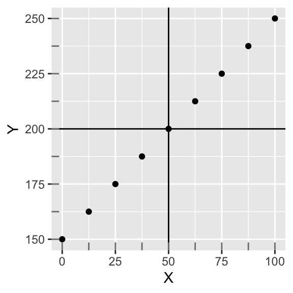
cov(data$X,data$Y)## [1] 1171.875But the number 1171.88 itself is rather arbitrary. It is influenced by the scale of each variable. For example, if we multiply both variables by 100, we get:
round(cov(10*data$X,10*data$Y))## [1] 117188We have arbitrarily increased the covariance by a factor of 100.
Here’s an interesting thought: this perfectly linear relationship should represent the maximum strength of association. What would we have to scale by if we wanted this pefect (positive) covariance to equal one?
Well, if we standardize both variables (by subtracting the variable’s mean from each observation and dividing that difference by the variable’s standard deviation), we preserve the relationship among observations but we put them on the same scale (i.e., each variable has a mean of 0 and a standard deviation of 1). That is, we convert each variable to a z-score (if you need a refresher, see my previous post about z-scores).
Plotting them yields an equivalent looking plot, but notice how the scales have changed! The relationship between X and Y is completely preserved. Also, the covariance of X and Y is now 1.
data<-data.frame(scale(data))
ggplot(data,aes(X,Y))+geom_point()+geom_hline(yintercept=mean(data$Y))+geom_vline(xintercept=mean(data$X))+geom_rug(color="gray50")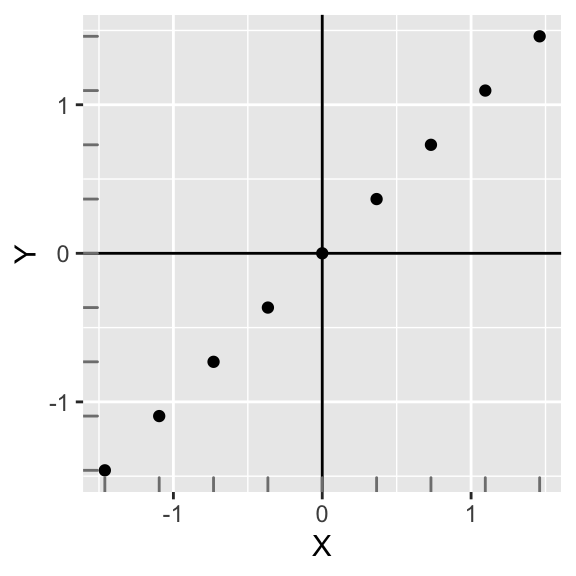
This is interesting! The covariance of two standardized variables that have a perfectly linear relationship is equal to 1. This is a desirable property: The linear relationship between X and Y simply cannot get any stronger!
Equivalently, since the calcualtion of the covariance (above) already subtracts the mean from each variable, instead of standardizing \(X\) and \(Y\), we could just divide the original \(cov(X,Y)\) by the standard deviations of \(X\) and \(Y\). Either way is fine!
\[ r=\sum_i\frac{Z_{X}Z_{Y}}{n-1}=\frac{\sum(x_i-\bar{x})(y_i-\bar{y})}{sd_Xsd_Y(n-1)}=\frac{cov(X,Y)}{\sqrt{var(X)}\sqrt{var(Y)}}=\frac{1171.88}{34.23 \times 34.23}=1 \]
We have hit upon the formula for Pearson’s correlation coefficient (\(r\)) for measuring the strength of a linear association between two variables. Taking the covariance of two standardized variables will always yield \(r\). In this case, \(r=1\) indicating a perfect linear direct relationship between the variables. This is the maximum value of \(r\) (the minimum value is -1, indicating a perfectly linear inverse relationship). Also, \(r=0\) means no relationship (i.e., random noise). Observe the scatterplots, and their respective correlations, below:
library(cowplot)

samples = 10; r = -1
d1 = as.data.frame(mvrnorm(n=samples, mu=c(0, 0), Sigma=matrix(c(1, r, r, 1), nrow=2), empirical=TRUE));r=-.5
d2= as.data.frame(mvrnorm(n=samples, mu=c(0, 0), Sigma=matrix(c(1, r, r, 1), nrow=2), empirical=TRUE));r=0
d3= as.data.frame(mvrnorm(n=samples, mu=c(0, 0), Sigma=matrix(c(1, r, r, 1), nrow=2), empirical=TRUE));r=.5
d4= as.data.frame(mvrnorm(n=samples, mu=c(0, 0), Sigma=matrix(c(1, r, r, 1), nrow=2), empirical=TRUE));r=1
d5= as.data.frame(mvrnorm(n=samples, mu=c(0, 0), Sigma=matrix(c(1, r, r, 1), nrow=2), empirical=TRUE))

names(d1)<-names(d2)<-names(d3)<-names(d4)<-names(d5)<-c("X","Y")

p1<-ggplot(d1,aes(X,Y))+geom_point()+theme(axis.text.x=element_blank(),axis.text.y=element_blank(),
      axis.ticks=element_blank(),axis.title.x=element_blank(),axis.title.y=element_blank())+ggtitle("r = -1")
p2<-ggplot(d2,aes(X,Y))+geom_point()+theme(axis.text.x=element_blank(),axis.text.y=element_blank(),axis.ticks=element_blank(),axis.title.x=element_blank(),axis.title.y=element_blank())+ggtitle("r = -0.5")
p3<-ggplot(d3,aes(X,Y))+geom_point()+theme(axis.text.x=element_blank(),axis.text.y=element_blank(),axis.ticks=element_blank(),axis.title.x=element_blank(),
      axis.title.y=element_blank())+ggtitle("r = 0")
p4<-ggplot(d4,aes(X,Y))+geom_point()+theme(axis.text.x=element_blank(),axis.text.y=element_blank(),axis.ticks=element_blank(),axis.title.x=element_blank(),axis.title.y=element_blank())+ggtitle("r = 0.5")
p5<-ggplot(d5,aes(X,Y))+geom_point()+theme(axis.text.x=element_blank(),axis.text.y=element_blank(),axis.ticks=element_blank(),axis.title.x=element_blank(),axis.title.y=element_blank())+ggtitle("r = 1")

plot_grid(p1,p2,p3,p4,p5,nrow=1)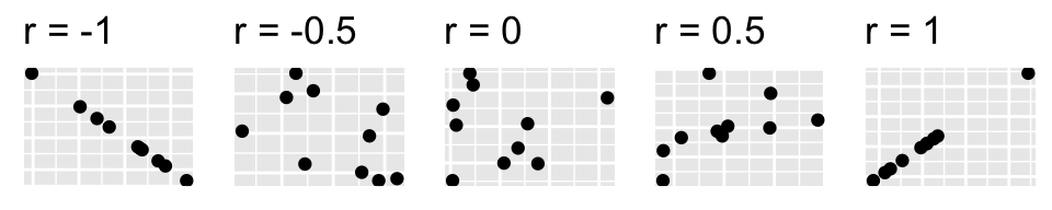
theme_set(theme_grey())Correlation demonstration!
Let’s approach the correlation \(r\) again, but from a slightly different angle. I want to demonstrate a helpful way to visualize the calculation.
As before, divide the scatterplot into quadrants (whose axes intersect at the mean of each variable, in this case 0). Now, for each point (i.e., for each pair of variables) find how far it is away from the x-axis and the y-axis.
data<-data.frame(scale(data))
knitr::kable(round(data,3),align='cc')| X | Y |
|---|---|
| -1.461 | -1.461 |
| -1.095 | -1.095 |
| -0.730 | -0.730 |
| -0.365 | -0.365 |
| 0.000 | 0.000 |
| 0.365 | 0.365 |
| 0.730 | 0.730 |
| 1.095 | 1.095 |
| 1.461 | 1.461 |
p<-ggplot(data,aes(X,Y))+geom_point()+geom_hline(yintercept=0)+geom_vline(xintercept=0)+scale_x_continuous(limits=c(-2.5,2.5))+scale_y_continuous(limits = c(-2.5,2.5))+xlab("Zx")+ylab("Zy")
p+geom_segment(aes(x=data[9,1],xend=data[9,1],y=0,yend=data[9,2]),lty=3)+geom_segment(aes(x=0,xend=data[9,1],y=data[9,2],yend=data[9,2]),lty=3)+xlab("Zx")+ylab("Zy")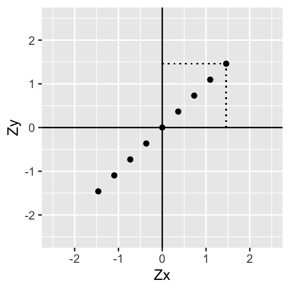
p+geom_segment(aes(x=data[9,1],xend=data[9,1],y=0,yend=data[9,2]),lty=3)+geom_segment(aes(x=0,xend=data[9,1],y=data[9,2],yend=data[9,2]),lty=3)+annotate("text", x = data[9,1], y=data[9,2], label = paste("(",round(data[9,1],2),",",round(data[9,2],2),")",sep=""),hjust=0,vjust=0,size=3)+xlab("Zx")+ylab("Zy")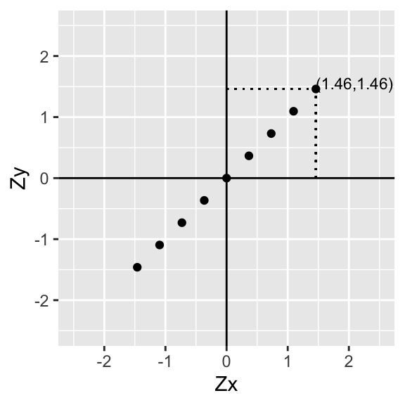
Now let’s go ahead and do this for every point:
p+geom_text(aes(label=paste("(",round(data$X,2),",",round(data$Y,2),")",sep=""),hjust=0, vjust=0),size=3)+xlab("Zx")+ylab("Zy")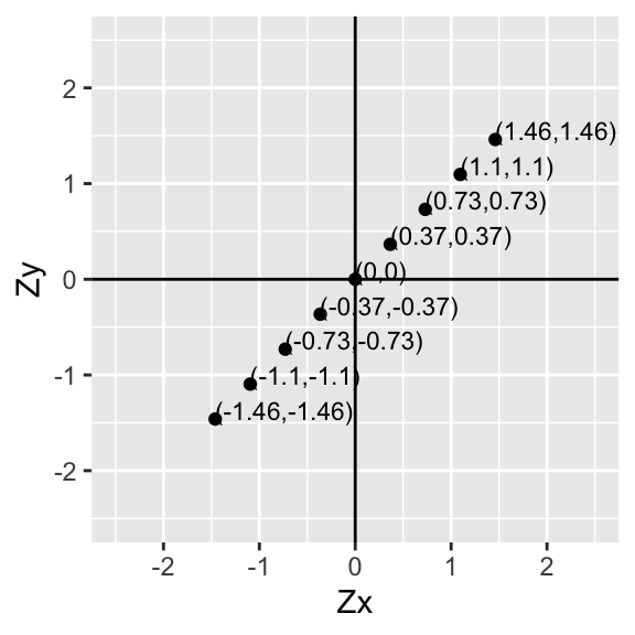
Since the mean of Zx is \(\bar{x}=0\) and the mean of Zy is \(\bar{y}=0\), for each point \((x_i,y_i)\) we just found the deviations of each value from the mean \((x_i-\bar{x},y_i-\bar{y})\)!
Now then, for each pair of values, multiply the two numbers together. Notice that this is the deviation of \(x_i\) from its mean times the deviation of \(y_i\) from its mean for all of the \(i\) pairs in our sample.
p+geom_text(aes(label=paste("(",round(data$X*data$Y,2),")",sep=""),hjust=0, vjust=0),size=3)+xlab("Zx")+ylab("Zy")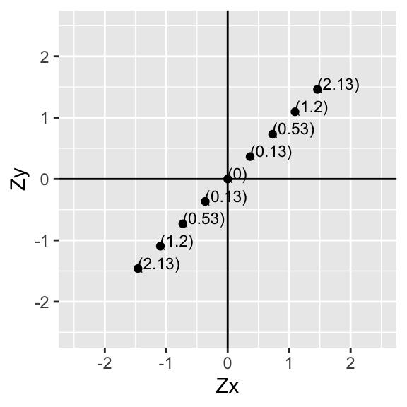
Let’s add them up in each quadrant and put the total in the middle:
p1<-ggplot(data,aes(X,Y))+geom_abline(slope = 1,intercept=0,color='gray50',lty=2)+geom_point()+geom_hline(yintercept=0)+geom_vline(xintercept=0)+scale_x_continuous(limits=c(-3,3))+scale_y_continuous(limits = c(-3,3))+xlab("Zx")+ylab("Zy")+annotate("text",2,2,label=round(sum(data[data$X>0 & data$Y>0,]$X*data[data$X>0 & data$Y>0,]$Y),2))+
  annotate("text",-2,-2,label=round(sum(data[data$X<0 & data$Y<0,]$X*data[data$X<0 & data$Y<0,]$Y),2))+
  annotate("text",-2,2,label=round(sum(data[data$X<0 & data$Y>0,]$X*data[data$X<0 & data$Y>0,]$Y),2))+
  annotate("text",2,-2,label=round(sum(data[data$X>0 & data$Y<0,]$X*data[data$X>0 & data$Y<0,]$Y),2))+xlab("Zx")+ylab("Zy")+geom_rug(color="gray50")
p1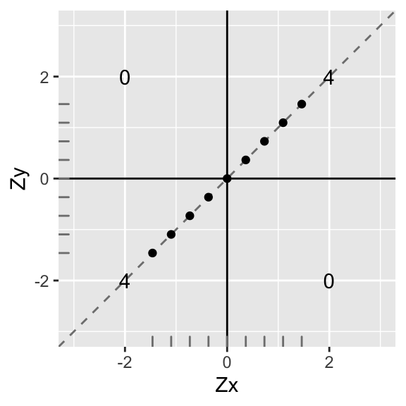
Now let’s use these totals to calculate the correlation coefficient: add up the total in each quadrant and divide by \(n-1\).
\[ \frac{\sum ZxZy}{n-1}=\frac{4+4+0+0}{8}=1 \]
Perfect correlation (\(r=1\))! Also, notice that the slope of the (dashed) line that the points lie on is also exactly 1…
What if the relationship were flipped?
data1<-data
data1$X<-data$X*-1
ggplot(data1,aes(X,Y))+geom_point()+geom_hline(yintercept=0)+geom_vline(xintercept=0)+scale_x_continuous(limits=c(-3,3))+scale_y_continuous(limits = c(-3,3))+xlab("Zx")+ylab("Zy")+annotate("text",2,2,label=round(sum(data1[data1$X>0 & data1$Y>0,]$X*data1[data1$X>0 & data1$Y>0,]$Y),2))+
  annotate("text",-2,-2,label=round(sum(data1[data1$X<0 & data1$Y<0,]$X*data1[data1$X<0 & data1$Y<0,]$Y),2))+
  annotate("text",-2,2,label=round(sum(data1[data1$X<0 & data1$Y>0,]$X*data1[data1$X<0 & data1$Y>0,]$Y),2))+
  annotate("text",2,-2,label=round(sum(data1[data1$X>0 & data1$Y<0,]$X*data1[data1$X>0 & data1$Y<0,]$Y),2))+xlab("Zx")+ylab("Zy")+geom_rug(color="gray50")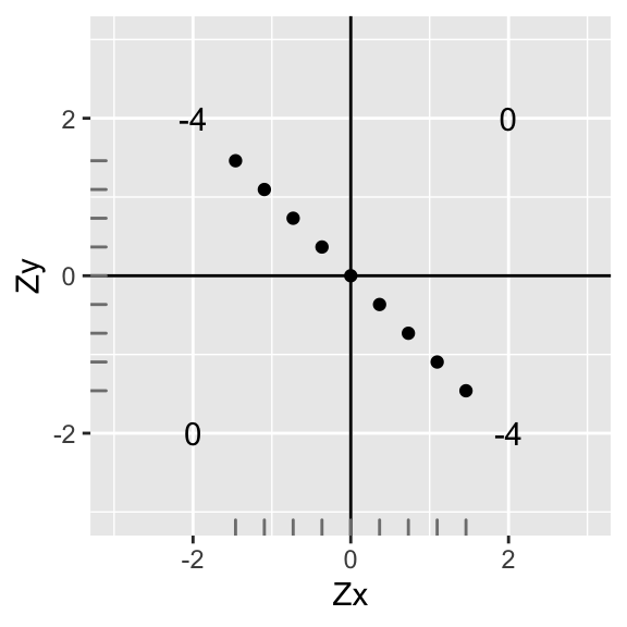
The sum of the deviations are the same, but the sign has changed. Thus, the correlation is the same strength, but different direction (r=-1) We have a perfect negative correlation: \(r=\sum\frac{ZxZy}{n-1}=\frac{-8}{8}=-1\). Notice that the mean and standard deviation of \(x\) and \(y\) are still the same (we just rotated it \(90^o\))
Now let’s see what would happen if data points were no longer perfectly linear. Let’s take the second data point from the bottom and scoot it up, making the y-value equal 0.
data1<-data
data1[2,2]<-0
ggplot(data1,aes(X,Y))+geom_point()+geom_hline(yintercept=0)+geom_vline(xintercept=0)+scale_x_continuous(limits=c(-3,3))+scale_y_continuous(limits = c(-3,3))+xlab("Zx")+ylab("y")+annotate("text",2,2,label=round(sum(data1[data1$X>0 & data1$Y>0,]$X*data1[data1$X>0 & data1$Y>0,]$Y),2))+
  annotate("text",-2,-2,label=round(sum(data1[data1$X<0 & data1$Y<0,]$X*data1[data1$X<0 & data1$Y<0,]$Y),2))+
  annotate("text",-2,2,label=round(sum(data1[data1$X<0 & data1$Y>0,]$X*data1[data1$X<0 & data1$Y>0,]$Y),2))+
  annotate("text",2,-2,label=round(sum(data1[data1$X>0 & data1$Y<0,]$X*data1[data1$X>0 & data1$Y<0,]$Y),2))+geom_rug(color="gray50")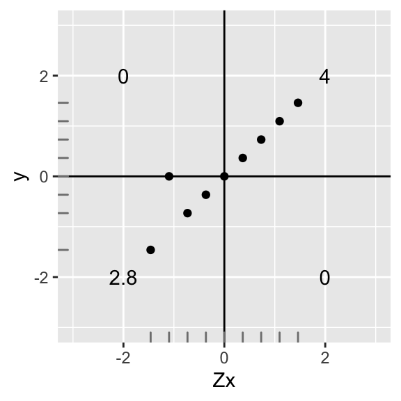
ggplot(data1,aes(X,Y))+geom_abline(slope = .92,intercept=0,color='gray50',lty=3)+
  geom_abline(slope = 1,intercept=0,color='gray50',lty=2)+geom_point()+geom_hline(yintercept=0)+geom_vline(xintercept=0)+scale_x_continuous(limits=c(-3,3))+scale_y_continuous(limits = c(-3,3))+xlab("Zx")+ylab("Zy")+annotate("text",2,2,label=round(sum(data1[data1$X>0 & data1$Y>0,]$X*data1[data1$X>0 & data1$Y>0,]$Y),2))+
  annotate("text",-2,-2,label=round(sum(data1[data1$X<0 & data1$Y<0,]$X*data1[data1$X<0 & data1$Y<0,]$Y),2))+
  annotate("text",-2,2,label=round(sum(data1[data1$X<0 & data1$Y>0,]$X*data1[data1$X<0 & data1$Y>0,]$Y),2))+
  annotate("text",2,-2,label=round(sum(data1[data1$X>0 & data1$Y<0,]$X*data1[data1$X>0 & data1$Y<0,]$Y),2))+xlab("Zx")+ylab("Zy")+geom_rug(color="gray50")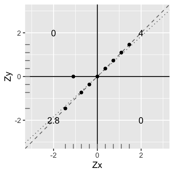
Uh oh, but since we changed a y-value, the mean of the \(y\)s no longer equals 1, and the standard deviation no longer equals 0. They are now \(M_y=.12\) and \(SD_y=.91\); however, \(X\) still remains standardized because nothing changed (see distribution along the bottom).
If we ignore this fact and try to calculate the “correlation” we get: \(r_{fake}=\sum\frac{Zx Y}{n-1}=\frac{6.8}{8}=.85\). However, if we go to the data and calculate the actual correlation, we get this:
knitr::kable(round(data1,3),align='cc')| X | Y |
|---|---|
| -1.461 | -1.461 |
| -1.095 | 0.000 |
| -0.730 | -0.730 |
| -0.365 | -0.365 |
| 0.000 | 0.000 |
| 0.365 | 0.365 |
| 0.730 | 0.730 |
| 1.095 | 1.095 |
| 1.461 | 1.461 |
print(paste("Correlation of X and Y: ",with(data1,cor(X,Y))))## [1] "Correlation of X and Y: 0.931128347758783"So the actual \(r=.93\). Moving one data point up reduced our actual correlation from 1 to .93. But what is the relationship between the “fake” correlation we got by not standardizing Y (\(r_{fake}=.85\)), and the actual correlation (.93)?
\[ \begin{aligned} r_{fake}&=r\times x\\ .85&=.93x\\ x&=\frac{.93}{.85}=.91=sd_Y \end{aligned} \]
Our “fake” correlation is just the covariance of X and Y! Remember, \(r=\frac{cov(X,Y)}{sd_Xsd_Y}\)
Let’s standardize Y again and proceed:
data1$Y<-scale(data1$Y)
ggplot(data1,aes(X,Y))+geom_abline(slope = .9311,intercept=0,color='gray50',lty=3)+
  geom_abline(slope = 1,intercept=0,color='gray50',lty=2)+geom_point()+geom_hline(yintercept=0)+geom_vline(xintercept=0)+scale_x_continuous(limits=c(-3,3))+scale_y_continuous(limits = c(-3,3))+xlab("Zx")+ylab("Zy")+annotate("text",2,2,label=round(sum(data1[data1$X>0 & data1$Y>0,]$X*data1[data1$X>0 & data1$Y>0,]$Y),2))+
  annotate("text",-2,-2,label=round(sum(data1[data1$X<0 & data1$Y<0,]$X*data1[data1$X<0 & data1$Y<0,]$Y),2))+
  annotate("text",-2,2,label=round(sum(data1[data1$X<0 & data1$Y>0,]$X*data1[data1$X<0 & data1$Y>0,]$Y),2))+
  annotate("text",2,-2,label=round(sum(data1[data1$X>0 & data1$Y<0,]$X*data1[data1$X>0 & data1$Y<0,]$Y),2))+xlab("Zx")+ylab("Zy")+geom_rug(color="gray50")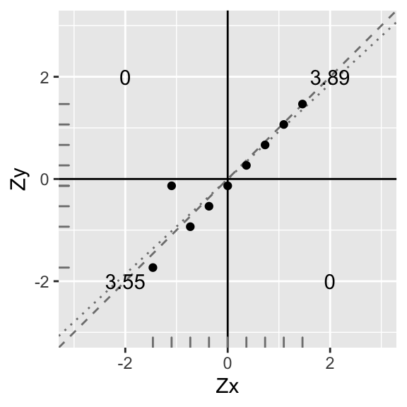
Again, you can see that the best-fitting line (dotted) has a slope somewhat less steep than before (compare to dashed line). Indeed, the slope is now \(r\frac{\sum Z_xZ_y}{n-1}=\frac{3.55+3.89}{8}=\frac{7.44}{8}=0.93\). Because the y-intercept is zero, the equation for the dotted line is \(Zy=.93\times Zx\). This will always be the case: Wen we have standardized variables, the slope of the line of best fit is equal to the correlation coefficient \(r\).
OK, so what happens if our data are not linear? (We will go ahead and standardize our variables to avoid issues this time.)
data1<-data
data1$Y<--(data$Y^2)+1
data1<-data.frame(scale(data1))
ggplot(data1,aes(X,Y))+geom_point()+geom_hline(yintercept=0)+geom_vline(xintercept=0)+scale_x_continuous(limits=c(-3,3))+scale_y_continuous(limits = c(-3,3))+xlab("Zx")+ylab("Zy")+annotate("text",2,2,label=round(sum(data1[data1$X>0 & data1$Y>0,]$X*data1[data1$X>0 & data1$Y>0,]$Y),2))+
  annotate("text",-2,-2,label=round(sum(data1[data1$X<0 & data1$Y<0,]$X*data1[data1$X<0 & data1$Y<0,]$Y),2))+
  annotate("text",-2,2,label=round(sum(data1[data1$X<0 & data1$Y>0,]$X*data1[data1$X<0 & data1$Y>0,]$Y),2))+
  annotate("text",2,-2,label=round(sum(data1[data1$X>0 & data1$Y<0,]$X*data1[data1$X>0 & data1$Y<0,]$Y),2))+xlab("Zx")+ylab("Zy")+geom_rug(color="gray50")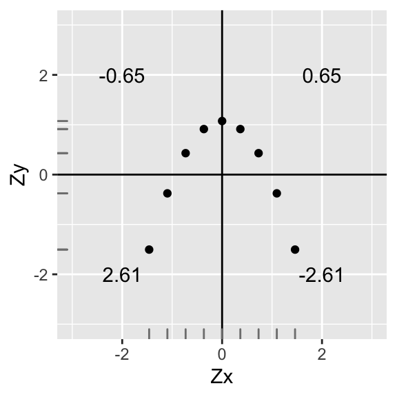
#mean(data1$Y)
#sd(data1$Y)
We have \(r=\sum\frac{ZxZy}{n-1}=\frac{.65+(-.65)+2.61+(-2.61)}{8}=\frac{0}{8}=0\), zero correlation! This is because every point in a positive quadrant is cancelled out by a point in a negative quadrant!
However, there is still clearly a relationship between \(Zy\) and \(Zx\)! (Specifically, \(Zy=-Zx^2+1\)). So calculating the correlation coefficient is only appropriate when you are interested in a linear relationship. As we will see, the same applies to linear regression.
Finally, let’s see what more realistic data might look like:
library(ggplot2)
library(MASS)

samples = 9
r = 0.5

data1 = as.data.frame(mvrnorm(n=samples, mu=c(0, 0), Sigma=matrix(c(1, r, r, 1), nrow=2), empirical=TRUE))
names(data1)<-c("X","Y")

ggplot(data1,aes(X,Y))+geom_point()+geom_hline(yintercept=0)+geom_vline(xintercept=0)+scale_x_continuous(limits=c(-3,3))+scale_y_continuous(limits = c(-3,3))+xlab("Zx")+ylab("Zy")+annotate("text",2,2,label=round(sum(data1[data1$X>0 & data1$Y>0,]$X*data1[data1$X>0 & data1$Y>0,]$Y),2))+
  annotate("text",-2,-2,label=round(sum(data1[data1$X<0 & data1$Y<0,]$X*data1[data1$X<0 & data1$Y<0,]$Y),2))+
  annotate("text",-2,2,label=round(sum(data1[data1$X<0 & data1$Y>0,]$X*data1[data1$X<0 & data1$Y>0,]$Y),2))+
  annotate("text",2,-2,label=round(sum(data1[data1$X>0 & data1$Y<0,]$X*data1[data1$X>0 & data1$Y<0,]$Y),2))+xlab("Zx")+ylab("Zy")+geom_rug(color="gray50")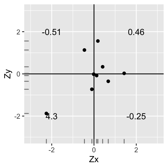
Here, we find that \(r=\sum \frac{ZxZy}{n-1}=\frac{(-0.18)+3.1+(-1.01)+2.09}{8}=\frac{4}{8}=0.5\)
A positive correlation, but not nearly as strong as before.
To recap,
r = strength of linear relationship between two variables
for variables \(x\) and \(y\), measures how close points \((x,y)\) are to a straight line
linear transformations (add/subtract a constant, multiply/divide by a constant) do not affect the value of r.
Now then, in the above case where the line fit perfectly (\(r=1\)), we could write our prediction for y (denoted \(\hat{y}\)) like so:
\[ Zy=Zx \longrightarrow \frac{\hat{y}-\bar{y}}{sd_y}=\frac{x-\bar{x}}{sd_x} \]
In this case, it was a perfect prediction! But when it is not perfect prediction, we need to calculate a slope coefficient for Zx
Regression
Correlation and regression are fundamental to modern statistics.
Regression techniques are useful when you want to model an outcome variable \(y\) as a function of (or in relationship to) predictor variables \(x_1, x_2,...\). Specifically, regression is useful when you want
\[ y=f(x_1,x_2,...) \]
Because this goal is so common, and because the tool is so general, regression models are ubiquitous in research today.
We are going to be talking here about situations where we model \(y\) as a linear function of \(x1, x2,...\)
\[ y=b_0+b_1x_1+b_2x_2+...+\epsilon \]
We are interested in modeling the mean of our response variable \(y\) given some predictors \(x_1, x_2,...\). Right now, think of regression as a function which gives us the expected value of \(y\) (\(\hat y\)) for a given value of \(x\). The value \(\hat y\) is the predicted value, which will lie on the straight line that runs right through the middle of our scatterplot. Notice that some of the data will be above the predicted line and some will be below it: our \(\hat y\)s will not perfectly match our \(y\). The distances between the predicted (or “fitted”) values \(\hat y\) and the actual values \(y\) are called residuals (\(\epsilon=y-\hat y\)). The residuals end up being very important conceptually: they represent the variability in \(y\) that is left after accounting for the best-fitting linear combination of your predictor(s) \(x\) (i.e., \(\hat y\)).
Deriving regression coefficients!
Let’s keep it basic, because doing so will allow us to do something amazing using pretty basic math.
Let’s look at a special regression with one dependent variable \(y\), one predictor \(x\), and no intercept. Like we said above, the \(x\)s and \(y\)s we observed aren’t going to have a perfectly linear relationship: we need a residual term (\(\epsilon\)) that capture deviations of our data from the predicted line \(\hat y=b x\) (“error”). Here’s the model:
\[ \begin{aligned} y&=b x+\epsilon \\ \hat y&=b x\\ &\text{subtract bottom from top},\\ y-\hat y&=\epsilon\\ \end{aligned} \]
Now, when we estimate \(b\), our goal is to miminize the errors (the residuals \(\epsilon= y-\hat y\)). Minimizing the errors/residuals will give us the best fitting line! But \(\epsilon_i\) can be positive or negative, so we square them. Specifically, we want to choose \(b\) to minimize the sum of these squared residuals. Let’s do it! From above, we know that \(\epsilon=y-b x\), so \(\sum_i\epsilon_i^2=\sum_i(y_i-b x_i)^2\). Let’s do a tiny bit of algebra (\(min_b\) just means our goal is to find the value of \(b\) that minimizes the function:
\[ \begin{aligned} \min_b \sum_i\epsilon_i^2&=\sum_i(y_i-\hat y_i)^2\\ \min_b \sum_i\epsilon_i^2&=\sum_i(y_i-b x_i)^2\\ &=\sum_i(y_i-b x_i)(y_i-b x_i)\\ &=\sum_i y_i^2-2b x_iy_i+b^2x_i^2 \end{aligned} \]
Recall that \(x\) and \(y\) are fixed. We want to know the value of \(b\) that will result in the smallest total squared error. We can find this value by taking the derivative of the error function (above) with respect to \(b\): this results in a new function that tells you the slope of a line tangent to the original function for each value of \(b\). Since the original function \(\sum_i(y_i-b x_i)^2\) is a positive quadratic, we know that it has its minimum value at the bottom of the bend where the slope of the tangent line is zero. This is the minimum value of the error function! We just need to solve for \(b\).
\[ \begin{aligned} &\text{dropping subscripts for readability}\\ \min_b \sum\epsilon^2 &=\sum (y^2-2b xy+b^2x^2)\\ &\text{distribute sums, pull out constants, apply derivative operator}\\ \frac{d}{db} \sum\epsilon^2 &= \frac{d}{db} \sum y^2-2b\sum xy +b^2\sum x^2\\ &=0-2\sum xy+2b\sum x^2 \\ \end{aligned} \]
\[ \begin{aligned} &\text{set derivative equal to zero, solve for }b\\ -2\sum xy+2b\sum x^2&=0 \\ 2b\sum x^2&=2\sum xy \\ b&=\frac{\sum xy}{\sum x^2} \\ \end{aligned} \]
So the “least squares estimator” \(\hat{b}\) is \(\frac{\sum xy}{\sum x^2}\).
This means that our best prediction of \(\hat y\) given \(x\) is
\[ \begin{aligned} \hat y &= \hat b x \\ &= \left(\frac{\sum_i x_iy_i}{\sum_i x_i^2}\right)x\\ &= \sum_i y_i\frac{ x_i}{\sum_i x_i^2}x\\ \end{aligned} \]
So our prediction for \(y\) given \(x\) is a weighted average of all the observed \(y_i\)s.
This can be hard to see, so let’s say we observe the following data: \(y=\{-1,0,1\}, x=\{-1,1,0\}\) Then given that \(x=1\), our estimate \(\hat y\) is \[ \sum_i y_i\frac{ x_i}{\sum_i x_i^2}x=-1\frac{-1}{2}1+0\frac{1}{2}1+1\frac{0}{2}1=.5+0+0=.5 \]
ggplot(data.frame(x=c(-1,1,0),y=c(-1,0,1)),aes(x,y))+geom_point()+geom_smooth(method=lm, se=F)+annotate(geom="point",x=1,y=.5,color="red")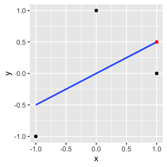
Look again at \(\hat b =\frac{\sum xy}{\sum x^2}\) for a moment. The top part of the estimator looks kind of like covariance, and the bottom looks kind of like a variance. Indeed,
\[\frac{cov(X,Y)}{var(X)}=\frac{\sum(x_i-\bar{x})(y_i-\bar{y})/n-1}{\sum(x_i-\bar{x})^2/n-1}=\frac{\sum(x_i-\bar{x})(y_i-\bar{y})}{\sum(x_i-\bar{x})^2}\]
The only difference is that \(\frac{cov(X,Y)}{var(X)}\) scales the variables first, by subtracting the mean from each! Remember that in our simplified equation \(y_i=b x_i+\epsilon_i\), we are implicitly assuming that the y-intercept is zero (as it is when both variables are standardized). When it is, you are fine to use \(\hat b=\frac{\sum x_iy_i}{\sum x_i^2}\) However, when you do have a y-intercept you want to find (which is usually the case), then the best estimator of the true slope \(b_1\) is \(\hat b_1=\frac{cov(X,Y)}{var(X)}=\frac{\sum(x_i-\bar{x})(y_i-\bar{y})}{\sum(x_i-\bar{x})^2}\). Let me show you the difference with some play data.
x1<-1:20
y1<-rnorm(20)+.5*x1+5
data<-data.frame(x1,y1)
b_noint=sum(x1*y1)/sum(x1^2)
b_int=cov(x1,y1)/var(x1)

ggplot(data,aes(x1,y1))+geom_point()+scale_x_continuous(limits=c(0,20))+scale_y_continuous(limits=c(0,15))+geom_abline(slope=b_noint,intercept=0)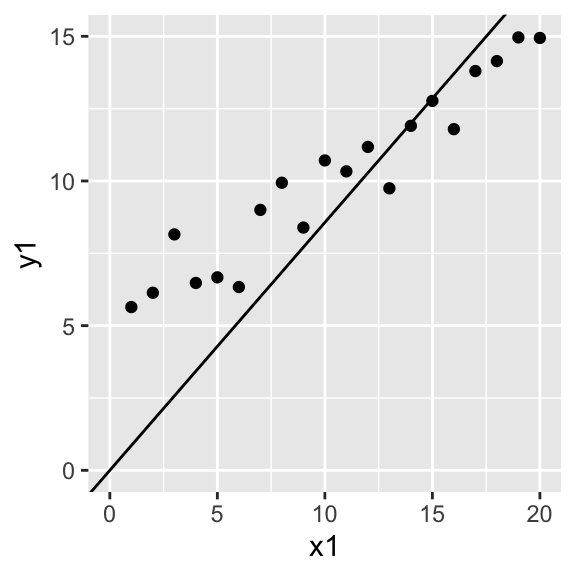
y2<-scale(y1)
x2<-scale(x1)
ggplot(data,aes(x2,y2))+geom_point()+geom_abline(slope=b_noint,intercept=0)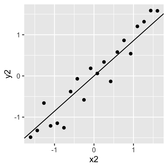
I wanted to show a derivation in the simplest case, but it works just as well with more variables. Here is a run-through of the same, but with vectors and matricies. let \(y=Xb+e\) where \(y\) is a vector, \(X\) is a matrix of all predictors, \(b\) is a vector of parameters to be estimated, and \(e\) is a vector of errors.
\[ \begin{bmatrix}{} y_1\\ y_2\\ \vdots \\ \end{bmatrix}= \begin{bmatrix}{} x_{1,1} & x_{1,2}\\ x_{2,1} & x_{2,2}\\ \vdots &\vdots \\ \end{bmatrix} \begin{bmatrix} b_1\\ b_2\\ \vdots \end{bmatrix}+ \begin{bmatrix} \epsilon_1\\ \epsilon_2\\ \vdots\\ \end{bmatrix} \]
\[ \begin{aligned} \mathbf{e'e} &=(\mathbf{y-Xb})'(\mathbf{y-Xb})\\ \mathbf{e'e} &=\mathbf{y'y-2b'X'y+b'X'Xb}\\ \frac{d}{db} \mathbf{e'e}&=-2\mathbf{Xy}+2\mathbf{b'X'X}\\ &\text{set equal to zero and solve for b}\\ 0 &=-2\mathbf{X'y}+2\mathbf{b'X'X}\\ 2\mathbf{X'y}&=2\mathbf{b'X'X}\\ \mathbf{b}&=\mathbf{(X'X)^{-1}X'y} \end{aligned} \]
Even if you are relatively unfamiliar with matrix algebra, you can see the resemblance that \(\mathbf{(X'X)^{-1}X'y}\) bears to \(\frac{1}{\sum x^2}\sum xy\).
Testing \((X'X)^{-1}X'Y\) on some data
Let’s say our data are \(Y=10,13,14\) and \(X=2,5,12\). Let’s derive the regression coefficient estimates \(\mathbf{\hat b} = b_0, b_1\) using the estimator \(\mathbf{X'X^{-1}X'y}\)
\[ \begin{aligned} \mathbf{y} \phantom{xx}&= \phantom{xxxxxx}\mathbf{Xb} \phantom{xxx} + \phantom{xx} \mathbf{e}\\ \begin{bmatrix}{} 10\\ 13\\ 14 \\ \end{bmatrix}&= \begin{bmatrix}{} 1 & 2\\ 1 & 5\\ 1 & 12 \\ \end{bmatrix} \begin{bmatrix} b_0\\ b_1\\ \end{bmatrix}+ \begin{bmatrix} \epsilon_1\\ \epsilon_2\\ \epsilon_3\\ \end{bmatrix} \end{aligned} \]
\[ \text{Now }\hat b = (X'X)^{-1}X'Y \text{, so...} \\ \] Click button to expand the calculation:So we found that the intercept estimate is 10.09 and the slope estimate is 0.35. Let’s check this result by conducting a regression on the same data:
lm(c(10,13,14)~c(2,5,12))##
## Call:
## lm(formula = c(10, 13, 14) ~ c(2, 5, 12))
##
## Coefficients:
## (Intercept) c(2, 5, 12)
## 10.0886 0.3544dat<-data.frame(x=c(2,5,12),y=c(10,13,14))
lm_eqn <- function(df){
m <- lm(y ~ x, df);
eq <- substitute(hat(italic(y)) == a + b %.% italic(x),
list(a = format(coef(m)[1], digits = 2),
b = format(coef(m)[2], digits = 2)))
as.character(as.expression(eq));
}
ggplot(dat,aes(x,y))+geom_point()+geom_smooth(method=lm,se=F)+geom_text(x = 5, y = 14, label = lm_eqn(dat), parse = TRUE)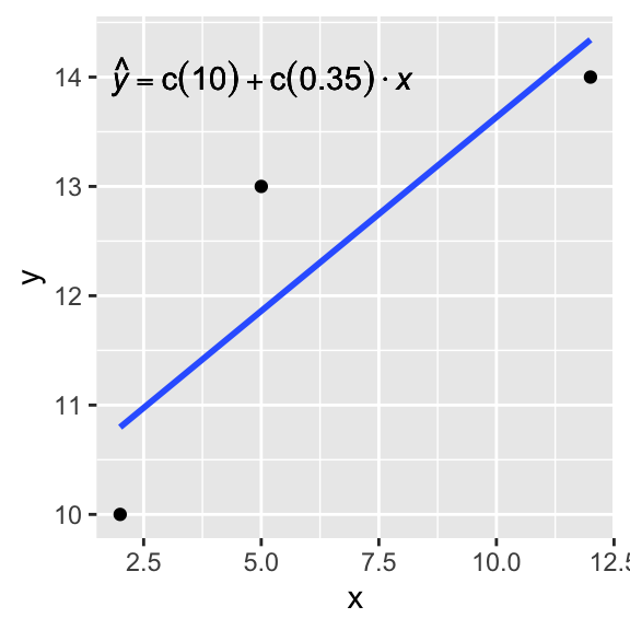
Why normally distributed errors?
Notice that we have derived regression coefficient estimates without making any assumptions about how the errors are distributed. But wait, you may say, if you already know something about regression: one assumption of regression (which is required for statistical inference) is that the errors are independent and normally distributed! That is,
\[ y_i=b_0 +b_1 x_i+\epsilon_i, \phantom{xxxxx} \epsilon_i\sim N(0,\sigma^2) \]
What does this say? Imagine there is a true linear relationship between \(x\) and \(y\) in the real world that actually takes the form \(y=b_0+b_1x\). When we estimate \(\hat b_0\) and \(\hat b_1\), we are estimating these true population coefficients, but we are doing so impercisely based on observed data. The data we collect is always noisy and imperfect, and in statistics, we handle these imperfections by modeling them as random processes. Thus, for now we assume that the deviations of \(y\) from our predicted \(\hat y\) are random and follow a normal distribution. Equivalently, we can say that for a given \(x_i\), \(y_i\) is normally distributed, with a mean of \(\hat y_i\) and a standard deviation of \(\sigma^2\).
Let’s visualize this function and use it to create some data, add some noise to it, and run a regression to see if we can estimate the true parameters. But what are those parameters going to be? How about \(b_0=1\) and \(b_1=2\), so we have \(y_i=1+2x_i+\epsilon_i\). Our predicted values of \(y\) (\(\hat{y}\)) are just \(\hat{y}=2x_i\).
x<-seq(-5,4.99,.01)
y<-1+2*x
qplot(x,y)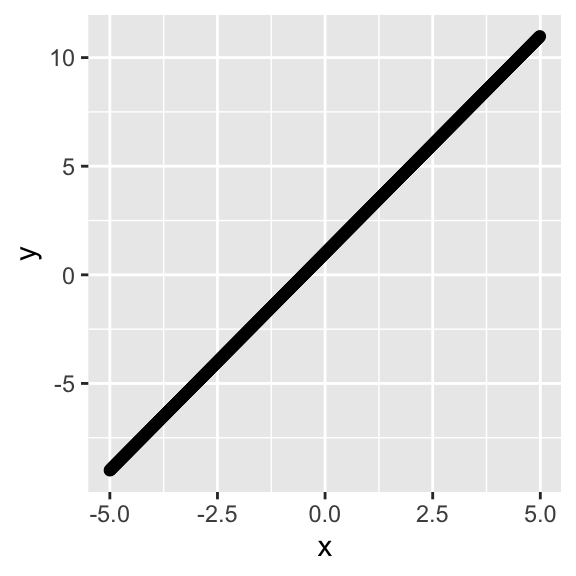
#ggplot()+geom_abline(slope=2,intercept=1)+
#  scale_y_continuous(limits=c(-4,4))+scale_x_continuous(limits=c(-4,4))
Now let’s give a little random error to each estimate by adding a draw from a standard normal distribution, \(\epsilon_i\sim N(\mu=0,\sigma^2=1)\).
#x<-seq(-4,4,.1)
y<-y+rnorm(1000,mean=0,sd=1)
qplot(x,y)#+geom_abline(slope=2,intercept=1,color="gray50")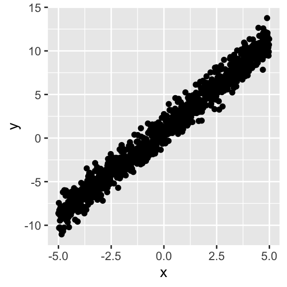
# scale_y_continuous(limits=c(-4,4))+scale_x_continuous(limits=c(-4,4))Since we set the standard deviation of the errors equal to one (i.e., \(\sigma=1\)), ~95% of the observations will lie within \(2\sigma\) of the predicted values \(\hat y\).
Now let’s estimate the best-fitting line, given only a sample of \(x\) and \(y\) (say, \(n=50\) from the population). We will plot it (gray) along with the line we know to be true, namely \(y=1+2x\) (white).
dat<-data.frame(x,y)
dat0<-data.frame(x,y)
sum1<-summary(lm(data=dat[sample(nrow(dat),size = 50,replace = F),],y~x))
sum1
##
## Call:
## lm(formula = y ~ x, data = dat[sample(nrow(dat), size = 50, replace = F),
## ])
##
## Residuals:
## Min 1Q Median 3Q Max
## -2.16228 -0.67774 0.03192 0.45548 2.39363
##
## Coefficients:
## Estimate Std. Error t value Pr(>|t|)
## (Intercept) 1.10971 0.14840 7.478 1.37e-09 ***
## x 1.95380 0.05926 32.969 < 2e-16 ***
## ---
## Signif. codes: 0 '***' 0.001 '**' 0.01 '*' 0.05 '.' 0.1 ' ' 1
##
## Residual standard error: 0.9574 on 48 degrees of freedom
## Multiple R-squared: 0.9577, Adjusted R-squared: 0.9568
## F-statistic: 1087 on 1 and 48 DF, p-value: < 2.2e-16beta<-coef(sum1)[1:2,1]
qplot(x,y)+geom_abline(intercept=1,slope=2,color="white")+geom_abline(intercept=beta[1],slope=beta[2],color="gray50")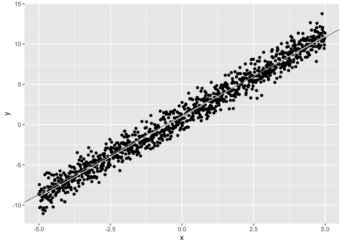 We generated the data to have \(\epsilon\sim N(\mu=0,\sigma^2=1)\). Notice that the coefficient estimate for \(x\), (\(\hat b_1=\) 1.95) is very close to the actual value (\(b_1=2\)), and the coefficient estimate for the intercept (\(\hat b_0=\) 1.11) is close to it’s actual value (\(b_0=1\)). Notice also that the residual standard error is also close to 1. This is the standard deviation of the residuals (\(\epsilon=y-\hat y\)) and thus it is an estimate of \(\sigma\) above.
If we repeat this 1000 times (i.e., based on new random samples of 50), we get 1000 different estimates of the slope \(\hat b_1\)
#betas<-NULL
#sigma2<-NULL
betas<-vector()
sigma2<-vector()
for(i in 1:1000){
sum1<-summary(lm(data=dat[sample(nrow(dat),size = 50,replace = F),],y~x))
sum1
betas<-rbind(betas,coef(sum1)[1:2,1])
sigma2<-rbind(sigma2,sum1$sigma^2)
}

qplot(x,y)+geom_abline(intercept=betas[,1],slope=betas[,2],color="gray50")+geom_abline(intercept=1,slope=2,color="white")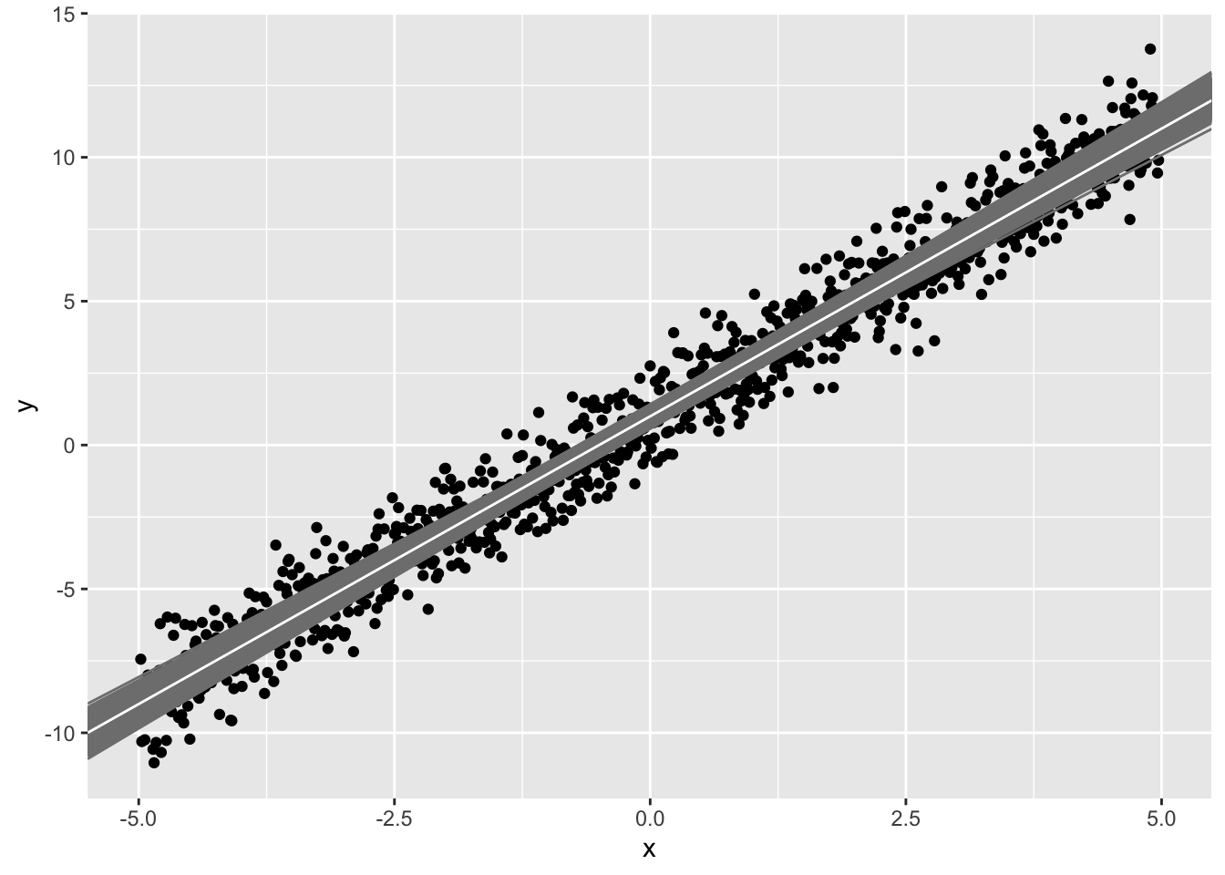
sample1<-data.frame(x,y)[sample(1:1000,size=50),]
#ggplot(sample1,aes(x,y))+geom_point()+geom_smooth(method='lm',se = T,level=.9999,color='gray50')
#ggplot(sample1,aes(x,y))+geom_point()+geom_abline(intercept=betas[,1],slope=betas[,2],color="gray50")+geom_abline(intercept=1,slope=2,color="white")
Each sample (i.e, your observed data) has error. Thus, each linear model also has error (in the intercept and in the slope). Notice that the prediced values for each sample (gray lines) tend to be better closer to the point (\(\bar x, \bar y\)) and worse (farther from the white line) at the extremes.
When taking 1000 samples of 50 data points from our population, the estimates we get for the intercept and slope (i.e., \(\hat b_0\) and \(\hat b_1\)) range from and from respectively.
As we saw above, we can also estimate \(\sigma^2\) from the sample variance of the residuals for each regression (\(\frac{\sum(y_i-\hat y)^2}{n-2}\)). (We divide by \(n-2\) here because \(\hat y\) requires estimating both beta parameters, which uses up 2 degrees of freedom.) Let’s plot the distribution of these estimates:
library(tidyr)
ests<-betas
colnames(ests)<-c("Est Intercept", "Est Slope")
colnames(sigma2)<-"Est Var"
ests<-gather(data.frame(ests,sigma2))
ggplot(ests,aes(x=value))+geom_histogram(bins=30)+facet_grid(~key,scales="free_x")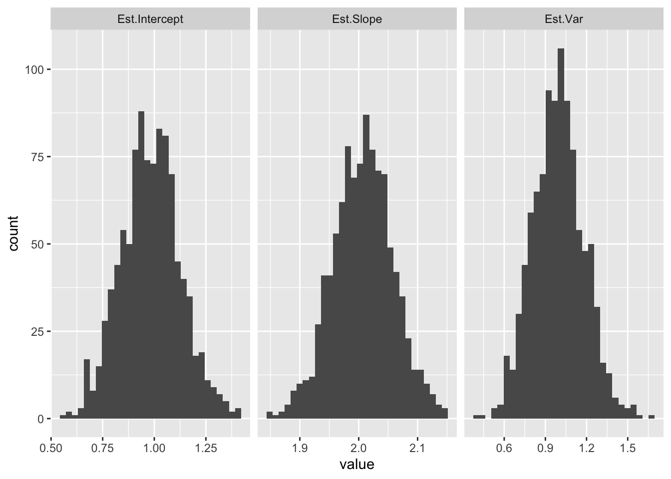
Notice how the mean of each distribution is equal to the population value (\(b_0=1, b_1=2, \sigma=1\)).
Normal-errors assumption and homoskedasticity
But let’s not get ahead of ourselves! Back to this for a moment:
\[ y_i=b_0 +b_1 x_i+\epsilon_i, \phantom{xxxxx} \epsilon_i\sim N(0,\sigma^2)\\ \]
For a given \(y_i\), \(b_0\), \(b_1\), and \(x_i\), the quantity \(b_0 +b_1 x_i\) gets added to the \(\epsilon_i\sim N(0,\sigma^2)\), thus shifting the mean from 0, but leaving the variance alone. Thus, we can write
\[ y_i \sim N(b_0 +b_1 x_i,\sigma^2)\\ \]
This means that we are modeling \(y\) as a random variable that is normally distributed, with a mean that depends on \(x\). Thus, given \(x\), y has a distribution with a mean of \(b_0+b_1 x\) and a standard deviation of \(\sigma\). Our predicted value \(\hat y\) is the conditional mean of \(y_i\) given \(x\).
We can see this below. For a given (range of) \(x\), the \(y\) should be normally distributed, \(N(\mu=b_0+b_1x,\sigma^2=1)\). We plot the observed density (red) and the theoretical density (blue).
Plot of density of y given x; plot includes entire “population” of 1000:
dat<-data.frame(x,y)

breaks <- seq(min(dat$x), max(dat$x), len=8)
dat$section <- cut(dat$x, breaks)

## Get the residuals
dat$res <- residuals(lm(y ~ x, data=dat))

## Compute densities for each section, and flip the axes, and add means of sections
## Note: the densities need to be scaled in relation to the section size (2000 here)
dens <- do.call(rbind, lapply(split(dat, dat$section), function(x) {
    res <- data.frame(y=mean(x$y)+seq(-3,3,length.out=50),x=min(x$x) +2*dnorm(seq(-3,3,length.out=50)))
    ## Get some data for normal lines as well
    xs <- seq(min(x$res)-2, max(x$res)+2, len=50)
    res <- rbind(res, data.frame(y=xs + mean(x$y),
                                 x=min(x$x) + 2*dnorm(xs, 0, sd(x$res))))
    res$type <- rep(c("theoretical", "empirical"), each=50)
    res
}))
dens$section <- rep(levels(dat$section), each=100)

## Plot both empirical and theoretical
ggplot(dat, aes(x, y)) +
  geom_point() +
  geom_smooth(method="lm", fill=NA, lwd=2) +
  geom_path(data=dens, aes(x, y, group=interaction(section,type), color=type), lwd=1)+
  theme_bw() + theme(legend.position="none")+
  geom_vline(xintercept=breaks, lty=2)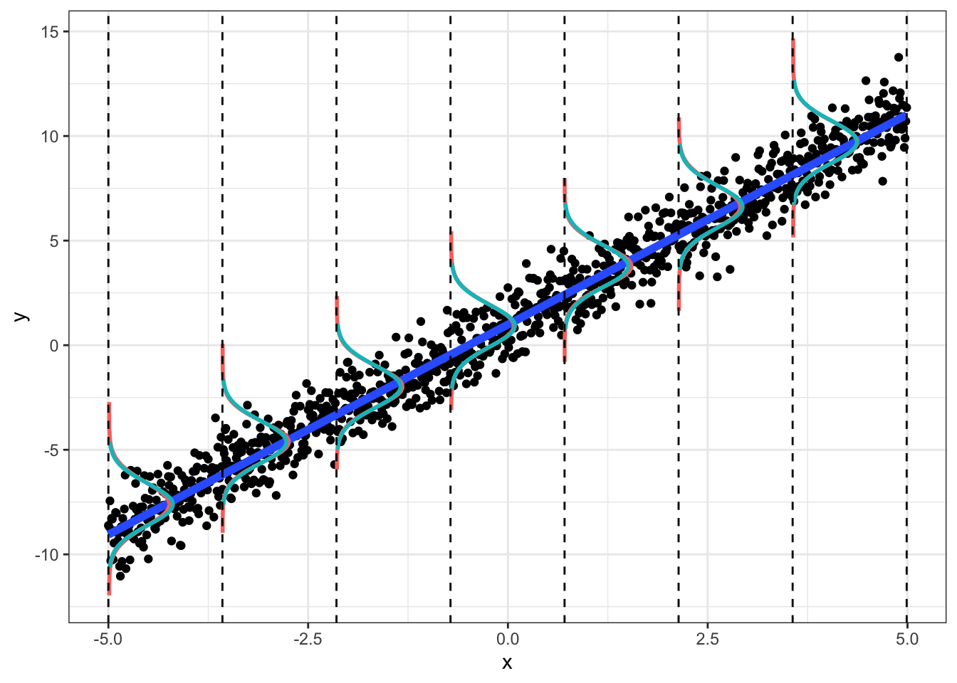
Plot of density of y given x for a sample of 50 data points:
dat<-data.frame(x,y)
dat<-dat[sample(size=50,nrow(dat),replace=F),]

breaks <- seq(min(dat$x), max(dat$x), len=8)
dat$section <- cut(dat$x, breaks)

## Get the residuals
dat$res <- residuals(lm(y ~ x, data=dat))

## Compute densities for each section, and flip the axes, and add means of sections
## Note: the densities need to be scaled in relation to the section size (2000 here)
dens <- do.call(rbind, lapply(split(dat, dat$section), function(x) {
    res <- data.frame(y=mean(x$y)+seq(-3,3,length.out=50),x=min(x$x) +2*dnorm(seq(-3,3,length.out=50)))
    ## Get some data for normal lines as well
    xs <- seq(min(x$res)-2, max(x$res)+2, len=50)
    res <- rbind(res, data.frame(y=xs + mean(x$y),
                                 x=min(x$x) + 2*dnorm(xs, 0, sd(x$res))))
    res$type <- rep(c("theoretical", "empirical"), each=50)
    res
}))
dens$section <- rep(levels(dat$section), each=100)

## Plot both empirical and theoretical
ggplot(dat, aes(x, y)) +
  geom_point() +
  geom_smooth(method="lm", fill=NA, lwd=2) +
  geom_path(data=dens, aes(x, y, group=interaction(section,type), color=type), lwd=1)+
  theme_bw() + theme(legend.position="none")+
  geom_vline(xintercept=breaks, lty=2)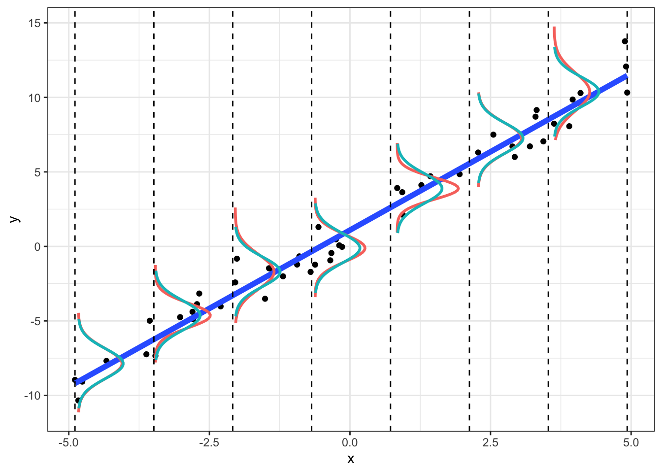
Notice that in the sample, the empirical densities are not exactly normal with constant variance (we wouldn’t expect them to be; this is just a small sample). However, we can example a plot of residuals vs. fitted-values (or vs. \(x\)) to see if the scatter looks random. We can also formally test for heteroskedasticity
samp.lm<-lm(data=dat,y~x)

dat$fvs<-samp.lm$fitted.values
dat$res<-samp.lm$residuals

ggplot(dat, aes(fvs,res))+geom_point()+geom_hline(yintercept=0)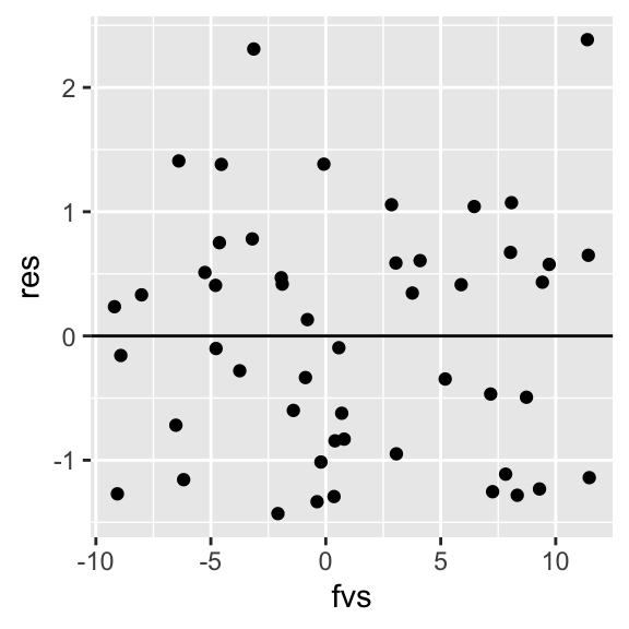
library(lmtest)
lmtest::bptest(samp.lm)
##
## studentized Breusch-Pagan test
##
## data: samp.lm
## BP = 0.76433, df = 1, p-value = 0.382In the Breusch-Pagan test, the null hypothesis is that variance is constant. Thus, if \(p<.05\) we have reason to suspect that the heteroskedasticity assumption might be violated. Also, if our residual plot shows any thickening/widening, or really any observable pattern, this is another way of diagnosing issues with nonconstant variance.
To see if our residuals are normally distributed, we can compare quantiles of their distribution to expanded quantiles under a normal distribution. If we plot them against each-other, their match would be indicated by all points falling on a straight line (with deviations from the line indicating non-normality). There are also hypothesis tests, such as the Shapiro-Wilk test, that assess the extent of deviation from normality. Here again, the null hypothesis is that the observed distribution matches a normal distribution.
plot(samp.lm, which=c(2))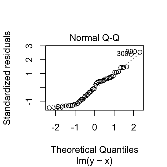
shapiro.test(dat$res)##
## Shapiro-Wilk normality test
##
## data: dat$res
## W = 0.95043, p-value = 0.03555This normal-errors assumption implies that at each \(x\) the scatter of \(y\) around the regression line is Normal. The equal-variances assumption implies that the variance of \(y\) is constant for all \(x\) (i.e., “homoskedasticity”). As we can see above (comparing empirical to theoretical distributions of \(y|x\)), they will never hold exactly for any finite sample, but we can test them.
Sampling distributions of coefficient estimates
The normal-errors assumption allows us to construct normal-theory confidence intervals and to conduct hypothesis tests for each parameter estimate.
Because \(\hat b_0\) and \(\hat b_1\) are statistics, they have a sampling distribution! In fact, we have already seen them (above), when we repeatedly estimated the coefficients based on samples of 50.
We can get empirical 95% confidence intervals by finding the quantiles that cut off the bottom 2.5% and the top 2.5% of each distribution:
library(tidyr)
cutoff95<-apply(data.frame(betas,sigma2),2,function(x)quantile(x,probs=c(.025,.975)))

colnames(cutoff95)<-c("Est.Intercept","Est.Slope","Est.Var")
cutoff95
## Est.Intercept Est.Slope Est.Var
## 2.5% 0.7047259 1.900251 0.6341556
## 97.5% 1.2752487 2.108677 1.3545577betas95<-data.frame(est.int=betas[!(is.na(cut(betas[,1],breaks=cutoff95[,1]))),1],est.slope=betas[!(is.na(cut(betas[,2],breaks=cutoff95[,2]))),2],est.sigma2=sigma2[!(is.na(cut(sigma2,breaks=cutoff95[,3])))])
cutoff95<-gather(data.frame(cutoff95))
ggplot(ests,aes(x=value))+geom_histogram(bins=30)+facet_grid(~key,scales="free_x")+geom_vline(data=cutoff95,aes(xintercept=value),color="red",lty=3)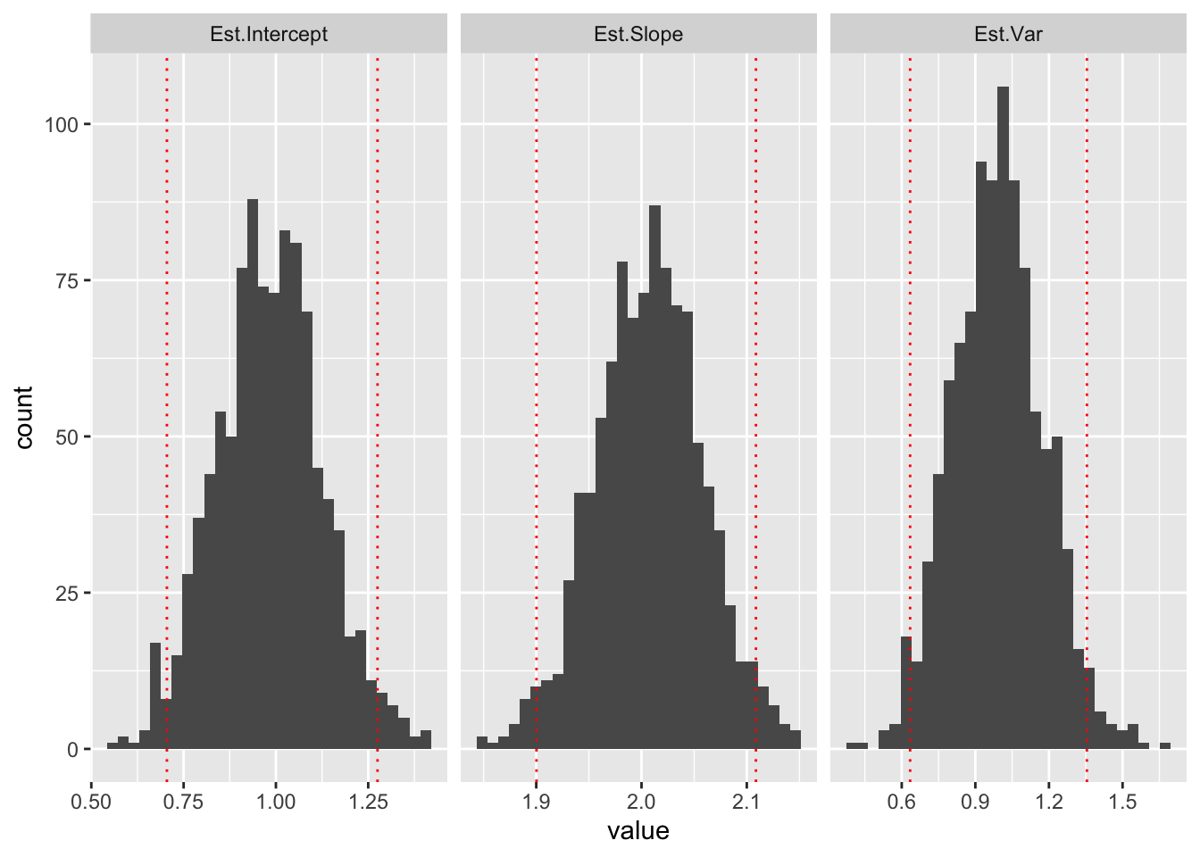
These are empirical confidence intervals (the middle 95% of the sampling distribution of each parameter).
But how can we get this from just a sample of the observed data?
We know that the (least squares) best estimate of \(b_1\) is \(\hat b_1=\frac{\sum(x_i-\bar x_i)(y_i-\bar y_i)}{\sum(x_i-\bar x_i)^2}\).
Because the regression line always passes through the point (\(\bar x, \bar y\)), we can plug those values in rearrange the equation to find that \(\hat b_0=\bar y-\hat b\bar x\).
But what about the variance of these estimates? Let’s find it!
\[ \begin{aligned} Var[\hat b_1]&=Var[\frac{\sum(x_i-\bar x)(y_i-\bar y)}{\sum(x_i-\bar x)^2}]=Var[\frac{\sum(x_i-\bar x)}{\sum(x_i-\bar x)^2}y_i]\\ &=Var[\frac{\sum(x_i-\bar x)}{\sum(x_i-\bar x)^2}(b_0+b_1x_i+\epsilon_i)]\\ \text{because only }\epsilon_i \text{ is a random variable, } \epsilon \sim N(0,\sigma^2),\\ &=\frac{\sum(x_i-\bar x_i)^2}{(\sum(x_i-\bar x)^2)^2}Var[\epsilon_i]\\ &=\frac{1}{\sum(x_i-\bar x)}\sigma^2 \end{aligned} \]
We could do something similar to find the variance of \(\hat b_0\), but in practice the intercept is much less interesting than the slope.
Typically, we are interested in whether changing \(x\) is associated with changes in \(y\), which is the same as testing the null hypothesis that \(b_1\) is zero, or \(H_0:b_1=0\)
We also showed earlier that \(\hat b_1=\frac{\sum(x_i-\bar x)}{\sum(x_i-\bar x)^2}y_i\). Thus, \(\hat b_1\) is a linear combination of the \(y_i\)s.
But wait! We know that \(y_i\sim N(b_0+b_1x_i,\sigma^2)\)
We also know that a linear combination of normally distributed variables is itself normally distributed! (Indeed, a linear combination of any independent random variable converges to a Normal distribution with as \(n\rightarrow \infty\))
Since \(\hat b_1\) is a linear combination of the \(y_i\)s, \(\hat b_1\) is normally distributed as well.
This means \(\hat b_1 \sim N(E[\hat b_1],Var[\hat b_1])\).
We already found the variance of the distribution of \(\hat b_1\), \(Var[\hat b_1]=\frac{\sigma^2}{\sum (x_i-\bar x)^2}\)
We have already seen that \(E[\hat b_1]= b_1\), but proving it isn’t too bad either:
\[ \begin{aligned} E[\hat b_1]&=E[\frac{\sum(x_i-\bar x)}{\sum(x_i-\bar x)^2}y_i]=E[\frac{\sum(x_i-\bar x)}{\sum(x_i-\bar x)^2}(b_0+b_1x_i+\epsilon_i)]\\ &=\frac{\sum(x_i-\bar x)}{\sum(x_i-\bar x)^2}E[b_0+b_1x_i+\epsilon_i]\\ &=\frac{\sum(x_i-\bar x)}{\sum(x_i-\bar x)^2}(b_0+b_1x_i)\\ &=b_0\left(\frac{\sum(x_i-\bar x)}{\sum(x_i-\bar x)^2}\right)+b_1\left(\frac{\sum(x_i-\bar x)x_i}{\sum(x_i-\bar x)^2}\right)\\ &=b_0(0)+b_1=(1)\\ &=b_1 \end{aligned} \]
Thus, we can now say that \(\hat b_1\sim N(b_1,\frac{\sigma^2}{\sum (x_i-\bar x)^2})\)
We don’t know \(\sigma^2\) but we do have an unbiased estimator of it: \(s^2=\frac{\sum(y_i-\hat y)^2}{n-2}\)
In a previous post, we showed that for sample of size \(n\) from \(x \sim N(\mu,\sigma^2)\), and a sample variance of \(s^2=\frac{\sum (x-\bar x)^2}{n-1}\), then \[ \frac{\bar{x}-\mu}{\sqrt{s^2/n}}\sim t_{(n-1)} \]
Since \(\hat b_1\sim N(\mu=b_1,\sigma^2/\sum(x-\bar x)^2)\), we have
\[ \frac{\hat b_1 - b_1}{\sqrt{s^2/\sum(x-\bar x)^2}}\sim t_{(n-2)} \]
We can check to see if this makes sense with our data above. Recall that we repeatedly sampled 50 data points \((x,y)\), ran a regression, and found \(\hat b_1\). We thus created a sampling distribution of those values for \(n=50\)
b1<-ests[ests$key=="Est.Slope",]
ggplot(b1,aes(x=value))+geom_histogram(bins=30)+geom_text(aes(x=1.9, y=75),label=paste("mean=",round(value),2)))+  geom_text(aes(x=1.9, y=60),label=paste("sd=",round(sd(value),3)))
#mean(b1$value)
#sd(b1$value)
## Error: <text>:2:112: unexpected ')'
## 1: b1<-ests[ests$key=="Est.Slope",]
## 2: ggplot(b1,aes(x=value))+geom_histogram(bins=30)+geom_text(aes(x=1.9, y=75),label=paste("mean=",round(value),2)))
## ^We know the true \(b_1\) is 2.0 and the variance is \(\sigma^2/\sum(x-\bar x)^2\). The sampling distribution (for samples of size 50) will converge to these values.
Notice that the estimate of the variance depends on the actual sample values. Interestingly, we get pretty close to the empirical value based on one sample of size 50:
x_samp=sample(x,size=50)
sqrt(1/sum((x_samp-mean(x_samp))^2))
## [1] 0.04553733Pretend all we observe are 50 observations. We can construct normal theory confidence intervals and conduct t-tests of the null hypothesis that \(\hat b_1\) is zero. First we estimate \(\hat b_1\) and \(s^2/\sum(x-\bar x)^2\). This means we have to estimate \(s^2=\frac{\sum(y_i-\hat y_i)^2}{n-2}\). Finally, we will conduct a t-test (\(df=n-2\)) and also construct a 95% CI for our estimate, \[ \hat b_1 \pm t^*_{(\alpha=.975,\ df=48)} \times \frac{s^2}{\sum(x-\bar x)^2} \]
Here are our coefficient estimates:
samp=dat[sample(nrow(dat),size = 50,replace = F),]

#coefficients
b1<-with(samp, sum((x-mean(x))*(y-mean(y)))/sum((x-mean(x))^2))
b0<-with(samp, mean(y)-b1*mean(x))

paste("b0:",round(b0,4))
## [1] "b0: 1.0932"paste("b1:",round(b1,4))## [1] "b1: 2.1033"Here is our estimated variance \(s^2\):
#residuals
e<-samp$y-(b0+b1*samp$x)

#MSE
s2<-sum(e^2)/(50-2)

s2
## [1] 0.9557969Here is our standard error (standard deviation of the sampling distribution for \(\hat b_1\)):
#standard deviation of the sampling distribution (standard error)
se_b1<-with(samp, sqrt(s2/sum((x-mean(x))^2)))
se_b1
## [1] 0.04852331#for the slope too: see below
se_b0<-with(samp,sqrt(s2*((1/50)+(mean(x)^2/sum((x-mean(x))^2)))))Let’s combine these to form a 95% confidence interval. We will use a critical \(t^*_{(48)}=2.0106\) value that cuts off 2.5% in either tail.
#95% CI:
b1+c(qt(.025,48)*se_b1,qt(.975,48)*se_b1)
## [1] 2.005766 2.200892Thus, there’s a 95% chance that the true \(b_1\) is captured by the interval [2.006, 2.201]
Equivalently, we could test the null hypothesis of no effect \(H_0: b_1=0\) versus the alternative hypothesis \(H_A: b_1\ne 0\):
First we find the test statistic and the p-value (below):
# t test (H0: b1=0)
t=(b1-0)/se_b1
t
## [1] 43.34677# pvalue
2*(1-pt(t,df = 48))## [1] 0So \(t=\) 43.3467681, \(p=\) 0. Let’s confirm with R.
#confirm with R
samp.lm<-lm(y~x, data=samp)
summary(samp.lm)
##
## Call:
## lm(formula = y ~ x, data = samp)
##
## Residuals:
## Min 1Q Median 3Q Max
## -1.42978 -0.84059 0.01852 0.60173 2.38497
##
## Coefficients:
## Estimate Std. Error t value Pr(>|t|)
## (Intercept) 1.09315 0.13827 7.906 3.05e-10 ***
## x 2.10333 0.04852 43.347 < 2e-16 ***
## ---
## Signif. codes: 0 '***' 0.001 '**' 0.01 '*' 0.05 '.' 0.1 ' ' 1
##
## Residual standard error: 0.9776 on 48 degrees of freedom
## Multiple R-squared: 0.9751, Adjusted R-squared: 0.9746
## F-statistic: 1879 on 1 and 48 DF, p-value: < 2.2e-16In much the same fashion, you can also construct 95% confidence intervals and conduct hypotheses tests for the intercept \(b_0\).
However, the standard deviation of the sampling distribution of \(b_0\) (i.e., the standard error) is different! We wont walk through the derivation, but it is very similar to that above for \(b_1\). You wind up with this for the variance:
\[ Var[b_0]=\sigma^2\left(\frac{1}{n}+\frac{\bar x^2}{\sum(x_i-\bar x)^2} \right) \] Again, since can’t know \(\sigma^2\), we use the estimator \(s^2=\frac{\sum (y_i-\hat y)^2}{n-2}\) as before. Thus, the standard error of the sampling distribution of \(b_0\) is
\[ s.e.(b_0)=s\sqrt{\frac{1}{n}+\frac{\bar x^2}{\sum(x_i-\bar x)^2}}\\ or, equivalently \\ s.e.(b_0)=\frac{s}{\sqrt{n}}\sqrt{1+\frac{\bar x^2}{\sum(x_i-\bar x)^2/n}} \] I included the second formulation of the standard error so that you can see that it is a product of the standard error of a variable’s mean (i.e., \(\frac{s}{\sqrt{n}}\)).
So a 95% confidence interval for \(b_0\) looks like
\[ \hat b_0 \pm t^*_{(n-2)}*s.e.(b_0) \] In our specific case, \(\hat b_0\) is 1.0932 and our standard error is 0.1382656, and our 95% confidence interval for the intercept is 0.8151532, 1.3711566
Confidence (and prediction) intervals for a given X
This focus on individual coefficients is very useful, but it can’t tell us two things: how confident we are in the value of an outcome \(y\) for a given \(x\), and what value of \(y\) we would predict if we observed another \(x\).
Here’s our sample of size 50 with the regression line overlayed.
ggplot(samp,aes(x,y))+geom_point()+geom_smooth(method=lm,color='gray50')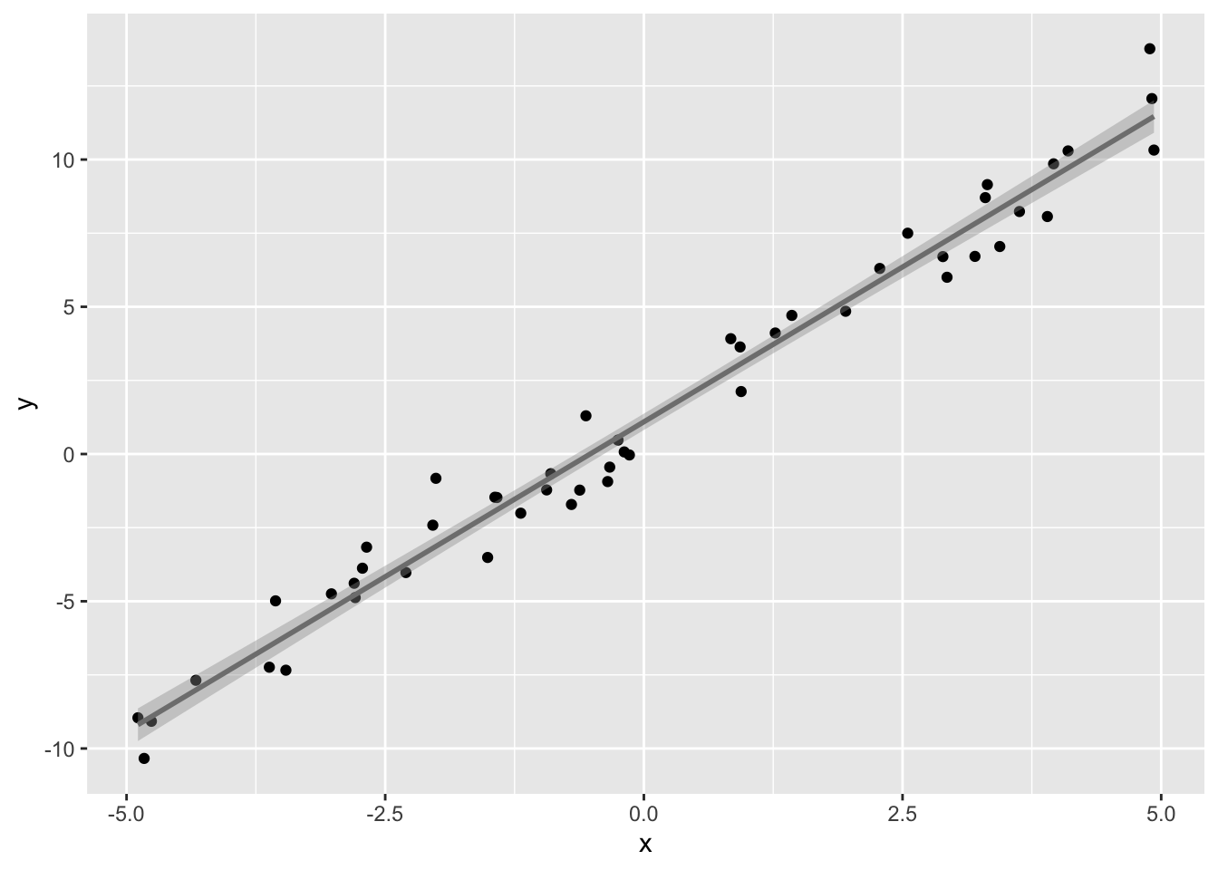
The gray band around the regression line is the 95% confidence interval for \(\hat y\) for a given value of \(x\). You can think of it as a range that captures the true regression 95% of the time! It is a band because the interval changes depending on which \(x\) you consider. It is narrowest at the point (\(\bar x, \bar y\)) and widest at the edges of the data. This confidence interval, for a given value of the predictor \(x_k\), is defined as
\[ \hat y_k\pm t^*_{(n-2)} \sqrt{s^2\left(\frac{1}{n}+\frac{(x_k- \bar x)^2}{\sum(x_i-\bar x)^2} \right)},\\ where\ (as\ before),\\ s^2=\frac{\sum (y_i-\hat y)^2}{n-2} \]
Again, I will not bore you with the derivation of the standard error (it is similar to how we did the slope above). Notice that the standard error is a function of the specific value of \(x_k\) that is chosen (the numerator of the second term). Notice that this numerator \((x_k-\bar x)^2\) will be zero when we choose \(x_k=\bar x\), and that the further away \(x_k\) is from the the mean, the larger the numerator becomes. This fact accounts for the wider confidence interval at the ends of the range of \(x\) and the narrowest interval at the mean of x.
Let’s calculate the 95% CI for three values of \(x_k: min(x),0, \text{ and } \bar x\). The mean of the \(x\)s in our data was 0.0248 and the smallest \(x\) in our data was -4.89
preds<-predict(samp.lm, newdata=data.frame(x=c(min(samp$x),0,mean(samp$x))),interval='confidence')

print(paste("95% CI for yhat when x=min(x): ","[",round(preds[1,2],3),",",round(preds[1,3],3),"]"))
## [1] "95% CI for yhat when x=min(x): [ -9.746 , -8.638 ]"print(paste("95% CI for yhat when x=0: ","[",round(preds[2,2],3),",",round(preds[2,3],3),"]"))## [1] "95% CI for yhat when x=0: [ 0.815 , 1.371 ]"print(paste("95% CI for yhat when x=mean(x):","[",round(preds[3,2],3),",",round(preds[3,3],3),"]"))## [1] "95% CI for yhat when x=mean(x): [ 0.867 , 1.423 ]"We can see this better if we plot these (in red) along with the full 95% confidence bands (in gray) on the regression line and zoom in.
ggplot(samp,aes(x,y))+geom_point()+geom_smooth(method=lm,size=.5,color="black",fill='gray50')+
#  scale_x_continuous(limits=c(min(x),mean(x)+1))+
#  scale_y_continuous(limits=c(-10,5))+
  geom_segment(aes(x=min(x),xend=min(x),y=preds[1,2],yend=preds[1,3]),color="red")+
  geom_segment(aes(x=0,xend=0,y=preds[2,2],yend=preds[2,3]),color="red")+
  geom_segment(aes(x=mean(x),xend=mean(x),y=preds[3,2],yend=preds[3,3]),color="red")+
   coord_cartesian(ylim=c(min(y),4),xlim=c(min(x),mean(x)+.5))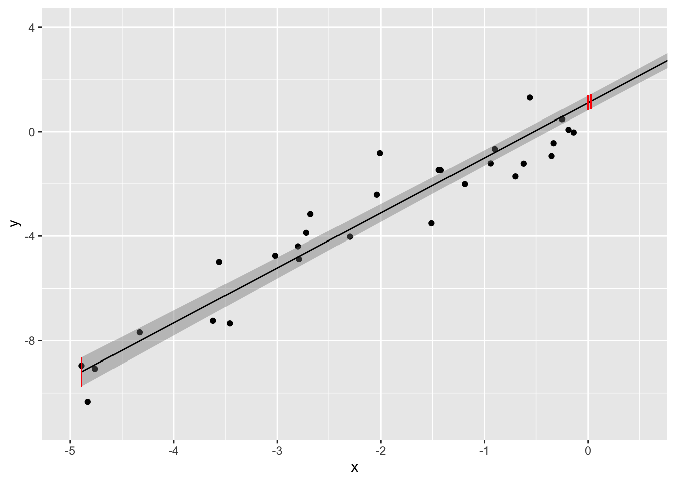
Notice that the 95% CI for \(\hat y\) when \(x=0\) is the exact same as the 95% CI for \(\hat b_0\)! To see this, just plug \(x_k=0\) into the formula for the standard error above and compare it with the intercept standard error! They will be identical!
Prediction interval
The confidence intervals we just calculated are for \(\hat y_k=E[y|x_k]\). But what if we want to predict what \(y_k\) would actually be if we observed a new \(x_k\)? These two intervals are not the same: there is a subtle difference! Recall that regression models the distribution of \(y\) given \(x\). Thus, even if you knew the true values for \(b_0\) and \(b_1\), you still don’t know exactly what \(y\) itself would be because of the error \(\sigma^2\). Now, \(\hat y_k\) is definitely your best guess (point estimate), but we are talking the confidence intervals! These are built from the standard error, and the standard error of \(y_k\) given \(x_k\) needs to account for the variability of the observations around the predicted mean \(\hat y\) (recall: \(y_k\sim N(\hat y_k,\sigma^2)\)). Since we don’t have \(\sigma^2\), we use \(s^2\). Literally, we are just adding this extra variability into the confidence interval (above) to get our prediction interval:
\[ \hat y_k\pm t^*_{(n-2)} \sqrt{s^2\left(1+\frac{1}{n}+\frac{(x_k- \bar x)^2}{\sum(x_i-\bar x)^2} \right)},\\ where\ (as\ before),\\ s^2=\frac{\sum (y_i-\hat y)^2}{n-2} \]
Again, the only different between a 95% confidence interval and a 95% prediction interval is the standard error, which is larger for the prediction interval because of the variability of individual observations around the predicted mean (i.e., \(s^2\)).
Here is the prediction interval for the same values of \(x_k\) as above:
preds<-predict(samp.lm, newdata=data.frame(x=c(min(samp$x),0,mean(samp$x))),interval='prediction')

print(paste("95% CI for y (obs) when x=min(x): ","[",round(preds[1,2],3),",",round(preds[1,3],3),"]"))
## [1] "95% CI for y (obs) when x=min(x): [ -11.234 , -7.15 ]"print(paste("95% CI for y (obs) when x=0: ","[",round(preds[2,2],3),",",round(preds[2,3],3),"]"))## [1] "95% CI for y (obs) when x=0: [ -0.892 , 3.078 ]"print(paste("95% CI for y (obs) when x=mean(x):","[",round(preds[3,2],3),",",round(preds[3,3],3),"]"))## [1] "95% CI for y (obs) when x=mean(x): [ -0.84 , 3.131 ]"Let’s plot both the prediction and the confidence interval for our data:
pred.int<-data.frame(predict(samp.lm,                       newdata=data.frame(x=samp$x),interval='prediction'))

conf.int<-data.frame(predict(samp.lm,                       newdata=data.frame(x=samp$x),interval='confidence'))

ggplot(samp,aes(x,y))+geom_point()+geom_smooth(method="lm",size=.5,color="black")+
    geom_ribbon(inherit.aes=F,data=conf.int,aes(x=samp$x,ymin=lwr,ymax=upr),fill="red",alpha=.3)+
    geom_ribbon(inherit.aes=F,data=pred.int,aes(x=samp$x,ymin=lwr,ymax=upr),fill="blue",alpha=.3)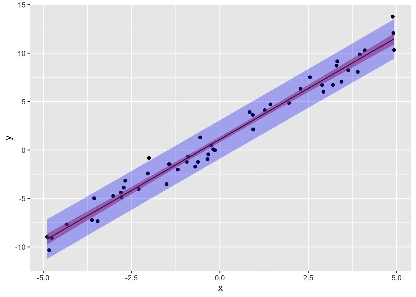
Notice also that the 95% prediction interval captures all but approximately 2-3 observations, which makes sense because we have \(N=50\), since 5% of the time our 95% CI wont contain \(y\), \(.05*50=2.5\)!
What’s the relationship between correlation and regression?
Let’s take a step back from all this nitty-gritty and think about things from an ANOVA perspective. (If you’ve made it this far, you probably won’t need it, but if you want a quick review of ANOVA, check out this post).
In ANOVA, the sum of the squared deviations of the \(y_i\)s around the mean \(\bar y\) is the total sum of squares (SST=\(\sum_i(y_i-\bar y)^2\)). Now, these deviations around the grand mean can be separated into two parts: the variability between the k groups (SSB=\(\sum_k(\bar y_k-\bar y)^2\)) and the variability within the k groups (SSW=\(\sum_k \sum_i (y_{ki}-\bar y_k)^2\)). It turns out that \(SST=SSB+SSW\)
Analogously, in Regression, the SST=SSR+SSE. For now, instead of groups we have at least one continuous predictor \(x\) (we will see soon that ANOVA is a special case of regression). Here, the total sum of squares is the same (SST=\(\sum_i(y_i-\bar y)^2\)). The regression sum of squares is the part of variability in \(y\) attributable to the regression, or the sum of the deviations of the predicted value from the mean of \(y\) (SSR=\(\sum_i(\hat y-\bar y)^2\)). What’s left over is the error: the deviations of the observed data from the predicted values that lie on the regression line (SSE=\(\sum_i(y_i-\hat y)^2\)). Thus,
\[ \sum_i(y_i-\bar y)^2=\sum_i(\hat y_i-\bar y)^2 + \sum_i(y_i-\hat y_i)^2 \]
This says that the total variablity can be partitioned into a component explained by the regression (SSR) and an error component (SSE). A natural question to ask is, what proportion of the variability in \(y\) can I account for with my regression \(\hat b_0+ \hat b_1x+...\)? To find out, we can literally just look at the ratio \(\frac{SSR}{SST}=\frac{\sum_i(\hat y_i-\bar y)^2}{\sum_i(y_i-\bar y)^2}\)
Now then, if \(\hat y=bx\), and remembering our formula for variances, we can see that \[ \frac{\sum_i(\hat y_i-\bar y)^2}{\sum_i(y_i-\bar y)^2}=\frac{var(\hat y)}{var(y)}=\frac{var(\hat bx)}{var(y)}=\frac{\hat b^2var(x)}{var(y)} \]
From above, we have the \(\hat b=\frac{cov(x,y)}{var(x)}\), so we get \[\frac{\hat b^2var(x)}{var(y)}=\frac{cov(x,y)^2var(x)}{var(x)^2var(y)}=\frac{cov(x,y)^2}{var(x)var(y)}=\left(\frac{cov(x,y)}{sd(x)sd(y)}\right)^2=r^2\]
So the proportion of variance explained by the regression line is equal to the square of the correlation coefficient \(r=cor(x,y)=cov(x,y)/sd(x)sd(y)\).
Now we are in a position to figure out the relationship between the slope of the regression line \(\hat b\) and \(r\).
\[ \hat b = \frac{cov(x,y)}{var(x)}, \ r=\frac{cov(x,y)}{\sqrt{var(x)}\sqrt{var(y)}} \] How do we transform \(r\) into \(\hat b\)? Multiply it by \(\sqrt{var(y)}\) and divide by \(\sqrt{var(x)}\)! \[ r\left(\frac{\sqrt{var(y)}}{\sqrt{var(x)}} \right)=r\left(\frac{sd_y}{sd_x} \right)=\frac{cov(x,y)\sqrt{var(y)}}{\sqrt{var(x)}\sqrt{var(y)}\sqrt{var(x)}}=\frac{cov(x,y)}{var(x)}=\hat b\\ \text{So,}\\ r(\frac{sd_y}{sd_x})=\hat b \]
We have found that all we need to do is multiply the correlation coefficient between \(x\) and \(y\) by the standard deviation of \(y\) and divide it by the standard deviation of \(x\) to get the regression coefficient (from the regression of \(y\) on \(x\)).
But if regression and correlation are both only able to describe an associative (i.e., non-causal) relationship, why is one different from the other?
Regression is primarily a predictive tool: it tells us what \(y\) we can expect in a subset of the observations with given vaules for the predictor variables \(x\) (that is, we make a probabilistic prediction by conditioning). To interpret a coefficient estimate causally, the predictor variables need to be assigned in a way that breaks dependencies between them and omitted variables (or noise), either using random assignment or control techniques. Most important from a modeling-flexibility standpoint, regression allows for multiple predictors!
Multiple regression: multiple predictors
So far our focus has been the simple linear case, \[ y_i=b_0+b_1x_i+\epsilon_i \]
By way of transition to the general case, here’s another helpful way of looking at all of this: regression seeks to find the linear combination of the predictor variables \(x_1,x_2,...\) (i.e., \(b_0+b_1x_1+b_2x_2,+...\)) that is maximally correlated with \(y\).
Indeed, minimizing the sum of squared errors is the same thing as maximizing the correlation between the observed outcome (\(y\)) and the predicted outcome (\(\hat y\)).
This way of thinking allows us to generalize from one predictor of interest to multiple predictors.
\[ \hat y_i=b_0+b_1x_1+b_2x_2+...+b_kx_k \\ \hat z_{y}=\beta_1z_{x_1}+\beta_2z_{x_2}+...+\beta_kz_{x_k} \] The second equation is the standardized form of the first: they result from estimating the coefficients with standardized variables \(z_y=\frac{y-\bar y}{sd_y}, z_{x_1}=\frac{x_1-\bar x_1}{sd_{x_1}}, z_{x_2}=\frac{x_2-\bar x_2}{sd_{x_2}}\) etc. Because the variables are scale-free, the coefficients can be easier to interpret and compare. Sometimes you want the interpretation “for ever standard deviation increase in \(x_1\), \(y\) goes up \(\beta_1\) standard deviations.” Other times you want to keep \(y\) and/or the \(x\)s in terms of their original units.
It is easy to convert between \(b\) and \(\beta\): you do not need to re-run the regression. As we will see below, \(b=\beta \frac{sd_y}{sd_x}\).
Also, notice that the fully standardized model has no intercept (i.e., \(\beta_0=0\)). This will always be the case when all variables are standarized. Just like in simple linear regression, the line (or plane) of best fit passes through the point (y, x_1, …). When all variables are standardized, the mean of each is 0, and so the y-intercept (when \(z_y=0\)) will be where \(\bar x_1=0\) also!
We already saw the matrix equations for calculating our least squares regression weights: \(\hat b = (X'X)^{-1}{X'y}\). There is another, more direct route to calculate the standardized coefficients \(\hat \beta\). All you need are correlations. You need correlations between all pairs of predictors, as well as the correlation between each predictor and the outcome. Specifically,
\[ \begin{aligned} \hat \beta&=\mathbf{R}^{-1}\mathbf{r}_{y,x}\\ \begin{bmatrix} \beta_1\\ \beta_2\\ \beta_3\\ \vdots \end{bmatrix}&= \begin{bmatrix} 1 & r_{x_1,x_2} & r_{x_1,x_3} & ...\\ r_{x_1,x_2}& 1 & r_{x_2,x_3} & ...\\ r_{x_1,x_3}&r_{x_2,x_3}&1 &... \\ \vdots & \vdots & \vdots & \ddots \\ \end{bmatrix}^{-1} \begin{bmatrix} r_{y,x_1}\\ r_{y,x_2}\\ r_{y,x_3}\\ \vdots\\ \end{bmatrix} \end{aligned} \]
In the above, \(\mathbf{R}\) is a correlation matrix containing all pairwise correlations of the predictors. Notice the diagonal consists of 1s because the correlation of anything with itself equals 1.
Here’s some play data
\[ \begin{matrix} y & x_1 & x_2 \\ \hline 12 & 1 & 6 \\ 13 & 5 & 5 \\ 14 & 12 & 7 \\ 17 & 14 & 10 \\\hline \bar y=14& \bar x_1=8 & \bar x_2=7\\ \end{matrix} \] Let’s get the deviations and sum their squares
\[ \begin{matrix} (y-\bar y)^2 & (x_1-\bar x_1)^2 & (x_2-\bar x_2)^2 \\ \hline (-2)^2 & (-7)^2 & (-1)^2 \\ (-1)^2 & (-3)^2 & (-2)^2 \\ 0^2 & 4^2 & 0^2 \\ 3^2 & 6^2 & 3^2\\\hline SS_y=14 & SS_{x1}=110 & SS_{x2}=14 \end{matrix} \] …and their products:
\[ \begin{matrix} (y-\bar y)(x_1-\bar x_1) & (y-\bar y)(x_2-\bar x_2) & (x_1-\bar x_1)(x_2-\bar x_2) \\ \hline (-2)(-7)&(-2)(-1) & (-7)(-1) \\ (-1)(-3)&(-1)(-2) & (-3)(-2) \\ 0(4) &0(0) & 4(0) \\ 3(6) &3(3) & 6(3)\\\hline SP_{y,x1}=35 & SP_{y,x2}=13 & SP_{x1,x2}=31 \end{matrix} \]
We can compute \[ \begin{aligned} r_{x1,x2}&=\frac{\sum(x_1-\bar x_1)(x_2-\bar x_2)}{n-1 sd_{x1}sd_{x2}} \\ &=\frac{\sum(x_1-\bar x_1)(x_2-\bar x_2)}{\sqrt{\sum(x_1-\bar x_1)^2\sum(x_2-\bar x_2)^2}}\\ &=\frac{SP_{x1,x2}}{\sqrt{SS_{x1}SS_{x2}}}\\ &=\frac{31}{\sqrt{110*14}}=0.79 \end{aligned} \]
We can do the same for the correlation of each predictor with the outcome:
\[ \frac{SP_{y,x1}}{\sqrt{SS_{x1}SS_{y}}} =\frac{35}{\sqrt{110*14}}=0.8919\\ \frac{SP_{y,x2}}{\sqrt{SS_{x2}SS_{y}}} =\frac{13}{\sqrt{14*14}}=0.9286 \]
Let’s confirm:
y=matrix(c(12,13,14,17))
x=matrix(c(1,5,12,14,6,5,7,10),nrow=4)
print("Correlation matrix of predictors:")
## [1] "Correlation matrix of predictors:"cor(x)## [,1] [,2]
## [1,] 1.0000000 0.7899531
## [2,] 0.7899531 1.0000000print("Correlation of y with x1:")## [1] "Correlation of y with x1:"cor(x[,1],y)## [,1]
## [1,] 0.8918826print("Correlation of y with x2:")## [1] "Correlation of y with x2:"cor(x[,2],y)## [,1]
## [1,] 0.9285714Yep! Looks good! Now for the amazing part:
\[\begin{aligned} \begin{bmatrix} \beta_1 \\ \beta_2 \end{bmatrix}&= \begin{bmatrix} 1& .79 \\ .79 & 1 \\ \end{bmatrix}^{-1} \begin{bmatrix} .8919 \\ .9286 \end{bmatrix}\\ &=\frac{1}{1-.79^2}\begin{bmatrix} 1& -.79 \\ -.79 & 1 \\ \end{bmatrix} \begin{bmatrix} .8919 \\ .9286 \end{bmatrix}\\ &=\begin{bmatrix} 2.6598& -2.1011 \\ -2.1011 & 2.6598 \\ \end{bmatrix} \begin{bmatrix} .8919 \\ .9286 \end{bmatrix}\\ &= \begin{bmatrix} 0.4212\\ 0.5959 \end{bmatrix}\\ \end{aligned} \]
Let’s check our calculations with R
solve(cor(x))%*%cor(x,y)## [,1]
## [1,] 0.4211851
## [2,] 0.5958549Good, it checks out! Now, are these the same as the standardized regression coefficients?
round(coef(lm(scale(y)~scale(x)))[2:3],4)## scale(x)1 scale(x)2
## 0.4212 0.5959#summary(lm(scale(y)~scale(x)))Yep! Neat!
Now that we’ve done the heavy lifting with the matrix equations, I want to show you a really handy (and conceptually important!) way to calculate the standardized regression coefficients using only correlations among \(x_1, x_2,\) and \(y\)
Recall that in the simple, one-predictor linear regression (with standardized variables) we had
\[ z_y=r_{y,x_1}z_{x_1} \]
Now, in the two-predictor case, instead of \(r_{x,y}\) we have
\[ z_y=\beta_1z_{x_1}+\beta_2z_{x_2} \]
You might ask: How is \(r_{y,x_1}\) related to \(\beta_1\)? Well,
\[ \beta_1= \frac{r_{y,x_1}-r_{y,x_2}r_{x_1,x_2}}{1-r_{x_1,x_2}^2} \\ \beta_2= \frac{r_{y,x_2}-r_{y,x_1}r_{x_1,x_2}}{1-r_{x_1,x_2}^2} \\ \] Look at the formula for a minute.
Starting in the numerator, we have \(r_{y,x_1}\), the old slope in the single-predictor case. But we subtract off the other slope \(r_{y,x_2}\) to the extent that \(x_2\) is correlated with \(x_1\).
In the denominator, we see \(r^2_{x1,x2}\). This is the proportion of variance in \(x_1\) shared with \(x_2\): their overlap! Thus, the denominator is adjusted to remove this overlap.
In summary, we can see that the old slopes have been adjusted to account for the correlation between \(x_1\) and \(x_2\).
Let’s show that these actually work. Recall from above that \(r_{y,x_1}=.8919\), \(r_{y,x_2}=.9286\), and \(r_{x_1,x_2}=.79\). Plugging in, we get
\[ \beta_1= \frac{.8919-(.9286)(.79)}{1-.79^2}=.4211 \\ \beta_2= \frac{.9286-(.8919)(.79)}{1-.79^2}=.5959 \\ \]
Also, we saw that in the simple, two-variable case, \(b=r(\frac{sd_y}{sd_x})\). But what about now, when we have two predictors \(x_1\) and \(x_2\)? How can we get unstandardized coefficients (\(\hat b_1, \hat b_2\)) from our standardized ones (\(\hat \beta_1, \hat \beta_2\))? Above, we found that
\[ \hat z_y=0.4212\times z_{x1}+0.5959\times z_{x2} \]
We can just apply the same logic to convert to unstandardized coefficients!
\(b_1=\beta_1(\frac{sd_y}{sd_{x_1}})\), \(b_2=\beta_2(\frac{sd_y}{sd_{x2}})\)
And the intercept can be found using the coefficients by plugging in the mean of each variable and solving for it: \(b_0= \bar y-(b_1\bar x_1+ b_2 \bar x_2)\)
\[ \begin{aligned} \hat y&=b_0+ \beta_1 \left(\frac{sd_y}{sd_{x1}}\right) x_1 + \beta_2 \left(\frac{sd_y}{sd_{x2}}\right)x_2\\ \hat y&=b_0+0.4212 \left(\frac{sd_y}{sd_{x1}}\right) x_1 + 0.5959 \left(\frac{sd_y}{sd_{x2}}\right)x_2 \end{aligned}\\ \text{Using SS from table above,}\\ \begin{aligned} \hat y&=b_0+0.4212 \left(\frac{\sqrt{14/3}}{\sqrt{110/3}}\right) x_1 + 0.5959 \left(\frac{\sqrt{14/3}}{\sqrt{14/3}}\right)x_2\\ &=b_0+0.1503 x_1 + 0.5959 x_2 \end{aligned} \] OK, but what about the intercept \(b_0\)? We know that \(\bar y=14\), \(\bar x_1=8\), and \(\bar x_2=7\) (see table above). Since the mean value (\(\bar x_1, \bar y\)) will always been on the line (or in this case, plane) of best fit, we can plug them in and solve for \(b_0\)
\[ \begin{aligned} \bar y&=b_0+0.1503(\bar x_1) + 0.5959 (\bar x_2)\\ 14&=b_0+0.1503(8) + 0.5959 (7)\\ b_0&=14-1.2024-4.1713\\ &=8.6263 \end{aligned} \]
So our final (unscaled) equation becomes
\[ \hat y=8.6263+0.1503(x_1) + 0.5959 (x_2) \]
Let’s see if R gives us the same estimates:
coef(lm(y~x))## (Intercept) x1 x2
## 8.6269430 0.1502591 0.5958549Looks good!
Multiple \(R\) and \(R^2\)
Recall that earlier we saw that the proportion of variance in the outcome (y) explained by the predictor was \(R^2=\frac{SS_{regression}}{SS_{total}}\). We found that this was just the Pearson correlation between \(x\) and \(y\), \(r_{x,y}\), squared. But now we have two predictors! So what is \(R^2\)?
Just as \(r\) represents the degree of association between two variables, \(R\) represents the degree of association between an outcome variable and an optimally weighted linear combination of the other variables. Since the fitted values \(\hat y\) represent this best-fitting linear combination of the \(x\)s, we could just use that (i.e., \(R=r_{y,\hat y}\)). However, there is another formula I want to call your attention to:
\[ \begin{aligned} R=R_{y,12}&=\sqrt{\frac{r^2_{y,x_1}+r^2_{y,x_2}-2r_{y,x_1}r_{x_1,x_2}}{1-r^2_{x_1,x_2}}}\\ &=\sqrt{\beta_1r_{y,x_1}+\beta_2r_{y,x_2}} \end{aligned} \] Let’s see it at work:
\[ R=\sqrt{.4211(.8919)+ .5959(.9286)}=.9638 \]
It turns out that the proportion of variance in \(y\) shared with the optimal linear combination of \(x_1\) and \(x_2\) is \(R^2=.9638^2=.9289\).
Above we claimed that the correlation coefficient R is the same as the correlation between the fitted values \(\hat y\) and the actual values \(y\). Let’s see for ourselves:
#R
cor(y,lm(y~x)$fitted.values)
## [,1]
## [1,] 0.9638161#R squared
cor(y,lm(y~x)$fitted.values)^2## [,1]
## [1,] 0.9289415The better the regression line fits, the smaller \(SS_{res}\) (This picture from wikipedia illustrates this nicely).
As we discussed above, the sum of squared deviations of \(y\) from its mean \(\bar y\) (\(SS_{tot}\)) can be paritioned into a sum of squared deviations of the fitted/predicted values \(\hat y\) from \(\bar y\) (the \(SS_{regression}\)) and the leftover deviations of \(y\) from the fitted values \(\hat y\) (the \(SS_{residuals}\), or error).
Because \(SS_{reg}\) is the sum of squared residuals after accounting for the regression line, \(\frac{SS_{reg}}{SS_{tot}}\) gives the proportion of the error that was saved by using the regression line (i.e., the proportion of variance explained by the regression line).
Is this value (\(R^2=0.9289\)) the same as \(R^2=\frac{SS_{regression}}{SS_{total}}=1-\frac{SS_{residuals}}{SS_{total}}\)?
\[R^2=\frac{SS_{regression}}{SS_{total}}=\frac{\sum(b_0+b_1x_1+b_2x_2-\bar y)^2}{\sum(y-\bar y)^2}=\frac{\sum(\hat y-\bar y)^2}{\sum(y-\bar y)^2}=1-\frac{\sum(y- \hat y)^2}{\sum(y-\bar y)^2}\]
\[ \begin{matrix} y & \epsilon=y-\hat y& \hat y &= \ \ b_0+b_1x_1+b_2x_2 \\ \hline 12 & -.3523 &12.3523 &=8.6263+0.1503(1) + 0.5959 (6) \\ 13 & .6425 &12.3573 &=8.6263+0.1503(5) + 0.5959 (5) \\ 14 & -.6010 & 14.6012 &=8.6263+0.1503(12) + 0.5959 (7) \\ 17 & .3109 &16.6895 &= 8.6263+0.1503(14) + 0.5959 (10) \\\hline & \sum \epsilon^2=.995 & \\ \end{matrix} \]
So \[R^2=1-\frac{SS_{residuals}}{SS_{total}}=1-\frac{\sum(y-\hat y)}{\sum(y-\bar y)}=1-\frac{.995}{14}=.9289\]
Yep! 92.9% of the variability in \(y\) can be accounted for by the combination of \(x_1\) and \(x_2\).
An easier way to think about this calculation is to break up our variance like so:
\[ \overbrace{\text{variance of } y}^{sd_y^2} = \overbrace{\text{variance of fitted values}}^{sd^2_{\hat y}} + \overbrace{\text{variance of residuals}}^{sd^2_{y-\hat y}} \] It is mathematically equivalent, but I find the formula rather helpful!
\(R^2\) in one bang using correlation matricies
Before we begin our discussion of semipartial and partial correlations, I want to show you a simple matrix calculation of \(R^2\) that only requires the correlation matrix of the predictors \(\mathbf{R}\) and the vector containing each predictor’s correlation with the outcome, \(\mathbf{r_{x,y}}=\begin{bmatrix}r_{y,x_1} & r_{y,x_2} &...\end{bmatrix}^{\text{T}}\)
Recall that above, we had this formula for the standardized regression coefficients:
\[ \begin{aligned} \hat \beta&=\mathbf{R}^{-1}\mathbf{r}_{y,x}\\ \begin{bmatrix} \beta_1\\ \beta_2\\ \beta_3\\ \vdots \end{bmatrix}&= \begin{bmatrix} 1 & r_{x_1,x_2} & r_{x_1,x_3} & ...\\ r_{x_1,x_2}& 1 & r_{x_2,x_3} & ...\\ r_{x_1,x_3}&r_{x_2,x_3}&1 &... \\ \vdots & \vdots & \vdots & \ddots \\ \end{bmatrix}^{-1} \begin{bmatrix} r_{y,x_1}\\ r_{y,x_2}\\ r_{y,x_3}\\ \vdots\\ \end{bmatrix} \end{aligned} \] If we (matrix) multiply both sides of this equation by \(\mathbf{r}_{x,y}^{\text{T}}=\begin{bmatrix}r_{y,x_1} & r_{y,x_2} &...\end{bmatrix}\), something really neat happens. I’ll shorten the depictions to the two-predictor case, but the formula holds in general:
\[ \begin{aligned} \mathbf{r}_{x,y}^{\text{T}} \hat \beta&=\mathbf{r}_{x,y}^{\text{T}}\mathbf{R}^{-1}\mathbf{r}_{y,x}\\ \begin{bmatrix}r_{y,x_1} & r_{y,x_2} &...\end{bmatrix} \begin{bmatrix} \beta_1\\ \beta_2\\ \vdots \end{bmatrix}&= \begin{bmatrix}r_{y,x_1} & r_{y,x_2} &...\end{bmatrix} \begin{bmatrix} 1 & r_{x_1,x_2} & ...\\ r_{x_1,x_2}& 1 & ...\\ \vdots & \vdots & \ddots \\ \end{bmatrix}^{-1} \begin{bmatrix} r_{y,x_1}\\ r_{y,x_2}\\ \vdots\\ \end{bmatrix}\\ r_{y,x_1}\beta_1+r_{y,x_2}\beta_2&=\begin{bmatrix} \frac{r_{y,x_1}-r_{y,x_2}r_{x_1,x_2}}{1-r^2_{x_1,x_2}} &\frac{-r_{y,x_1}r_{x_1,x_2}+r_{y,x_2}}{1-r^2_{x_1,x_2}}\end{bmatrix} \begin{bmatrix} r_{y,x_1}\\ r_{y,x_2}\\ \end{bmatrix}\\ &=\frac{r^2_{y,x_1}-r_{y,x_2}r_{x_1,x_2}r_{y,x_1}}{1-r^2_{x_1,x_2}} +\frac{-r_{y,x_1}r_{x_1,x_2}r_{y,x_2}+r^2_{y,x_2}}{1-r^2_{x_1,x_2}}\\ &=\frac{r^2_{y,x_1}+r^2_{y,x_2}-2r_{y,x_2}r_{x_1,x_2}r_{y,x_1}}{1-r^2_{x_1,x_2}}\\ &=R^2 \end{aligned} \]
All of these are equal to \(R^2\)! Specifically \(R^2\) is equal to the sum of the products of the correlation of \(y\) with each predictor times the standardized coefficient for that predcitor (in the two-variable case, \(R^2=r_{y,x_1}\beta_1+r_{y,x_2}\beta_2\)). \(R^2\) also equals the sum of the univariate \(r^2\)s minus twice the product of all three unique correlations (\(2r_{y,x_2}r_{x_1,x_2}r_{y,x_1}\)), divided by the variance not shared by the predictors (\(1-r_{x_1,x_2}^2\)).
Don’t believe me?
coryx<-matrix(c(cor(y,x[,1]),cor(y,x[,2])))
corxx<-cor(x)
#as before, the correlation of y with each x
coryx
## [,1]
## [1,] 0.8918826
## [2,] 0.9285714#and the correlation matrix of the xs
corxx## [,1] [,2]
## [1,] 1.0000000 0.7899531
## [2,] 0.7899531 1.0000000#now, R2 should be equal to
t(coryx)%*%solve(corxx)%*%coryx## [,1]
## [1,] 0.9289415#we should also be able to get it from the betas like so
t(coryx)%*%coef(lm(scale(y)~scale(x)))[2:3]## [,1]
## [1,] 0.9289415#perfect!Semipartial and Partial Correlations
The \(R^2\) value is extremely informative, but you might want to know how much of the variability in \(y\) is due to \(x_1\), holding \(x_2\) constant. This is known as a semi-partial (or “part” but not “partial”) correlation. We will represent this as \(r_{y(x_1 | x_2)}\). This is the correlation between \(x_1\) and \(y\) with the effect of \(x_2\) removed from \(x_1\) (but not from \(y_1\)).
On the other hand, we could remove the effect of \(x_2\) from both \(y\) and \(x_1\) before we calculate the correlation. This would result in the partial correlation of \(x_1\) and \(y\), which we will denote \(r_{y,x_1|x_2}\).
The difference between semi-partial and partial correlations can be difficult to see at first, so let’s look at this helpful venn diagram:

Imagine that the variance of each variable is represented by a circle with an area of 1. The overlapping area of \(x_1\), \(x_2\), and \(y\) (\(A+B+C\)) is \(R^2\). Interestingly, the squared correlation of \(x_1\) and \(y\), \(r^2_{y,x_1}\) (or equivalently, the \(r^2\) of the regression of \(y\) on \(x_1\)) is \(A+C\). Likewise, the \(r^2_{y,x_2}=B+C\)
The section marked \(A\) is the variance of \(y\) shared uniquely with \(x_1\), and the section marked \(B\) is the variance of \(y\) shared uniquely with \(x_2\). These represent the square of what is known as the semipartial (or “part”) correlations (that is, \(A=r_{y,x_1|x_2}^2\) and \(B=r_{y,x_2|x_1}^2\)).
Notice that when we remove the effect of \(x_2\), the squared semipartial correlation of \(x_1\) with \(y\) is \(\frac{A}{A+B+C+D}=\frac{A}{1}=A\).
Here is a full table of the relationships in the Venn diagram:
\[ \begin{matrix} \text{correlation }(r) & \text{semipartial } (sr_1) & \text{partial }pr_1\\ \begin{aligned} &=r^2_{y,x_1}\\ &=\frac{A+C}{A+B+C+D}\\ &\\ &=\frac{F-FB-FC}{A+D} \end{aligned} & \begin{aligned} &=r^2_{y,x_1|x_2}\\ &=\frac{A}{A+D}\\ &\\ &=\frac{F-FB-GB}{A+D} \end{aligned} & \begin{aligned} &=r^2_{y|x_2,x_1|x_2}\\ &=\frac{A}{A+B+C+D}\\ &\\ &=A \end{aligned} \end{matrix} \]
These squared semipartials are useful: they are equal to the increase in \(R^2\) when the second predictor is added to the model. This makes them easy to calculate: to find \(A\) above, all we need is \(r^2_{y,x_1|x_2}=R^2-r^2_{y,x_1}\). To find \(B\), \(r^2_{y,x_2|x_1}=R^2-r^2_{y,x_1}\).
For example, we know from above that \(R^2=.9289\) and \(r_{y,x_2}=.9286\), so \(A=r^2{y,x_1|x_2}=.9289-.9286^2=.0666\). Also, since \(r_{y,x_1}=.8919\), \(B=r^2{y,x_2|x_1}=.9289-.8919^2=.1334\). We can say that 6.66% of the variance in \(y\) is shared uniquely with \(x_1\) and that 13.34% of the variance in \(y\) is shared uniquely with \(x_2\).
There is also a useful formula for calculating these semipartial correlations directly with just three values: \(r_{y,x_2}=.9286\), \(r_{y,x_1}=.8919\), and \(r_{x_1,x_2}=.79\)
\[ \begin{aligned} sr_1=r_{y,x_1|x_2}&=\frac{r_{y,x_1}-r_{y,x_2}r_{x_1,x_2}}{\sqrt{1-r^2_{x_1,x_2}}}\\ &=\frac{.8919-.9286(.79)}{\sqrt{1-.79^2}}\\ &=\frac{.1583}{.6131}\\ &=.2582\\ (&=\sqrt{.0666}) \end{aligned} \]
Semipartial correlations: the residuals approach
If you thought that semipartial correlations were confusing, this might help conceptually.
We said at the start that semipartial correlations represented the correlation of \(y\) with \(x_1\) when the effects of \(x_2\) have been removed from \(x_1\). To remove the effects of \(x_2\) from \(x_1\), we regress \(x_1\) on \(x_2\) (that is, treating \(x_1\) as the dependent variable), and we save the residuals (the part of \(x_2\) unexplained by \(x_2\)). Then we correlate these \(x_1\) residuals (with the effect of \(x_2\) removed) with \(y\) to get our semipartial correlation:
res_x1.x2<-lm(x[,1]~x[,2])$res

cor(res_x1.x2,y)
## [,1]
## [1,] 0.2582569Semipartial correlations are called semi-partial because the effect of a controlling variable (e.g., \(x_2\)) is removed from the predictor (\(x_1\)) but not from the outcome (\(y\)). To the get partial correlation, we just remove the effect of the controlling variable from the outcome too! Let’s represent the partial correlation of \(y\) and \(x_1\) (with the effect of \(x_2\) removed from both \(y\) and \(x_1\)) as \(pr=r_{y|x_2,x_1|x_2}\). When we square partial correlations, we get the proportion of variance in \(y\) not associated with \(x_2\) that is associated with \(x_1\).
In the Venn diagram above, this quantity is found by
\[ pr_1^2=r^2_{y|x_2,x_1|x_2}=\frac{a}{a+d}=\frac{R^2-r^2_{y,x_2}}{1-r^2_{y,x_2}} \]
Because we are completely removing variance from \(y\), the denominator of partial correlations will be smaller than for semi-partial (which includes all of the variance in \(y\)). Thus, partial correlations will always be greater than semipartial correlations. Partial and semipartial correlations \(sr_1\) and \(pr_1\) will only ever be equal to each other if the other predictor \(x_2\) is uncorrelated with \(y\) (i.e., if \(r_{y,x_2}=0\)). We can see this using this formula for the partial correlation:
\[ \begin{aligned} pr_1=r_{y|x_2,x_1|x_2}&=\frac{r_{y,x_1}-r_{y,x_2}r_{x_1,x_2}}{\sqrt{1-r^2_{x_1,x_2}}\sqrt{1-r^2_{y,x_2}}}\\ \text{if } r_{y,x_2}=0,\\ &=\frac{r_{y,x_1}}{\sqrt{1-r^2_{x_1,x_2}}}\\ (\text{which equals }sr_1 \text{ when } r_{y,x_2}=0) \end{aligned} \]
Let’s go ahead and use this formula and our correlations to calculate the partial correlation between \(y\) and \(x_1\), removing the effect of \(x_2\) from each. We will need \(r_{y,x_2}=.9286\), \(r_{y,x_1}=.8919\), and \(r_{x_1,x_2}=.79\)
\[ \begin{aligned} pr_1=r_{y|x_2,x_1|x_2}&=\frac{r_{y,x_1}-r_{y,x_2}r_{x_1,x_2}}{\sqrt{1-r^2_{x_1,x_2}}\sqrt{1-r^2_{y,x_2}}}\\ &=\frac{.8919-.9286(.79)}{\sqrt{1-.79^2}\sqrt{1-.9286^2}}\\ &=\frac{.1583}{.6131*.3711}\\ &=.6958 \end{aligned} \]
Increments to \(R^2\) when adding predictors
It is important to realize that you can build \(R^2\) from semipartial correlations. You may have noticed this already, but take a look:
\[ R^2=r^2_{y,x_1}+r^2_{y,x_2|x_1}+r^2_{x_3|x_1,x2}+... \]
First, using our running example, we can take squared correlation of \(y\) with \(x_2\) (\(r_{y,x2}=.9286^2=.8623\)) and then add to it the squared semipartial correlation of \(x_1\) and \(y\) with the effect of \(x_2\) removed, \(r^2_{y,x1|x2}=.2582^2=.0666\).
\[ R^2=.8623+.0666=.9289 \]
The take-home here is that you can keep on adding variables in this fashion! When you add a new predictor, if it has a correlation with \(y\) when you have removed the effects of the other predictors in the model, then \(R^2\) will increase by the square of the semipartial correlation!
Let’s look at what happens when we add a third predictor. Unfortunately, because there are only four data points and we are estimating four parameters (including the intercept), we will be able to predict the data perfectly (serious overfitting, leaving no residuals). So we need another observation on each variable too.
\[ \begin{matrix} y & x_1 & x_2 & x_3 \\ \hline 12 & 1 & 6 & 2\\ 13 & 5 & 5 & 4\\ 14 & 12 & 7 & 6 \\ 17 & 14 & 10 & 8 \\ 24 & 18 & 17 & 25 \\ \hline \bar y=16& \bar x_1=10 & \bar x_2=9 &\bar x_3=10\\ \end{matrix} \] First, let’s find \(r^2_{y,x_1}\) by regressing \(y\) on \(x_1\) (and confirm that this equals the square of \(r_{y,x_1}\) and also the square of the correlation between \(y\) and the fitted values \(\hat y\)):
x=matrix(cbind(x,c(2,4,6,8)),nrow=4)
x=matrix(rbind(x,c(18,17,25)),nrow=5)
y<-matrix(rbind(y,24),nrow=5)

summary(lm(y~x[,1]))$r.squared
## [1] 0.7404815cor(y,x[,1])^2## [,1]
## [1,] 0.7404815cor(lm(y~x[,1])$fitted.values,y)^2## [,1]
## [1,] 0.7404815Check! \(r^2_{y,x_1}=.7405\). Now we need the semipartial correlation of \(y\) and \(x_2\) (with the effect of \(x_1\) removed from \(x_2\)), \(r_{y,x_2|x_1}\). An easy way is to (1) regress \(x_2\) on \(x_1\) and take the residuals (the part of \(x_2\) not associated with \(x_1\)), and use them to predict \(y\).
res_x2_x1<-lm(x[,2]~x[,1])$residuals

summary(lm(y~res_x2_x1))$r.squared
## [1] 0.2432009#correlation of y with the residuals, quantity squared
cor(y,lm(y~res_x2_x1)$fitted.values)^2## [,1]
## [1,] 0.2432009OK, so \(r^2_{y,x_1}=.7405\) and \(r^2_{y,x_2|x_1}=.2432\), and their sum is \(.9837\). Clearly there is not much additional variability for the third predictor to explain.
But how can we find the third predictor’s contribution to \(R^2\), \(r_{y,x1|x2,x3}\)?
The same way as before: remove the effects of \(x_1\) and \(x_2\) from \(x_3\) and see how much variability those residuals share with \(y\).
res_x3_x1x2<-lm(x[,3]~x[,1]+x[,2])$residuals

summary(lm(y~res_x3_x1x2))$r.squared
## [1] 0.008596529All together,
\[ \begin{aligned} R^2=R^2_{y.123}&=r^2_{y,x_1}+r^2_{y,x_2|x_1}+r^2_{y,x_3|x_1,x2}\\ &=.7405+.2432+.0086\\ &=.9923 \end{aligned} \]
We can confirm that this is the total \(R^2\) with the full regression:
round(summary(lm(y~x[,1]+x[,2]+x[,3]))$r.squared,4)## [1] 0.9923Notice that it is easy to find squared semipartial correlations by subtracting \(R^2\) from different models.
For example, let’s find how much variability in \(y\) is shared with \(x_1\) when you remove the effects of \(x_2\) and \(x_2\) (i.e., \(r^2_{y,x_1|x_2,x_3}\)). As we will see, this is equivalent to the increase in \(R^2\) when you add \(x_1\) to the regression predicting \(y\) that already contains \(x_2\) and \(x_3\). We can use this logic and work backwards: first, we find the \(R^2\) when all three predictors are in the model (we can denote this \(R^2_{y.123}\)), and subtract from it the \(R^2\) when only predictors \(x_2\) and \(x_3\) are in the model (\(R^2_{y.23}\)). What you are left with will be \(r^2_{y,x1|x2,x3}\). Again,
\[ r^2_{y,x_1|x_2,x_3}=R^2_{y.123}-R^2_{y.23} \]
Don’t take my word for it. Let’s try it!
Here’s the \(R^2\) when all three predictors are in the model (\(R^2_{y.123}\)):
summary(lm(y~x[,1]+x[,2]+x[,3]))$r.squared## [1] 0.992279And here’s the \(R^2\) when just predictors \(x_2\) and \(x_3\) are in the model (\(R^2_{y.23}\)):
summary(lm(y~x[,2]+x[,3]))$r.squared## [1] 0.9876434Thus, \[ \begin{aligned} r^2_{y,x_1|x_2,x_3}&=R^2_{y.123}-R^2_{y.23}\\ &=.9923-.9876\\ &=.0047 \end{aligned} \] This means that when \(x_1\) is added to a model that already contains \(x_2\) and \(x_3\), the increase in \(R^2\) is very small: it explains just 0.5% of the additional variability!
But we saw earlier that when \(x_1\) is the only predictor in the model, \(R^2=r^2_{y,x_1}=.7405\). With no other predictors in the model, \(x_1\) accounts for almost 75% of the variability in \(y\)!
This is because the predictors are highly intercorrelated: they share a lot of variance!
Multicollinearity
Multicollinearity is observed when a given predictor can be predicted from the others very accurately. For example, using the data above, the \(R^2\) from the model predicting \(x_3\) from \(x_1\) and \(x_2\) (call it \(r^2_{x_3.12}\)) is
summary(lm(x[,3]~x[,1]+x[,2]))$r.squared## [1] 0.9473233Extremely high! This is the reason that \(x_3\) adds so little when added to a model containing \(x_1\) and \(x_2\): it is almost entirely redundant with those variables!
Multicollinearity affects cofficient estimates by making them less precise (large standard errors). This is because collinear predictors contain mostly the same information about the dependent variable \(y\) and are thus extremely sensitive to the presence of other predictors. Regression coefficients are interpreted as the impact of one variable (e.g., \(x_1\)) with the other variables held constant. But because of multicolinearity, we do not have a set of observations for which changes in \(x_1\) are independent of changes in the other variables!
Measuring multicollinearity for a variable (say \(x_3\)) is often done using the tolerance (\(1-r^2_{x_3.12}\)). Here, \(tolerance=.053\). More commonly, the inverse of the tolerance (known as the variance inflation factor, or VIF) is used. \[ VIF=\frac{1}{tolerance}=\frac{1}{.053}=18.87 \] Here, this VIF for predictor \(x_3\) is very high. Common cut-offs for problematic variables are 5 (conservative) or 10 (liberal).
Regression assumptions
I have already mentioned all of the assumptions of linear regression in this post, but I will bring them all in once place here!
- Linear relationship
- Independent observations (or equivalently, errors)
- Normally distributed errors
- Homoskedasticity (constant variance)
- No outliers (haven’t discussed)
- No severe multicolinearity (e.g., \(VIF>5\))
Partial correlations
Finding the partial correlation from residuals is easy: we do just as we did for semipartials, except we also have to remove the effect of \(x_2\) from \(y\). The full procedure is as follows: regress \(y\) on \(x_2\) and save the residuals \(\epsilon_{y|x_2}\); regress \(x_1\) on \(x_2\) and save the residuals \(\epsilon_{x_1|x_2}\). Finally, compute the correlation between both sets of residuals (i.e., \(r_{\epsilon_{y|x_2},\epsilon_{x_1|x_2}}\)).
res_x1.x2<-lm(x[,1]~x[,2])$res
res_y.x2<-lm(y~x[,2])$res

cor(res_x1.x2,res_y.x2)
## [1] 0.4785116Thus, we can say that \(pr^2_1=.6958^2=48.4\%\) of the variance in \(y\) is uniquely associated with \(x_1\).
Let’s say \(y\) is a vector of \(i\) people’s scores on an survey measuring attitude toward abortion, \(x1\) is a vector of political ideology scores, and \(x2\) is a vector of religiosity scores. Clearly the outcome would be correlated with each of the variables in isolation, but what if we want to model \(y\) as a function of both? Regression allows us to assess the unique relationship between a predictor and an outcome variable conditional on other predictors.
For example, the relationship between political views (x) and abortion attitudes (y) may appear strong, but if removing the effect of religiosity (z) from both leaves little or no variation in common (i.e., the partial correlation \(r_{y,x|z}\) is near zero; see below), then the influence of \(x\) on \(y\) is likely spurious, since it no longer exists given \(z\). Another way to think about the relationship of \(x\) and \(y\) “controlling for” \(z\) is to look at the relationship of \(x\) and \(y\) only in groups that have the same value for \(z\)