
Let’s enrich our previous discussion of linear regression by considering outcome data that is binary/dichotomous (e.g., success/failure, whether someone recovered or not) and data that is count-based (e.g., number of distinct species per survey site).
In a regular linear regression, we model an outcome \(Y\) as a linear function of explanatory variables \(X_i\) and error \(e\), like this
\[ Y=\beta_0+\beta_1X_1+\dots+\beta_nX_n+e, \phantom{xxxxx} e\sim N(0,\sigma) \] Let’s focus on the case of just a single predictor,
\[ Y=\beta_0+\beta_1X_1+e, \phantom{xxxxx} e\sim N(0,\sigma) \]
Recall that the residuals (deviations from data to prediction) are normally distributed, since you can rearrange the above to \(Y-\beta_0+\beta_1X_1=e, \phantom{xxxxx} e\sim N(0,\sigma)\)
Also, recall that \(\beta_0+\beta_1X_1\) is equal to the mean of \(Y\) where \(X_1=x_i\). That is \(\mu=E[Y|X]=\beta_0+\beta_1X_1\), and therefore we are modeling the response variable \(Y\sim N(\beta_0+\beta_1X_1,\sigma)\)
What happens if we try to run a linear regression on binary response data? Let’s use the biopsy dataset include with the MASS package. This dataset includes nine attributes of tumors and whether they were malignant (1) or benign (0). Let’s predict this outcome from the clump thickness using simple linear regression.
library(dplyr)
library(MASS)
library(ggplot2)

data<-biopsy%>%transmute(clump_thickness=V1,
                         cell_uniformity=V2,
                         marg_adhesion=V3,
                         bland_chromatin=V7,
                         outcome=class,
                         y=as.numeric(outcome)-1)
head(data)
## clump_thickness cell_uniformity marg_adhesion bland_chromatin outcome
## 1 5 1 1 3 benign
## 2 5 4 4 3 benign
## 3 3 1 1 3 benign
## 4 6 8 8 3 benign
## 5 4 1 1 3 benign
## 6 8 10 10 9 malignant
## y
## 1 0
## 2 0
## 3 0
## 4 0
## 5 0
## 6 1fit<-lm(y~clump_thickness,data=data)
summary(fit)##
## Call:
## lm(formula = y ~ clump_thickness, data = data)
##
## Residuals:
## Min 1Q Median 3Q Max
## -0.77804 -0.17331 -0.01994 0.06859 1.06859
##
## Coefficients:
## Estimate Std. Error t value Pr(>|t|)
## (Intercept) -0.189535 0.023395 -8.102 2.43e-15 ***
## clump_thickness 0.120947 0.004467 27.078 < 2e-16 ***
## ---
## Signif. codes: 0 '***' 0.001 '**' 0.01 '*' 0.05 '.' 0.1 ' ' 1
##
## Residual standard error: 0.3323 on 697 degrees of freedom
## Multiple R-squared: 0.5127, Adjusted R-squared: 0.512
## F-statistic: 733.2 on 1 and 697 DF, p-value: < 2.2e-16ggplot(data, aes(clump_thickness,y))+geom_jitter(width=.3,height=0)+geom_smooth(method='lm')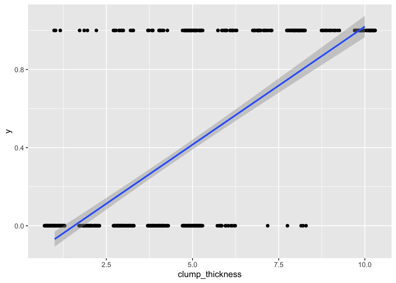
Well, it runs! But as you can see, we are violating many assumptions here (the residuals will certainly not be normal). Also, your outcome data can only be 0/1, but predicted values can be greater than 1 or less than 0, which is not appropriate. For example, someone with a clump thickness of \(X=10\) would have a predicted probability of \(-.190+.121(10)=1.02\), or 102%. This is clearly the wrong tool for the job.
Above, we used the structural part of the model (i.e., the part without the error) \(\mu=\beta_0+\beta_1X_1\), where \(\mu\) is the mean of \(Y\) at a specific value of \(X_1\). This works when the response is continuous and the assumption of normality is met. Instead, however, we could use \(g(\mu)=\beta_0+\beta_1X_1\), where \(g()\) is some function that links the response to the predictors in an acceptable, continuous fashion.
In the case of binary outcome data, \(g()\) would need to take \([0,1]\) data and output continuous data (or vice versa). One idea is to use a cumulative distribution function (CDF). For example, the normal distribution is defined over \((-\infty, \infty)\), but the cumulative probability (the area under the distribution) is defined over \([0,1]\), since \(\int_{-\infty}^a \frac{1}{\sqrt{2\pi}}e^{-\frac{x^2}{2}}dx \in [0,1]\) for all \(a\). Since the normal CDF \(\Phi(z)=P(Z\le z), Z \sim N(0,1)\) maps from all real numbers \(z\) to \([0,1]\), it’s inverse \(\Phi^{-1}(x)\) will do the opposite.
#normal CDF
curve(pnorm(x,0,1),-4,4)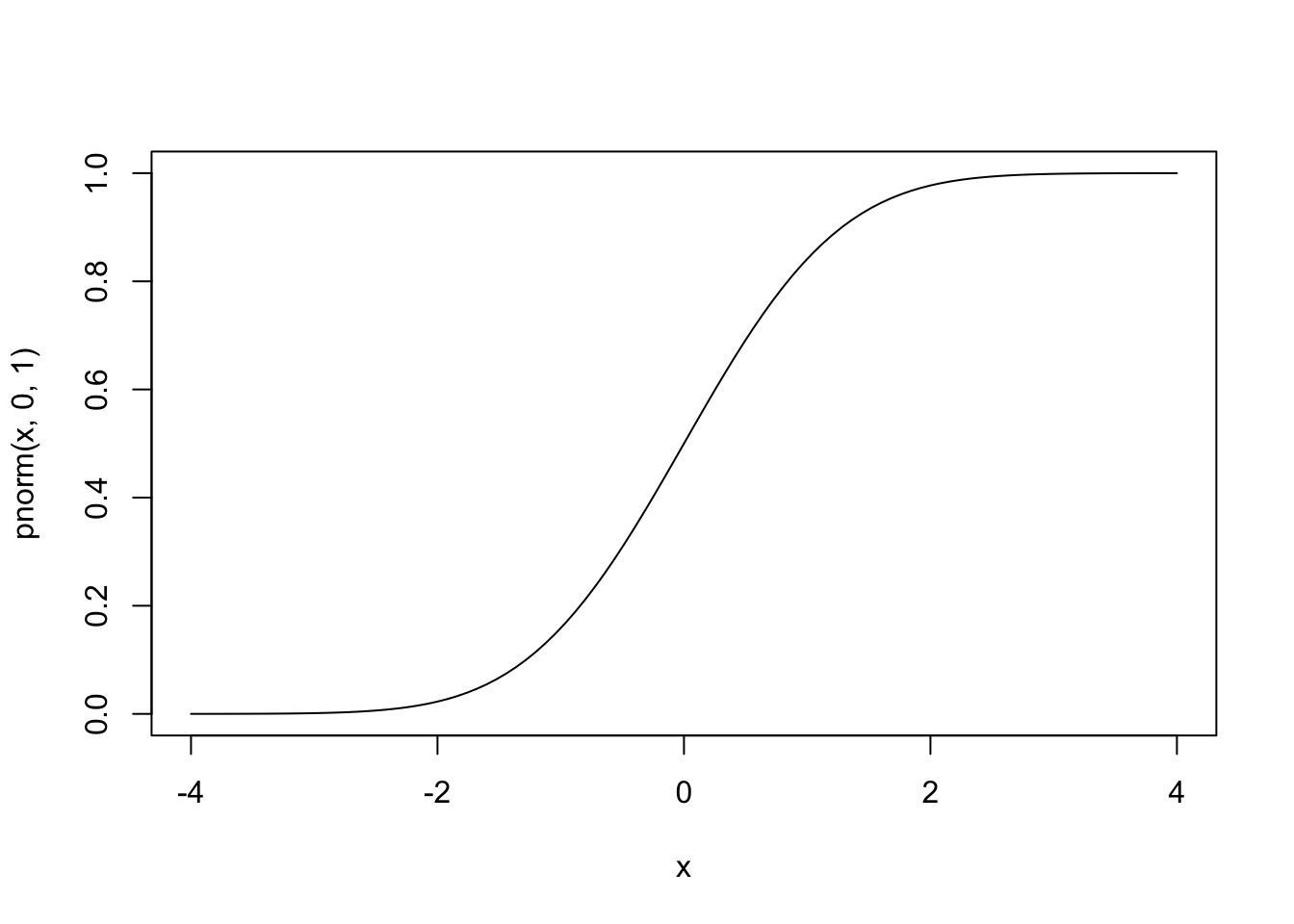
#inverse
curve(qnorm(x,0,1),0,1)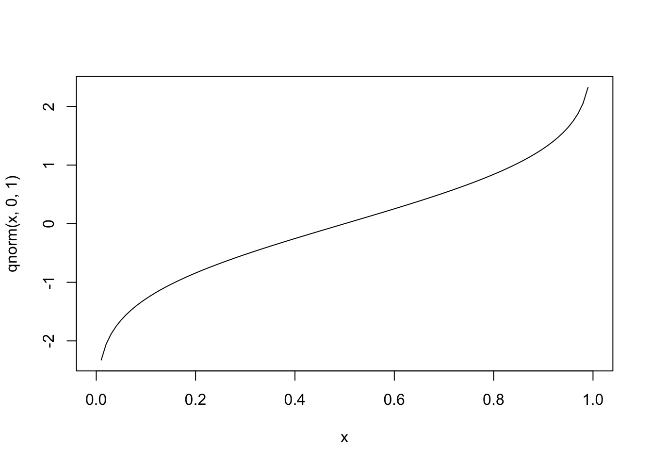
Let’s regress \(y\) using the probit link function
fit<-glm(y~clump_thickness,data=data,family=binomial(link="probit"))
summary(fit)
##
## Call:
## glm(formula = y ~ clump_thickness, family = binomial(link = "probit"),
## data = data)
##
## Deviance Residuals:
## Min 1Q Median 3Q Max
## -2.1443 -0.4535 -0.1421 0.1450 3.0332
##
## Coefficients:
## Estimate Std. Error z value Pr(>|z|)
## (Intercept) -2.83936 0.18083 -15.70 <2e-16 ***
## clump_thickness 0.51487 0.03535 14.56 <2e-16 ***
## ---
## Signif. codes: 0 '***' 0.001 '**' 0.01 '*' 0.05 '.' 0.1 ' ' 1
##
## (Dispersion parameter for binomial family taken to be 1)
##
## Null deviance: 900.53 on 698 degrees of freedom
## Residual deviance: 466.66 on 697 degrees of freedom
## AIC: 470.66
##
## Number of Fisher Scoring iterations: 6This equation tells us that for every 1 unit increase in clump thickness (X), the z score increases by .514 on average.
\[ \begin{aligned} \Phi^{-1}(\widehat{P(\text{malignant} | X)})&=-2.839+0.514X\\ \widehat{P(\text{malignant} | X)}&=\Phi(-2.839+0.514X)\\ \end{aligned} \]
If a patient has a clump thickness of 10, our predicted probability of malignancy is \(\Phi(-2.839+0.514*10)=P(Z\le2.301)=.989\)
We can get everyone’s predicted z-score (and probability) in this fashion
data$z_pred<-predict(fit)
data$prob_pred<-predict(fit,type = "response")

head(data)
## clump_thickness cell_uniformity marg_adhesion bland_chromatin outcome
## 1 5 1 1 3 benign
## 2 5 4 4 3 benign
## 3 3 1 1 3 benign
## 4 6 8 8 3 benign
## 5 4 1 1 3 benign
## 6 8 10 10 9 malignant
## y z_pred prob_pred
## 1 0 -0.2650294 0.39549341
## 2 0 -0.2650294 0.39549341
## 3 0 -1.2947609 0.09770136
## 4 0 0.2498364 0.59864305
## 5 0 -0.7798952 0.21772629
## 6 1 1.2795679 0.89965143ggplot(data, aes(clump_thickness,y))+geom_jitter(width=.3,height=0)+
stat_smooth(method="glm",method.args=list(family=binomial(link="probit")),se=F)
Cross validation of probit model
Let’s use cross-validation to see how this simple model performs when we train it to part of our full 699 dataset and test how well it predicts the rest. Let’s split the dataset into 10 roughly equal pieces, leave one piece (or “fold”) out (70 observations), fit the model to the remaining 9 folds (629 observations), see how well it classifies the test set by computing false-positive and false-negative rates, and repeat the process so that each fold gets a turn being the one left out (i.e., retrain the model on a new training set, test it on a new test set). Since we get predicted z-scores (or probabilities) from the model, we say the model predicts 1 if \(z\ge 0\ (p\ge.5)\), and 0 otherwise.
set.seed(1234)

k=10

acc<-fpr<-fnr<-NULL

data1<-data[sample(nrow(data)),]
folds<-cut(seq(1:nrow(data)),breaks=k,labels=F)

for(i in 1:k){
  train<-data1[folds==i,]
  test<-data1[folds!=i,]
  truth<-test$y

  fit<-glm(y~clump_thickness,data=train,family=binomial(link="probit"))

  pred<-ifelse(predict(fit,newdata = test)>0,1,0)

  acc[i]<-mean(truth==pred)
  fpr[i]<-mean(pred[truth==0])
  fnr[i]<-mean(1-pred[truth==1])
}

mean(acc); mean(fnr); mean(fpr)
## [1] 0.860595## [1] 0.3299324## [1] 0.03901361The probit regression is classifying correctly about 85.49% of the time using just the clump thickness predictor variable. The false negative rate (the percentage of malignancies it identified as benign) was 29.71%; the false positive rate (the percentage of benign tumors it identified as malignant) was 6.45%.
Logistic regression
There is another, more widely used link function for binary data, and that is the logit (or log odds) function. This approach is based on odds. Recall that the odds are calculated from a probability like so: \(odds(p)=\frac{p}{1-p}\). The nice thing about this is that we can take a variable \(p\) from \([0,1]\) and transform it. However, as \(p\) approaches 0, the odds approach 0, and as \(p\) approaches 1, the odds approach \(\infty\).
curve(x/(1-x),from = 0, 1)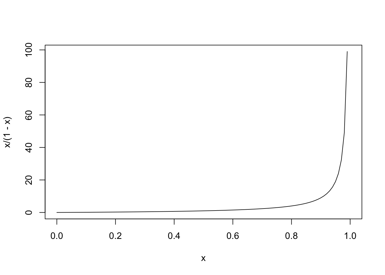
If we take the logarithm of the odds (use the natural log for convenience), you now have variable taking values from \([-\infty,\infty]\). This function, the logarithm of the odds, is called the logit function (it’s inverse is the logistic function): it is where logistic regression gets its name. Below is a graph of \(y=log(\frac{p}{1-p})\) shown alongside the dotted normal quantile function (i.e., \(\Phi^{-1}(x)\)
curve(log(x/(1-x)),0,1)
curve(qnorm(x,0,1),0,1,add=T,lty=2)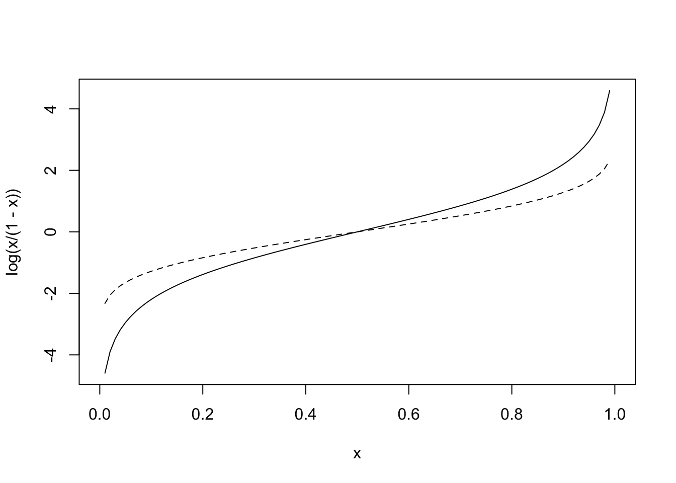
Very similar! Using this link function to convert our 0, 1 values to a continuous scale, we write the logistic regression equation
\[ log(\frac{p}{1-p})=\beta_0+\beta_1X \] Where \(p\) is the \(p(Y=1 \mid X=x)\).
Let’s try using this link function in our regression of malignancy on clump thickness.
fit<-glm(y~clump_thickness,data=data,family=binomial(link="logit"))
summary(fit)
##
## Call:
## glm(formula = y ~ clump_thickness, family = binomial(link = "logit"),
## data = data)
##
## Deviance Residuals:
## Min 1Q Median 3Q Max
## -2.1986 -0.4261 -0.1704 0.1730 2.9118
##
## Coefficients:
## Estimate Std. Error z value Pr(>|z|)
## (Intercept) -5.16017 0.37795 -13.65 <2e-16 ***
## clump_thickness 0.93546 0.07377 12.68 <2e-16 ***
## ---
## Signif. codes: 0 '***' 0.001 '**' 0.01 '*' 0.05 '.' 0.1 ' ' 1
##
## (Dispersion parameter for binomial family taken to be 1)
##
## Null deviance: 900.53 on 698 degrees of freedom
## Residual deviance: 464.05 on 697 degrees of freedom
## AIC: 468.05
##
## Number of Fisher Scoring iterations: 6data$logit_pred<-predict(fit)What does this tell us? Well first, clump thickness appears to be strongly and positively predictive of malignancy. The equation with the parameter estimates is \(log(\frac{p}{1-p})=-5.160+0.935X\). You can see that for every one-unit increase in X (clump thickness), the log-odds goes up by .935, which means that the odds change by a factor of \(e^{.935}=2.55\) (i.e., they go up by 155%)! If you go up two clump-thickesses, we get a change in odds of \(e^{2\times.935}=e^{.935}e^{.935}=2.55\times 2.55\approx6.50\), which is \(2.55\times 2.55\).
How about getting a predicted probability for a person with a clump thickness of \(X\)? For a person with \(X=10\), for example, we get a logit score of \(4.19\) (by plugging into the equation above). But how do we invert the logit function to get the predicted probability out? Just use algebra: first exponentiate to remove the log, then multiply both sides by the denominator, then distribute, the get all terms with p on the same side, then factor out the p, then solve for it!
\[ \begin{aligned} log(\frac{p}{1-p})&=\beta_0+\beta_1X\\ \frac{p}{1-p}&=e^{\beta_0+\beta_1X}\\ p&=(1-p)e^{\beta_0+\beta_1X}\\ p&=e^{\beta_0+\beta_1X}-pe^{\beta_0+\beta_1X}\\ p+pe^{\beta_0+\beta_1X}&=e^{\beta_0+\beta_1X}\\ p(1+e^{\beta_0+\beta_1X})&=e^{\beta_0+\beta_1X}\\ p&=\frac{e^{\beta_0+\beta_1X}}{1+e^{\beta_0+\beta_1X}}\\ \end{aligned} \]
In general, \(p=\frac{odds}{1+odds}\). Note that if you multiply top and bottom of the RHS by \(e^{-\beta_0+\beta_1X}\) (note the negative), you get the alternative formulation \(p=\frac{1}{1+e^{-\beta_0+\beta_1X}}\).
So we take what the regression evaluates to, raise \(e\approx2.71828\) to that power, and divide the result by \(1 +\) itself.
exp(4.19)/(1+exp(4.19))## [1] 0.9850797A 98.5% chance! A bit smaller than what the probit model predicted. We can also get this directly from R. Let’s ask R for the probability of malignancy at each level of clump thickness (i.e., from 1 to 10).
predict(fit,newdata=data.frame(clump_thickness=1:10),type="response")## 1 2 3 4 5 6
## 0.01441866 0.03594186 0.08676502 0.19492345 0.38157438 0.61125443
## 7 8 9 10
## 0.80028036 0.91080524 0.96299397 0.98514461data$logit<-predict(fit)
ggplot(data, aes(clump_thickness,y))+geom_jitter(width=.3,height=0)+stat_smooth(method="glm",method.args=list(family="binomial"),se=F)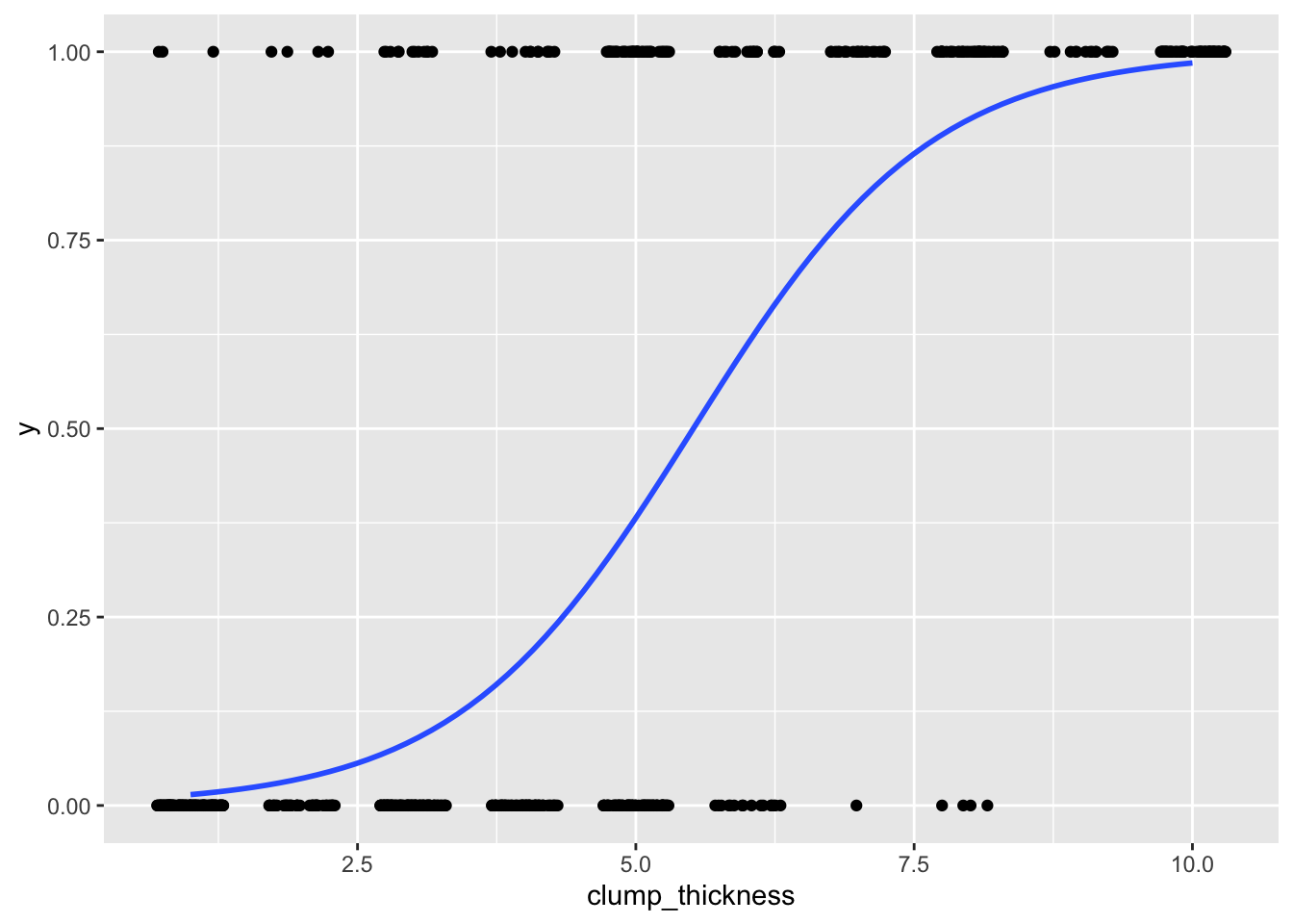
data$outcome<-factor(data$outcome,levels=c("malignant","benign"))
ggplot(data,aes(logit, fill=outcome))+geom_density(alpha=.3)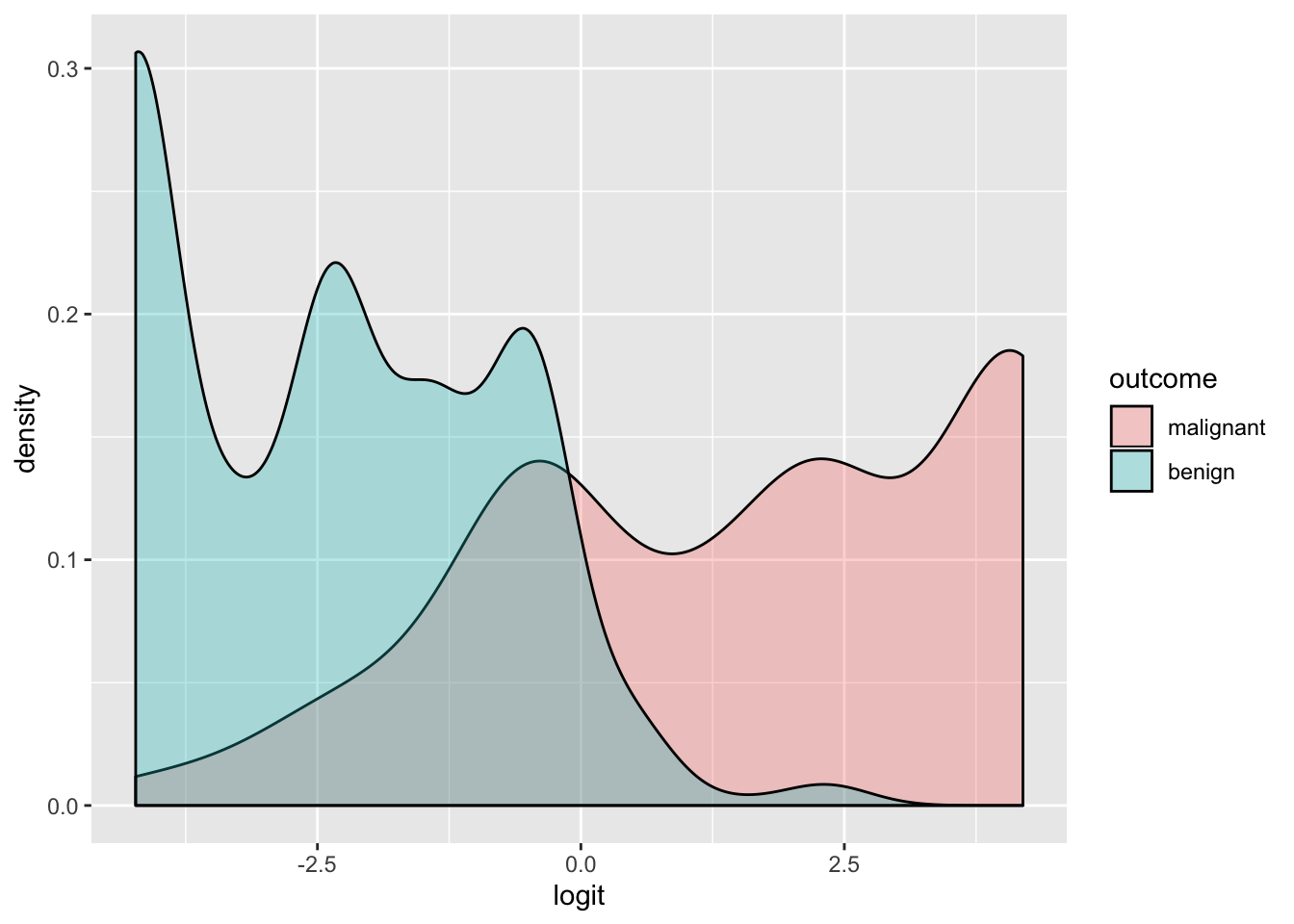
Let’s see how it fares under cross-validation. We will start by using the exact same procedure as we did above.
acc<-fpr<-fnr<-NULL

for(i in 1:k){
  train<-data1[folds==i,]
  test<-data1[folds!=i,]
  truth<-test$y

  fit<-glm(y~clump_thickness,data=train,family=binomial(link="logit"))

  pred<-ifelse(predict(fit,newdata = test)>0,1,0)

  acc[i]<-mean(truth==pred)
  fpr[i]<-mean(pred[truth==0])
  fnr[i]<-mean(1-pred[truth==1])
}

mean(acc); mean(fnr); mean(fpr)
## [1] 0.860595## [1] 0.3299324## [1] 0.03901361The logistic regression accurately predicted out of sample exactly as accurately as the probit model; the false negative and false positive rates were the same as well!
I’m curious what we will see using another supervised classification approach: linear discriminant analysis (LDA). I won’t go into details here, but just for the sake of comparison let’s run it.
acc<-fpr<-fnr<-NULL

for(i in 1:k){
  train<-data1[folds==i,]
  test<-data1[folds!=i,]
  truth<-test$y

  fit<-lda(y~clump_thickness,data=train)

  pred<-predict(fit,test)
  tab<-table(pred$class,test$outcome)

  acc[i]=sum(diag(tab))/sum(tab)
  fpr[i]<-tab[2,1]/sum(tab[,1])
  fnr[i]<-tab[1,2]/sum(tab[,2])
}

mean(acc); mean(fnr); mean(fpr)
## [1] 0.860595## [1] 0.3299324## [1] 0.03901361Hmm, ever so slightly worse in the accuracy and false negative department, but slightly lower false positive rate. Still, very close!
Leave-One-Out CV
Let’s take this opportunity to introduce another kind of cross-validation technique: Leave-one-out cross-validation (or LOOCV).
Just like it sounds we train the model on \(n-1\) datapoints and use it to predict the omitted point. We do this for every observation in the dataset (i.e., each point gets a turn being left out and we try to predicted it from all of the rest). Let’s try it on the logistic regression.
acc<-fpr<-fnr<-NULL

for(i in 1:length(data)){

  train<-data[-i,]
  test<-data[i,]
  truth<-test$y

  fit<-glm(y~clump_thickness,data=train,family=binomial(link="logit"))

  pred<-ifelse(predict(fit,newdata = test)>0,1,0)

  acc[i]<-truth==pred
  if(truth==0 & pred==1) fpr[i]<-1
  if(truth==1 & pred==0) fnr[i]<-1
}

mean(acc)
## [1] 0.9Categorical predictor variables
Imagine that instead, clump size was a categorical variable with three levels, say small, medium, and large. I will artificially create this variable using terciles because the dataset doesn’t actually contain any categorical variables for us to play with (and the interpretation of the coefficients is slightly different).
data$clump_cat<-cut(data$clump_thickness,breaks=quantile(data$clump_thickness,0:3/3),include.lowest = T)
data$clump_cat<-factor(data$clump_cat,labels=c("S","M","L"))

fit1<-glm(y~clump_cat, data=data, family=binomial(link="logit"))
summary(fit1)
##
## Call:
## glm(formula = y ~ clump_cat, family = binomial(link = "logit"),
## data = data)
##
## Deviance Residuals:
## Min 1Q Median 3Q Max
## -2.0886 -0.3599 -0.3599 0.4895 2.3534
##
## Coefficients:
## Estimate Std. Error z value Pr(>|z|)
## (Intercept) -2.7045 0.2370 -11.413 < 2e-16 ***
## clump_catM 1.7171 0.2833 6.062 1.34e-09 ***
## clump_catL 4.7660 0.3314 14.381 < 2e-16 ***
## ---
## Signif. codes: 0 '***' 0.001 '**' 0.01 '*' 0.05 '.' 0.1 ' ' 1
##
## (Dispersion parameter for binomial family taken to be 1)
##
## Null deviance: 900.53 on 698 degrees of freedom
## Residual deviance: 518.73 on 696 degrees of freedom
## AIC: 524.73
##
## Number of Fisher Scoring iterations: 5First of all, notice that the residual deviance and the AIC are higher now than the were before we artificially discretized this variable. This serves to illustrate the value of keeping your data numeric rather than using it to create groups: here, we are wasting good information and getting poorer model fit.
Notice that there are two effect estimates in the output: one for the medium category (M) and one for the large category (L). By default, regressions are dummy coded such that the estimates are compared to the reference category (the one not listed; in this case, the small category). Here, the coefficients are log odds ratios; if we exponentiate, we get odds ratios compared to the reference category. For example, \(e^{1.717}=5.57\), so the odds of malignancy are 5.57 times as high for those with medium clump sizes as those with small clump sizes, and this difference is significant. This difference is of course more pronounced for the large clump sizes: compared to those with small clump sizes, the odds of malignancy among those with large clump sizes are \(e^{4.766}=117.45\) times as high!
To see that this is true, let’s calculate the odds ratios by hand.
table(data$y,data$clump_cat)##
## S M L
## 0 284 153 21
## 1 19 57 165The odds of cancer (y=1) if you have small clump thickness is \(19/284=.0669\) and the odds for medium and large are \(57/153=.3725\) and \(7.8571\). The odds ratio of M-to-S is \(\frac{.3725}{.0669}=5.57\) and L-to-S is \(\frac{7.8571}{.0669}=117.45\)
We can even use these numbers to calculate the standard errors. The estimated standard error of a \(log\ OR\) is just \(\sqrt{\frac 1a + \frac 1b +\frac 1c + \frac 1d}\) where \(a, b, c,\) and \(d\) are the counts with/without cancer in each of the two conditions being compared. For example, comparing M-to-S, \(SE=\sqrt{\frac{1}{284}+\frac{1}{19}+\frac{1}{153}+\frac{1}{57}}=.2833\), which matches the output above. You can use this to perform hypothesis tests using the normal distribution.
Multiple predictor variables
Let’s add more variables to our model to try to improve prediction. Let’s try adding bland chromatin and marginal adhesion. Our model becomes
fit2<-glm(y~clump_thickness+marg_adhesion+bland_chromatin, data=data, family="binomial")
summary(fit2)
##
## Call:
## glm(formula = y ~ clump_thickness + marg_adhesion + bland_chromatin,
## family = "binomial", data = data)
##
## Deviance Residuals:
## Min 1Q Median 3Q Max
## -3.11645 -0.16339 -0.08323 0.03270 2.94043
##
## Coefficients:
## Estimate Std. Error z value Pr(>|z|)
## (Intercept) -9.0911 0.8262 -11.003 < 2e-16 ***
## clump_thickness 0.6137 0.1069 5.744 9.26e-09 ***
## marg_adhesion 0.8457 0.1257 6.729 1.71e-11 ***
## bland_chromatin 0.7404 0.1267 5.845 5.07e-09 ***
## ---
## Signif. codes: 0 '***' 0.001 '**' 0.01 '*' 0.05 '.' 0.1 ' ' 1
##
## (Dispersion parameter for binomial family taken to be 1)
##
## Null deviance: 900.53 on 698 degrees of freedom
## Residual deviance: 165.23 on 695 degrees of freedom
## AIC: 173.23
##
## Number of Fisher Scoring iterations: 7Notice that you can be lazy with your family= specification for logistic regression. Wow, so all of these variables are significant. Notice that the AIC is 173.23, compared to our previous model’s 468.05! Lower AIC/deviance is better. We could formally test the additional explanatory value of the new variables by performing an analysis of deviance with the null hypothesis that the more basic model is the true model.
Without going into too much detail, the way this works under the hood is that we compute the likelihood of the data given the saturated model (i.e., estimating a parameter for every data point) and compare it to the likelihood of the data under the basic (null) model (i.e., estimating just a single intercept parameter). We take the ratio of these likelihoods (full to null), take the log of these ratios, and multiply them each by \(-2\), resulting in something called the null deviance (the smaller, the better the null model explains the data). We also compare the saturated model to each of our actual model(s) in the same, resulting in residual deviance: the smaller it is, the better the proposed model explains the data. We can compute residual deviances for two models and compare them: For example, the residual deviance of the first model is 464.05 (from the output below), while the deviance for the model with three predictors is 165.23 (smaller: a good thing!). The difference in residual deviances follows a chi-squared distribution with DF equal to the number of additional parameters in the larger model. That is, we compute
fit<-glm(y~clump_thickness,data=data,family=binomial(link="logit"))
anova(fit,fit2,test="LRT")
## Analysis of Deviance Table
##
## Model 1: y ~ clump_thickness
## Model 2: y ~ clump_thickness + marg_adhesion + bland_chromatin
## Resid. Df Resid. Dev Df Deviance Pr(>Chi)
## 1 697 464.05
## 2 695 165.23 2 298.82 < 2.2e-16 ***
## ---
## Signif. codes: 0 '***' 0.001 '**' 0.01 '*' 0.05 '.' 0.1 ' ' 1Yes, it appears that the full model is better! We can get a goodness-of-fit estimate analogous to \(R^2\) by seeing what proportion of the total deviance in the null model can be accounted for by the full model. You just put the difference in deviances in the numerator and the null deviance in the denominator, like this.
(fit2$null.deviance-fit2$deviance)/fit2$null.deviance## [1] 0.8165162Wow, quite high! This quantity is known as the Hosmer and Lemeshow pseudo \(R^2\); it is analogous to traditional \(R^2\), but there are alternatives (e.g., Nagelkerke).
Here is the fitted model with the parameter estimates:
\[ log(\frac{p}{1-p})=-9.09+0.61Clump+0.85MargAd+0.74BlandChrom \]
Holding marginal adhesion and bland chromatin constant, we see an \(e^{.61}=1.84\) change in the odds of developing breast cancer for every one-unit increase in clump thickness. Specifically, we see an 84% increase in the odds of cancer for each increase in clump thickness.
How much better does this perform? Let’s rerun our cross-validation. First, 10-fold:
acc<-fpr<-fnr<-NULL

for(i in 1:k){
  train<-data[folds==i,]
  test<-data[folds!=i,]
  truth<-test$y

  fit<-glm(y~clump_thickness+marg_adhesion+bland_chromatin,data=train,family=binomial(link="logit"))

  pred<-ifelse(predict(fit,newdata = test)>0,1,0)

  acc[i]<-mean(truth==pred)
  fpr[i]<-mean(pred[truth==0])
  fnr[i]<-mean(1-pred[truth==1])
}

mean(acc); mean(fnr); mean(fpr)
## [1] 0.9434098## [1] 0.09410461## [1] 0.03666142Wow, very good prediction! We are accurately predicting out-of-sample 94.3% of the time, with a 9.4% false negative rate and a 3.7% false positive rate.
Sensitivity, Specificity, and ROC Curves
We could try to visualize this logistic regression, but we would need an axis for each additional predictor variable. We could just plot one predictor at a time on the x-axis. Instead, let’s use PCA to find the best linear combination of our three predictors, resulting in a single variable that summarizes as much of the variability in the set of three as possible. We can this use this as a predictor (note this is really just for visualization purposes; just pretend we ran the logistic regression with a single variable called predictor).
pca1<-princomp(data[c('clump_thickness','marg_adhesion','bland_chromatin')])
data$predictor<-pca1$scores[,1]

fit<-glm(y~predictor,data=data,family="binomial")
data$prob_pred<-predict(fit,type="response")

ggplot(data, aes(predictor,prob_pred))+geom_point(aes(color=outcome),alpha=.5,size=3)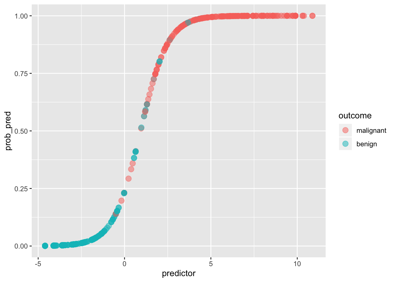
If we give anyone above \(p(y=1|x)=.5\) a prediction of malignancy, and anyone below a prediction of benign, we can calculate the true positive rate (Sensitivity), the true negative rate (Specificity), and the corresponding false positive/negative rates.
ggplot(data, aes(predictor,prob_pred))+geom_point(aes(color=outcome),alpha=.5,size=3)+geom_rug(aes(color=outcome),sides="right")+geom_hline(yintercept=.5)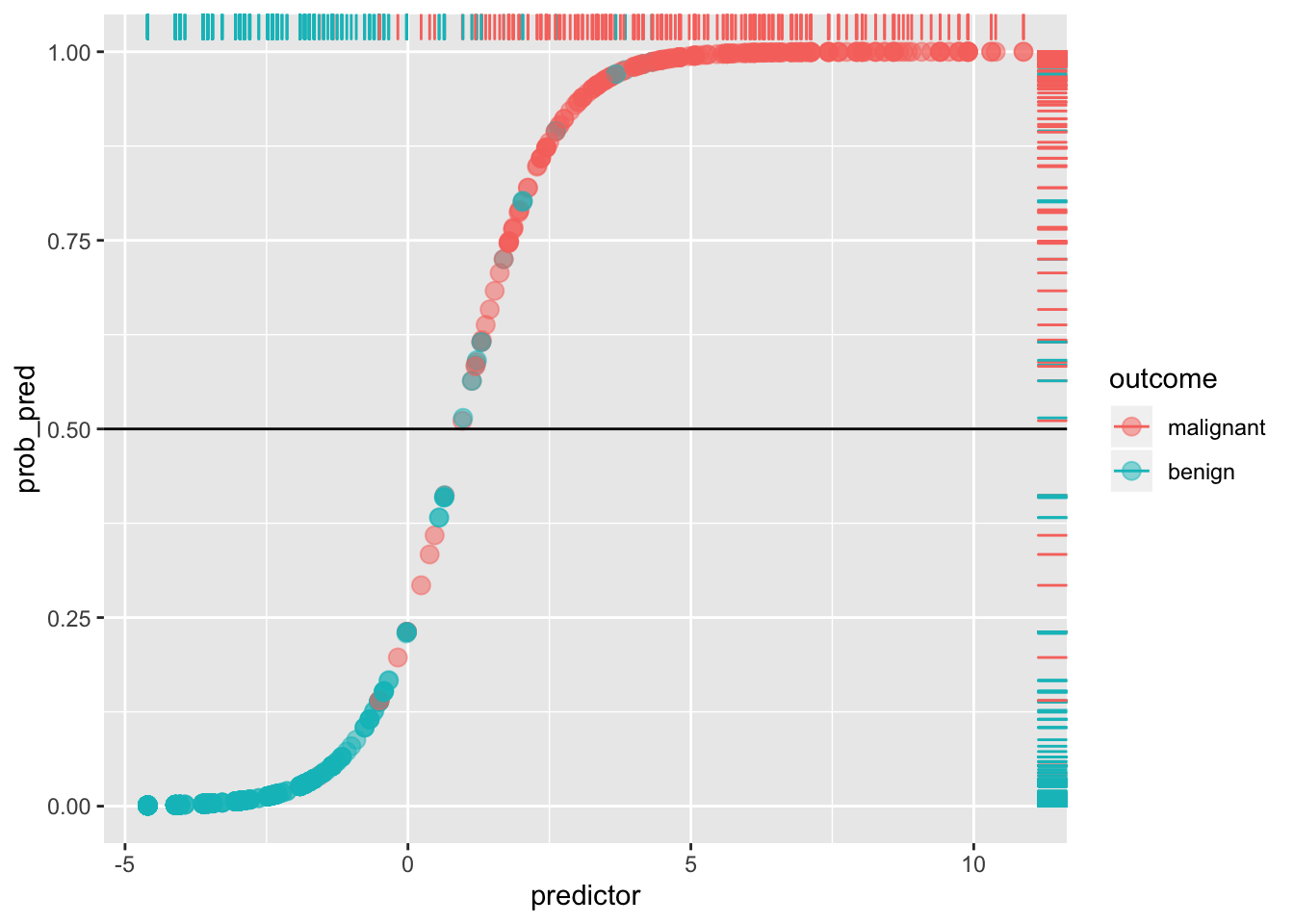
Any blue dots above the line are false positives: any reds below the line are false negatives. For example, the Sensitivity (or true positive rate, TPR) is the number of red dots above the line (which are predicted positive, since \(p(y=1)>.5\)) out of the total number of red dots.
sens<-sum(data[data$y==1,]$prob_pred>=.5)/sum(data$y)
sens
## [1] 0.9419087Think of it as the probability of detecting the disease, given that it exists (i.e., probability of detection). It is the percentage of actual positives (e.g., people with the disease) that are correctly flagged as positive. Thus, Sensitivity is the degree to which actual positives are not overlooked: A test that is highly sensitive (e.g., \(>.90\)) rarely overlooks a thing it is looking for. The higher the Sensitivity, the lower the false negative rate (type II error).
Compare this to the Specificity (true negative rate, TNR), the proportion of actual negatives (e.g., healthy people) that are correctly flagged as negative. It is the probability of detecting the absence of the disease, given that it does not exist! Thus, it indexes the avoidance of false positives: the higher the Specificity, the lower the false positive rate (1-Specificity, or type I error). A test that is highly specific rarely mistakes something else for the thing it is looking for.
Here, Specificity is the percentage of blue dots that fall below the horizontal cut-off (i.e., of those with \(p(y=1)<.5\), the percentage that are actually \(y=0\)).
spec<-sum(data[data$y==0,]$prob_pred<.5)/sum(data$y==0)
spec
## [1] 0.9694323You can put confidence intervals on these estimates (e.g., using large-sample approximations for binomial)
#sensitivity
sens+c(-1.96,1.96)*sqrt(sens*(1-sens)/sum(data$y))
## [1] 0.9123757 0.9714417#specificity
spec+c(-1.96,1.96)*sqrt(spec*(1-spec)/sum(data$y==0))## [1] 0.9536666 0.9851980This quickly gets confusing, so it is a good idea to make a table like this (indeed, it is referred to as a confusion matrix):
data$test<-as.factor(ifelse(predict(fit)>0,"positive","negative"))
data$disease<-data$outcome

with(data, table(test,disease))%>%addmargins
## disease
## test malignant benign Sum
## negative 14 444 458
## positive 227 14 241
## Sum 241 458 699As before, Sensitivity is the proportion of those with the desease who test positive, \(p(+|malignant)=\frac{227}{241}=.942\), while Specificity is the proportion of those who do not have the disease who test negative, \(p(-|benign)=\frac{444}{458}=.969\).
Here is a helpful plot of the proportions testing positive/negative in each disease category, to help keep things straight visually:
library(magrittr)

plotdat<-data.frame(rbind(
  cbind(density(data$logit_pred[data$outcome=="malignant"])%$%data.frame(x=x,y=y),disease="malignant"),
  cbind(density(data$logit_pred[data$outcome=="benign"])%$%data.frame(x=x,y=y),disease="benign")))%>%
  mutate(test=ifelse(x>0,'positive','negative'),`disease.test`=interaction(disease,test))

plotdat%>%ggplot(aes(x,y,fill=`disease.test`))+geom_area(alpha=.6,color=1)+geom_vline(xintercept=0,size=1)+
    theme(axis.title.y=element_blank(),legend.position=c(.87,.8))+xlab("Predicted logit")+
    geom_text(x=-3,y=.1,label="TN")+
    geom_text(x=-1,y=.015,label="FN")+
    geom_text(x=.5,y=.015,label="FP")+
    geom_text(x=3,y=.05,label="TP")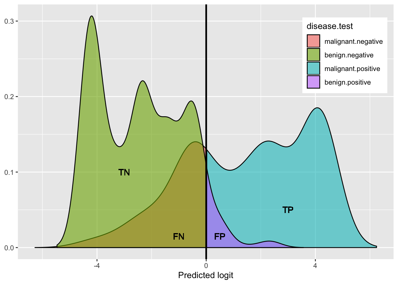
This shows the density of benign (hump on left side: green + purple) and the density of malignant (right side: blue + red): both humps add up to 100%.
- green represents the proportion of benign that got a negative test result (True Negative rate: Specificity)
- purple represents the proportion of benign that got a positive test result (False Positive rate)
- blue represents the proportion of malignant that got a positive test results (True Positive rate: Sensitivity)
- red represents the proportion of malignant that got a negative test result (False Negative rate)
Just like in traditional null hypothesis testing, there is a trade-off between type I and type II error (and so there is a trade-off between sensitivity and specificity). The stricter your test, the fewer false positives it will make (and thus the higher the Specificity), but the more false negatives. The laxer your test, the fewer false negatives it will make (and thus the higher the Sensitivity or Power), but it will allow in more false positives.
Notice that a lot depends on the cut-off! For example, if we set the cut-off at 10% (thus making it a laxer criterion), so that a predicted probability of 10% or more means we predict malignant (i.e., 1), otherwise benign (0), we get
ggplot(data, aes(predictor,prob_pred))+geom_point(aes(color=outcome),alpha=.5,size=3)+geom_rug(aes(color=outcome),sides="right")+geom_hline(yintercept=.1)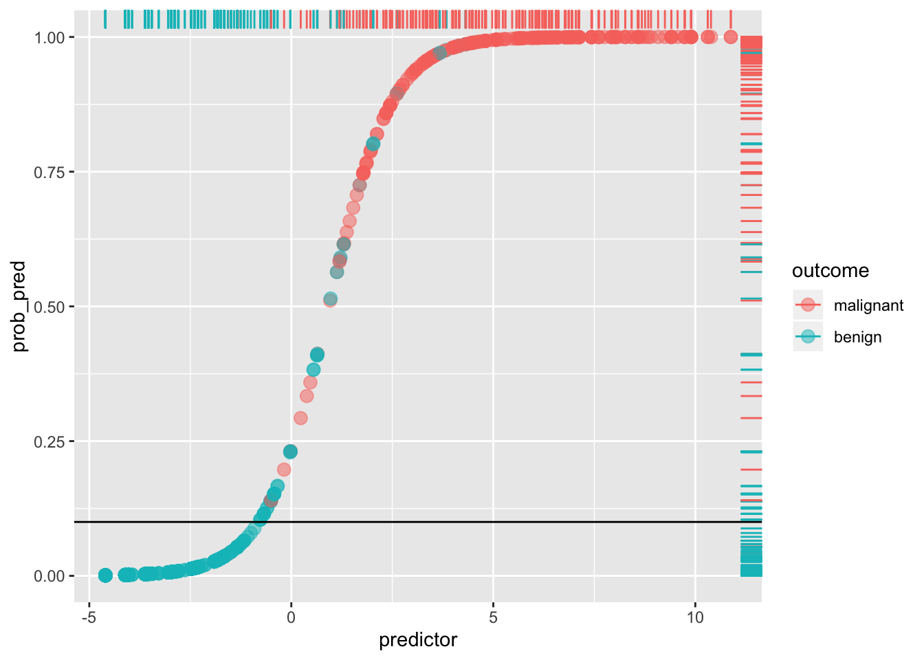
#sensitivity
sum(data[data$y==1,]$prob_pred>.1)/sum(data$y)
## [1] 0.9875519#specificity
sum(data[data$y==0,]$prob_pred<.1)/sum(data$y==0)## [1] 0.8973799By lowering our cut-off we have improved sensitivity (and lowered the false negative rate: very few red dots are below the line), but we have worsened our specificity (we have increased the false positive rate: we are more likely to say a patient doesn’t have cancer when they do; there is a greater proportion of blue dots above the line). This tradeoff always occurs:
true_pos<-function(x,data=data) sum(data[data$y==1,]$prob_pred>x)/sum(data$y)
false_pos<-function(x,data=data) sum(data[data$y==0,]$prob_pred>x)/sum(data$y==0)

TPR<-sapply(seq(0,1,.01),true_pos,data)
FPR<-sapply(seq(0,1,.01),false_pos,data)

ROC1<-data.frame(TPR,FPR,cutoff=seq(0,1,.01))

library(tidyr)
ROC1%>%gather(key,value,-cutoff)%>%ggplot(aes(cutoff,value,color=key))+geom_path()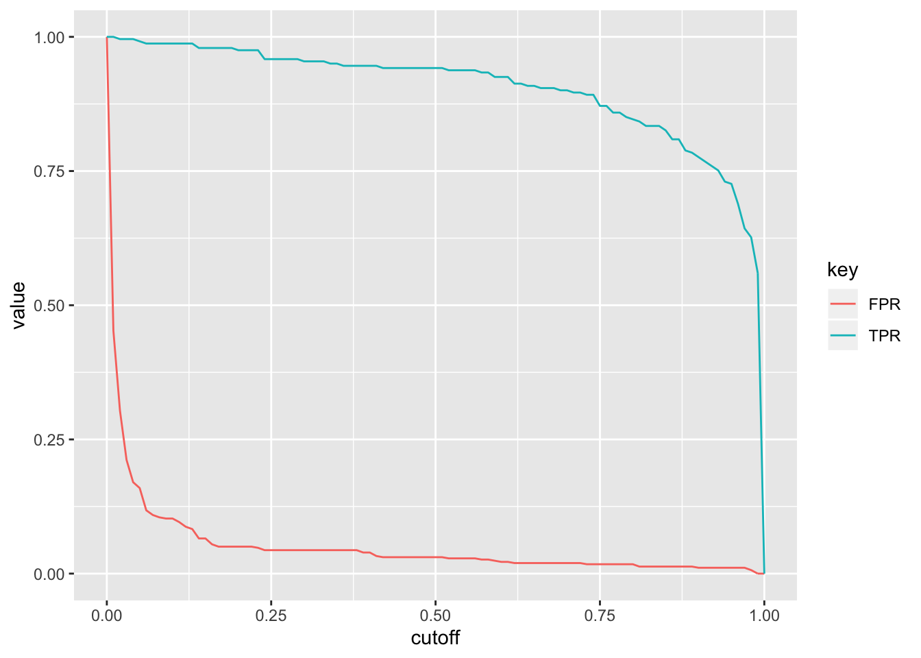
What happens if we plot the true positive rate (Sensitivity) versus the false positive rate (1-Specificity) for all possible cut-offs?
ROC1%>%ggplot(aes(FPR,TPR))+geom_path(size=1.5)+geom_segment(aes(x=0,y=0,xend=1,yend=1),lty=2)+scale_x_continuous(limits = c(0,1))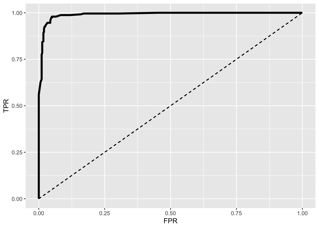
This is an ROC (Receiver Operating Characteristic) curve. If we were predicting perfectly with no mistakes, the TPR wouldbe 1 while the FPR would be 0 regardless of the cutoff and thus the curve would extend all the way to the upper right corner (100% sensitivity and 100% specificity). The dotted line shows the worst-case scenario (the FPR equal to the TPR, so our test is just as good as randomly assigning people positive and negative results), while the thick curve is our emprical ROC (pretty good!).
You can use this plot to find the optimal cutoff. Usually, this is defined as \(max(TPR-FPR)\) but there are lots of alternatives. We can find out what this is quickly
ROC1[which.max(ROC1$TPR-ROC1$FPR),]## TPR FPR cutoff
## 18 0.9792531 0.05021834 0.17AUC
The area under the curve (AUC) quantifies how well we are predicting overall and it is easy to calculate: just connect every two adjacent points with a line and then drop a vertical line from each point to the x-axis to form a trapezoid. Then just calculate the area of each trapezoid, \((x_1-x_0)(y_0+y_1)/2\) and add them all together.
#order dataset from least to greatest
ROC1<-ROC1[order(-ROC1$cutoff),]

widths<-diff(ROC1$FPR)
heights<-vector()

for(i in 1:100) heights[i]<-ROC1$TPR[i]+ROC1$TPR[i+1]

AUC<-sum(heights*widths/2)
AUC%>%round(4)
## [1] 0.9903You can interpret the AUC as the probability that a randomly selected person with cancer has a higher predicted probability of having cancer than a randomly selected person without cancer.
By way of an important, interesting aside, you might be thinking that this sounds like the usual interpretation for a Wilcoxon test statistic W (the non-parametric alternative to Student’s t test, sometimes called Mann-Whitney U). To refresh, this is a nonparametric statistic used to test whether the level of some numeric variable in one population tends to be greater/less than in another population without making any assumptions about how the variable is distributed, with the null hypothesis that the numeric variable is a useful discriminator: that a value of the numeric variable is just as likely to be from an individual in the first population as from an individual in the second. To calculate this statistic, you compare every observation in your first sample to every observation in your second sample, recording 1 if the first is bigger, 0 if the second is bigger, and 0.5 if they are equal. Then you average these across all possible combinations to get your U statistic.
Let’s calculate this statistic for a binary prediction situation: We will compute how well the scores (i.e., the predicted probabilities of cancer) discriminate between those with cancer (sample 1) and those without (sample 2). Our malignant sample consists of 241 individuals and our benign sample consists of 458 individuals. Comparing each individual’s predicted outcome in one sample to each individual’s predicted outcome in the other means we make \(241\times 458=110378\) comparisons. Using the base R function expand.grid() we generate a row for every possible comparison. Then we check if predicted probability of disease is higher for malignant than for benign for every row and sum up the yesses.
pos<-data[which(data$disease=="malignant"),]$prob_pred
neg<-data[which(data$disease=="benign"),]$prob_pred

n1<-length(pos)
n2<-length(neg)

expand.grid(pos=pos,neg=neg)%>%summarize(W=sum(ifelse(pos>neg,1,ifelse(pos==neg,.5,0))),n=n(),W/n)
## W n W/n
## 1 109309.5 110378 0.9903196wilcox.test(pos,neg)##
## Wilcoxon rank sum test with continuity correction
##
## data: pos and neg
## W = 109310, p-value < 2.2e-16
## alternative hypothesis: true location shift is not equal to 0wilcox.test(pos,neg)$stat/(n1*n2)## W
## 0.9903196The W (or U) statistic itself counts the number of times that the predicted probability for malignant individuals is higher than for benign individuals. Here we can see that the proportion of times that malignant individuals have a higher predicted probability than beningn individuals is .9903 (for all possible comparisons). This quantity is the same as the AUC!
The nice thing is, we can calculate a standard error for the AUC using the large-sample normal aproximation
#see Fogarty, Baker, and Hudson 2005 for details
Dp<-(n1-1)*((AUC/(2-AUC))-AUC^2)
Dn<-(n2-1)*((2*AUC^2)/(1+AUC)-AUC^2)

sqrt((AUC*(1-AUC)+Dp+Dn)/(n1*n2))
## [1] 0.00448658Several packages have out-of-the-box ROC curve plotters and AUC calculators. For example, here’s the package plotROC’s geom_roc() function that plays nicely with ggplot2, and it’s calc_auc() function, which you can use on a plot object that uses geom_roc()
library(plotROC)
ROCplot<-ggplot(data,aes(d=disease,m=predictor))+geom_roc(n.cuts=0)+coord_fixed()
ROCplot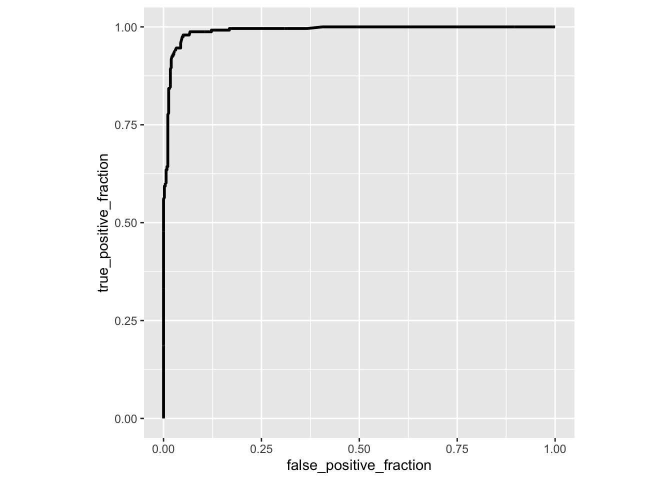
calc_auc(ROCplot)## PANEL group AUC
## 1 1 -1 0.9903196Just for comparison, here is the ROC curve from our logistic regression using only clump thickness as a predictor
library(plotROC)
ROCplot<-ggplot(data,aes(d=disease,m=clump_thickness))+geom_roc(n.cuts=0)+coord_fixed()
ROCplot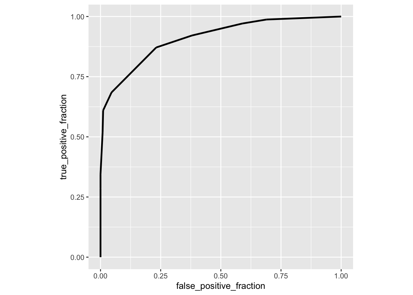
calc_auc(ROCplot)## PANEL group AUC
## 1 1 -1 0.9098416Here is another package called auctestr which gives you standard errors as well (using the large-sample approximation above)
#install.packages("auctestr")
library(auctestr)
AUC<-.9903
se_auc(AUC,n1,n2)
## [1] 0.004480684sqrt((AUC*(1-AUC)+(n1-1)*((AUC/(2-AUC))-AUC^2)+(n2-1)*((2*AUC^2)/(1+AUC)-AUC^2))/(n1*n2))## [1] 0.004480684The package `pROC gives bootstrap SE estimates too
#install.packages("pROC")
library(pROC)

data$test_num<-data$test%>%as.numeric()-1

roc(response=data$y,predictor=data$prob_pred,print.auc=T,ci=T,plot=T)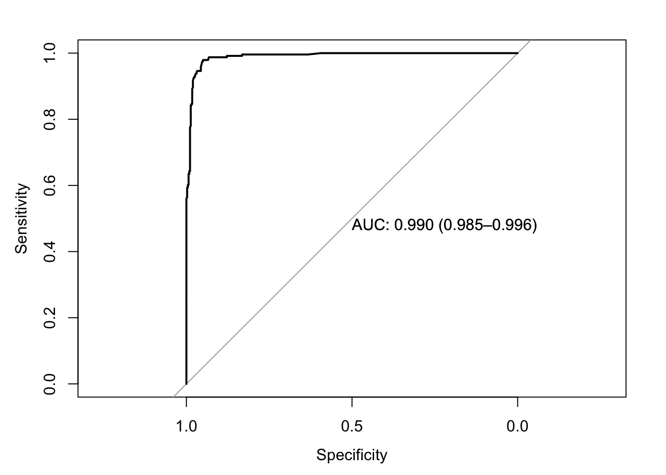
##
## Call:
## roc.default(response = data$y, predictor = data$prob_pred, ci = T,     plot = T, print.auc = T)
##
## Data: data$prob_pred in 458 controls (data$y 0) < 241 cases (data$y 1).
## Area under the curve: 0.9903
## 95% CI: 0.9848-0.9959 (DeLong)ci.auc(response=data$y,predictor=data$prob_pred,method="bootstrap")## 95% CI: 0.9842-0.9953 (2000 stratified bootstrap replicates)I’m curious if we can replicate this bootstrap ourselves by resampling cases with replacement. Let’s try it!
AUCboots<-replicate(1000, {
  samp<-data[sample(1:dim(data)[1],replace=T),]
  fit<-glm(y~predictor,data=samp,family=binomial)
  samp$prob_pred<-predict(fit,type="response")

  TPR<-sapply(seq(0,1,.01),true_pos,samp)
  FPR<-sapply(seq(0,1,.01),false_pos,samp)
  ROC1<-data.frame(TPR,FPR,cutoff=seq(0,1,.01))

  #compute AUC
  ROC1<-ROC1[order(-ROC1$cutoff),]
  widths<-diff(ROC1$FPR)
  heights<-vector()
  for(i in 1:100) heights[i]<-ROC1$TPR[i]+ROC1$TPR[i+1]
  sum(heights*widths/2)%>%round(4)
})

mean(AUCboots)
## [1] 0.9894112sd(AUCboots)## [1] 0.002633121mean(AUCboots)+c(-1,1)*sd(AUCboots)## [1] 0.9867781 0.9920443Some other metrics
Positive predictive value (PPV or PV+, aka Precision)
Another metric that is commonly calculated is the PPV, or positive predictive value. This is just what it sounds like: the predictive value of a positive test result, or the probability of actually having the disease given a positive test result. Therefore, it is simply \(p(disease \mid positive)=\frac{p(disease\ \&\ positive)}{p(positive)}=\frac{TP}{TP+FP}\). In this case (from the confusion matrix), there are 227 TPs and 14 FPs, for a PPV of 94.19. Thus, if you get a positive test result, there is a 94% chance that you actually have the disease. In this case, the Precision is the same as the Sesitivity because FP=FN.
with(data, table(test,disease))%>%addmargins## disease
## test malignant benign Sum
## negative 14 444 458
## positive 227 14 241
## Sum 241 458 699Positive/negative likelihood ratios
These are simply TP/FP for the positive LR and FN/TN for negative LR. So in this case, \(LR_+=\frac{227}{14}=16.214\) and $LR_-==.0315. Thus, true positives are 16.2 times as likely as false positives and false negatives are .0315 times as likely as true negatives.
The ratio of LR+ and LR- is the diagnostic odds ratio: it is the ratio of the odds of testing positive if you have the disease relative to the odds of testing positive if you do not have the disease
\[ DOR=\frac{LR_+}{LR_-}=\frac{TP/FP}{FN/TN}=\frac{TP/FN}{FP/TN}=\frac{odds(+|disease)}{odds(+|no\ disease)}=\frac{227/14}{14/444}=514.225 \] So the odds of testing positive are 514 times greater if you have the disease than if you do not!
It can be shown that the logarithm of an odds ratio is approximately normal with a standard error of \(SE(ln OR)=\sqrt{\frac{1}{TP}+\frac{1}{FP}+\frac{1}{TN}+\frac{1}{FN}}\).
So we have \(\sqrt{\frac{1}{227}+\frac{1}{14}+\frac{1}{14}+\frac{1}{444}}=.3867\), so our 95% CI for \(lnOR\) is
log(514.225)+(c(-1.96,1.96)*(.3867))## [1] 5.484729 7.000593And exponentiating to get back to the original scale,
exp(c(5.485,7.001))## [1] 241.0489 1097.7303Poisson Regression
In my Biostatistics course, students have to conduct their own research project, which requires data. Many students choose to collect their own data and often their response variable is count-based. For example, they might ask how many times per month a student eats at a restaurant. However, in this course we only cover up to multiple regression and we do not broach the topic of link functions at all. Just like the binary cases above, we can’t very well model count data using a linear model, since a line has negative y-values for certain x values. Counts have a minimum value of 0!
Just like a linear regression models the average outcome as \(\mu_i=\beta_0+\beta_1x_i\), we could try to model the average of the count data in the same way, \(\lambda_i=\beta_0+\beta_1x_i\), where \(\lambda\) is the average (and variance) of a Poisson distribution, often called the “rate”. But this is linear, so to avoid the problem of negative values, we use a link function that maps a domain of \((-\infty,\infty)\) to a range of \([0,\infty)\), the natural log.
\[ log(\lambda_i)=\beta_0+\beta_1x_i \]
We are also assuming that our observed counts \(Y_i\) come from a Poisson distribution with \(\lambda=\lambda_i\) for a given \(x_i\). Note that there is no separate error term: this is because \(\lambda\) determines both the mean and the variance of our response variable.
Below we have the famous Prussian horse kicks dataset, compiled by Ladislaus Bortkiewicz, the father of Poisson applications (see his book Das Gezets der kleinen Zahlen, or the Law of Small Numbers). This dataset gives the number of personnel in the Prussian army killed by horse kicks per year from 1875 to 1895 from 10 different corps. Each corps is given its own column, so we will need to rearrange a bit.
prussian<-read.table("http://www.randomservices.org/random/data/HorseKicks.txt",header = T)

prussian<-gather(prussian,Corps,Kicks,-Year)
prussian$Corps<-as.factor(prussian$Corps)
prussian%>%head()
## Year Corps Kicks
## 1 1875 GC 0
## 2 1876 GC 2
## 3 1877 GC 2
## 4 1878 GC 1
## 5 1879 GC 0
## 6 1880 GC 0Good! Notice that most of the Kicks per year are close to zero. For a Poisson distribution, recall that the pmf is given as
\[
P(y|\lambda)=\frac{\lambda^ye^{-\lambda}}{y!}
\] And \(E(y)=\lambda\) and \(Var(Y)=\lambda\). Thus, using mean(y) is a good estimate for \(\lambda\) (indeed, it can be shown that it is the maximum likelihood estimate). Let’s quickly do this. There are 280 observations, and assuming they arise from a poisson distribution, we have the following likelihood function, which we take the log of for convenience, then take the deriviative with respect to \(\lambda\) so we can solve for the critical point (in this case, the maximum of the likelihood function).
\[ \begin{aligned} L(\lambda,y)&=\prod_{i=1}^{280}\frac{\lambda^{y_i}e^{-\lambda}}{y_i!}\\ log(L(\lambda,y))&=-280\lambda+log(\lambda)\sum_{i=1}^{280} y-\sum log(y!)\\ \frac{d}{d\lambda}log(L(\lambda,y))&=-280+\frac1\lambda\sum_{i=1}^{280}y \phantom{xxxxx}\text{set equal to zero to find maximum}\\ 0&:=-280+\frac1\lambda\sum_{i=1}^{280}y\\ \rightarrow \lambda&=\sum_{i=1}^{280}y/280\\ \end{aligned} \] Thus, the maximum probability occurs when we set \(\lambda\) to the mean of the data \(y\), which is exactly what we see.
loglik<-function(lambda){sum(log(lambda^prussian$Kicks*exp(-lambda)/factorial(prussian$Kicks)))}
loglik<-sapply(seq(.1,5,.1),FUN=loglik)

plot(seq(.1,5,.1),loglik,type="l")
abline(v=.7)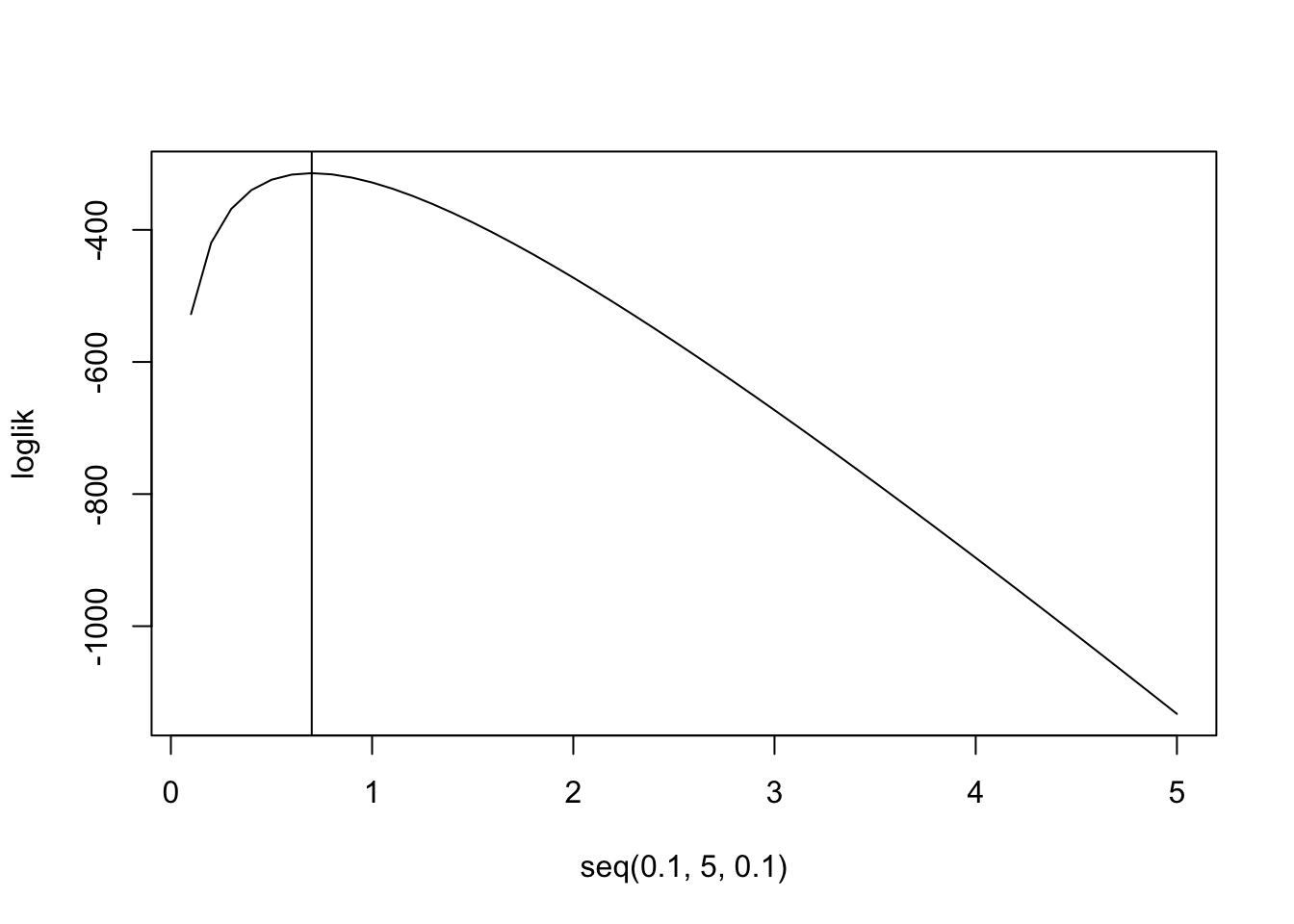
mean(prussian$Kicks)## [1] 0.7prussian%>%ggplot(aes(Kicks))+geom_histogram(aes(y=..density..),bins=5)+stat_function(geom="point",fun=dpois,n=5,args=list(lambda=.7),color="red",size=3)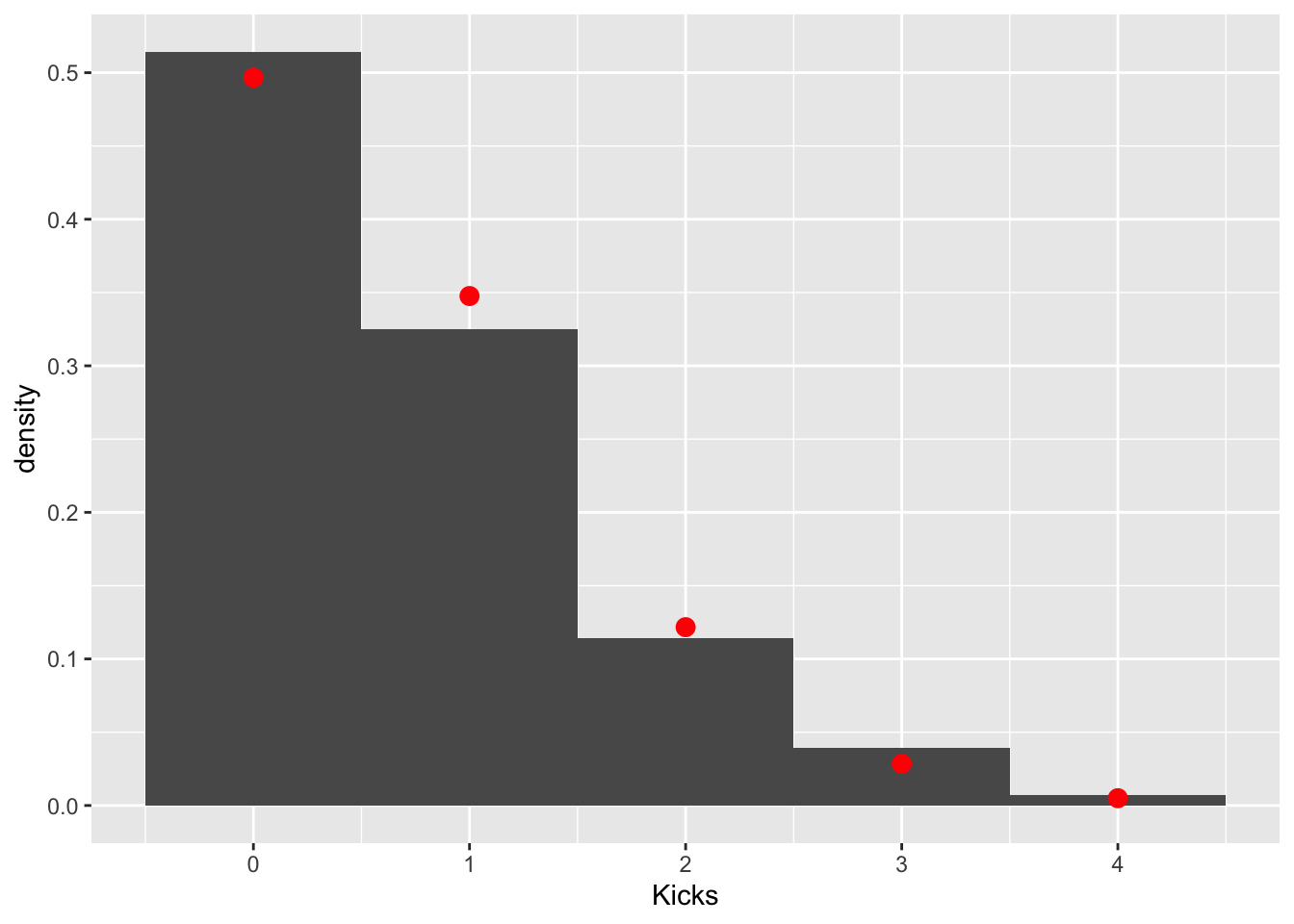
These data clearly follow a Poisson distribution (as do most low-count data). Let’s test the null hypothesis that the observed counts are not different from the counts expected under a poisson distribution with a \(\lambda=.7\). We can get our observed counts by simply tabling our response variable. The expected couns of 0, 1, 2, 3, and 4 in a sample of 280 can be calculated using the poisson pmf \(p(y|\lambda=.7)=\frac{.7^ye^{-.7}}{y!}\) and the total sample size.
obs<-table(prussian$Kicks)
exp<-dpois(0:4,.7)*280
cbind(obs,exp)
## obs exp
## 0 144 139.043885
## 1 91 97.330720
## 2 32 34.065752
## 3 11 7.948675
## 4 2 1.391018Now we just have to calculate a chi-squared test statistic quantifying how far these counts are from each other and see if it is large enough to warrant rejecting the null hypothesis that they were generated with this probabilities.
chisq<-sum((obs-exp)^2/exp)
pchisq(chisq,df = 3,lower.tail = F)
## [1] 0.5415359Fail to reject: we don’t have evidence that the data differ from this expected distribution.
Poisson Regression
For Poisson random variables, the variance is equal to the mean. Let’s look within groups of years and see if this holds
prussian$Group<-cut(prussian$Year,breaks = seq(1875,1895,5),include.lowest = T)
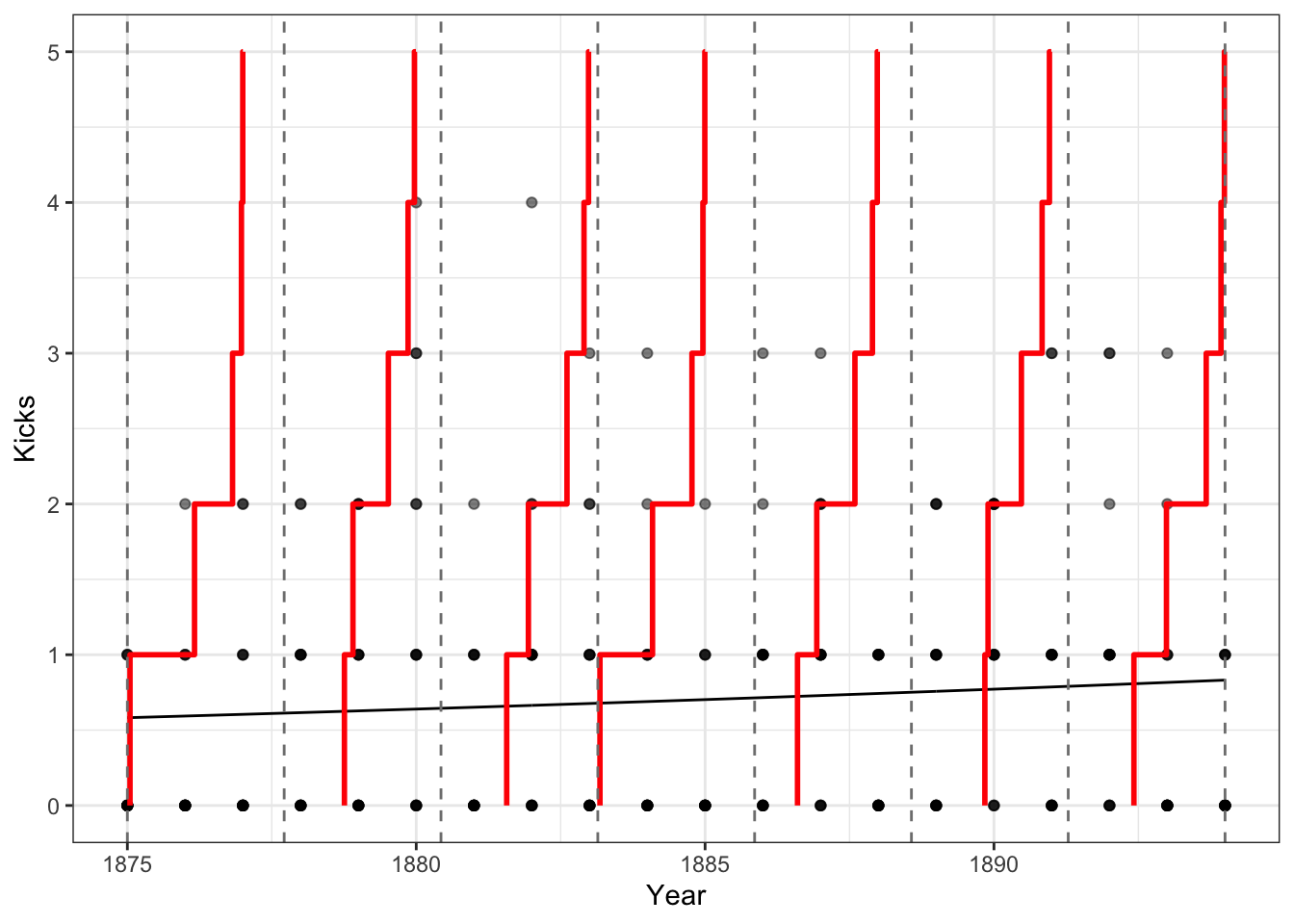
prussian%>%ggplot(aes(Kicks))+geom_histogram(bins=5)+facet_wrap(~Group)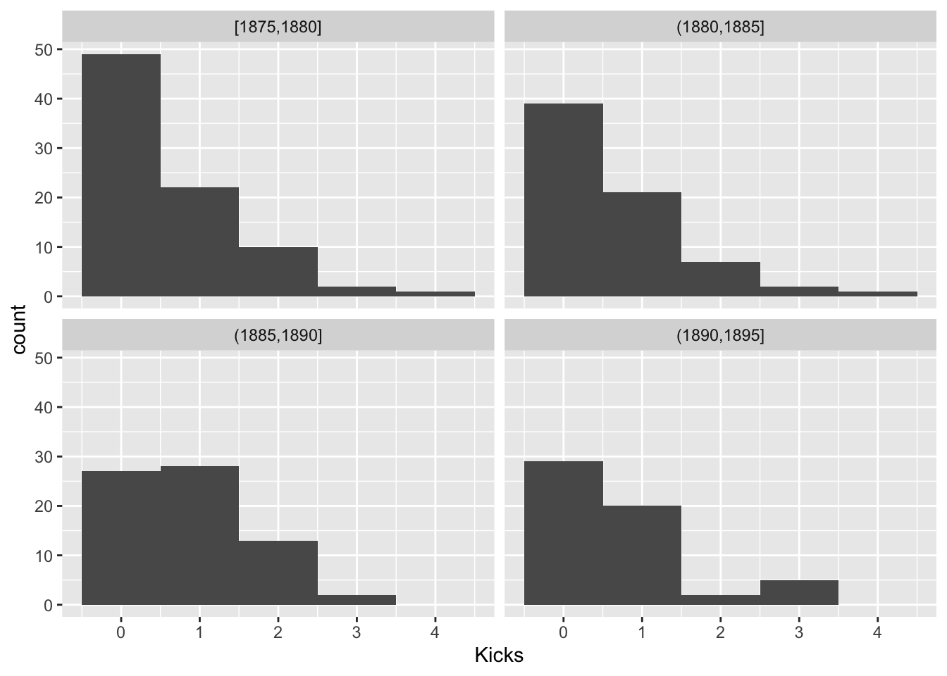
prussian%>%group_by(Group)%>%summarize(mean(Kicks),var(Kicks),n())## # A tibble: 4 x 4
## Group `mean(Kicks)` `var(Kicks)` `n()`
## <fct> <dbl> <dbl> <int>
## 1 [1875,1880] 0.619 0.769 84
## 2 (1880,1885] 0.643 0.784 70
## 3 (1885,1890] 0.857 0.675 70
## 4 (1890,1895] 0.696 0.833 56This looks OK. Another assumption is the \(log(\lambda_i)\) is a linear function of Year, since we are modeling it as such. Let’s look at the average number of kicks per year and see if it is a linear function of year.
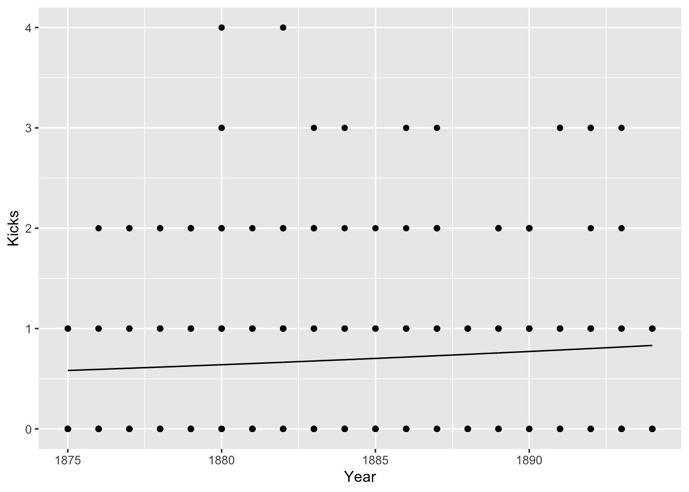
prussian%>%group_by(Year)%>%summarize(Kicks=mean(Kicks))%>%ggplot(aes(Year,log(Kicks),group))+geom_point()+geom_smooth()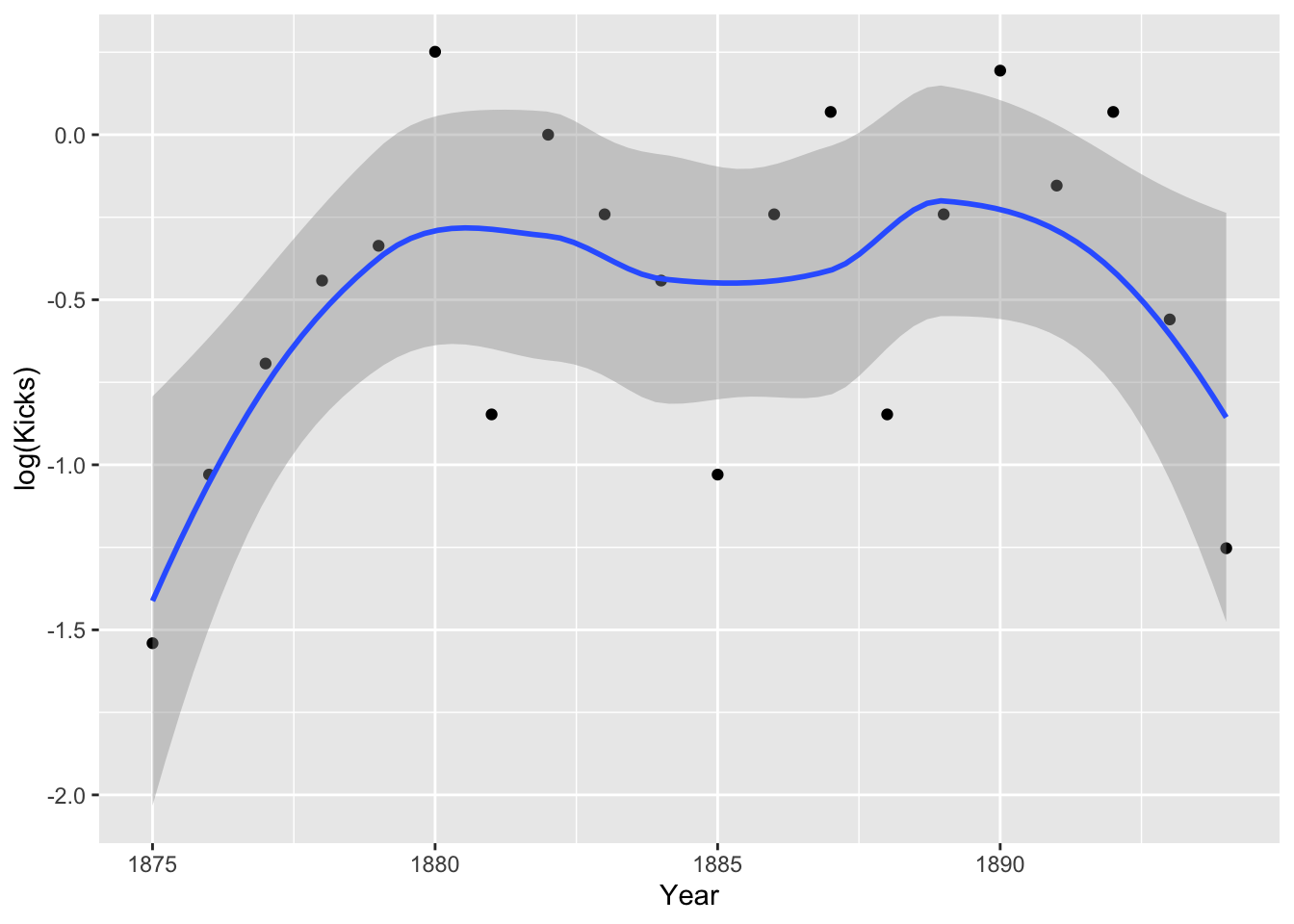
Hmm, it doesn’t look especially linear. Perhaps including a quadratic term is appropriate. Still, the assumption is about the true means, not the empirical means. Let’s go ahead and run our regressions.
Now, a Poisson regression differs from a regular regression in two ways: the errors should follow a Poisson distribution, and the link function is logarithmic. Let’s examine the effect of Year just to use a continuous predictor.
fit3<-glm(Kicks~Year,data=prussian,family="poisson")
summary(fit3)
##
## Call:
## glm(formula = Kicks ~ Year, family = "poisson", data = prussian)
##
## Deviance Residuals:
## Min 1Q Median 3Q Max
## -1.2897 -1.1742 -1.0792 0.3997 2.8187
##
## Coefficients:
## Estimate Std. Error z value Pr(>|z|)
## (Intercept) -35.72380 23.43349 -1.524 0.127
## Year 0.01876 0.01243 1.510 0.131
##
## (Dispersion parameter for poisson family taken to be 1)
##
## Null deviance: 323.23 on 279 degrees of freedom
## Residual deviance: 320.94 on 278 degrees of freedom
## AIC: 630.02
##
## Number of Fisher Scoring iterations: 5Because of the (log) link function, the coefficient estimate will need to be transformed via exponentiation. Here, \(e^{.019}=1.02\), so every additional year increases the expected number of horse-kick deaths by a factor of 1.02, or a yearly increase of 2%, which is not significant. Note that the increase is multiplicative rather than additive as in linear regression.
To get our 95% CI, we take our estimate \(\pm 1.96 SE\) and then exponentiate. So here we have \(.01875 \pm 1.96*.1243=[-.0055,.0432]\), and we exponentiate each limit, \([.9945, 1.0441]\). It contains 1, so no effect!
We can see the same thing by comparing this model to the null model and seeing if we significantly decrease deviance (we get the same p-value).
nullfit<-glm(Kicks~1, data=prussian, family="poisson")
anova(nullfit,fit3,test="LRT")
## Analysis of Deviance Table
##
## Model 1: Kicks ~ 1
## Model 2: Kicks ~ Year
## Resid. Df Resid. Dev Df Deviance Pr(>Chi)
## 1 279 323.23
## 2 278 320.94 1 2.2866 0.1305Because of our quadratic looking plot above, let’s add a term that let’s Year affect Kicks quadratically
fit3quad<-glm(Kicks~Year+I(Year^2),data=prussian,family="poisson")
summary(fit3quad)
##
## Call:
## glm(formula = Kicks ~ Year + I(Year^2), family = "poisson", data = prussian)
##
## Deviance Residuals:
## Min 1Q Median 3Q Max
## -1.3175 -1.2046 -0.8679 0.3841 2.7584
##
## Coefficients:
## Estimate Std. Error z value Pr(>|z|)
## (Intercept) -2.376e+04 9.246e+03 -2.570 0.0102 *
## Year 2.520e+01 9.812e+00 2.568 0.0102 *
## I(Year^2) -6.679e-03 2.603e-03 -2.566 0.0103 *
## ---
## Signif. codes: 0 '***' 0.001 '**' 0.01 '*' 0.05 '.' 0.1 ' ' 1
##
## (Dispersion parameter for poisson family taken to be 1)
##
## Null deviance: 323.23 on 279 degrees of freedom
## Residual deviance: 314.00 on 277 degrees of freedom
## AIC: 625.08
##
## Number of Fisher Scoring iterations: 5anova(fit3,fit3quad,test="LRT")## Analysis of Deviance Table
##
## Model 1: Kicks ~ Year
## Model 2: Kicks ~ Year + I(Year^2)
## Resid. Df Resid. Dev Df Deviance Pr(>Chi)
## 1 278 320.94
## 2 277 314.00 1 6.9469 0.008397 **
## ---
## Signif. codes: 0 '***' 0.001 '**' 0.01 '*' 0.05 '.' 0.1 ' ' 1Looks like it does: the quadratic model definitely fits better. Our model is \(log(Kicks)=-2376+25.2Year-.0067Year^2\), and maximizing this function shows that the year with the most deaths was \(\frac{25.2}{.0135]=1866.67\)
We could also examine the differences among corps:
fit4<-glm(Kicks~Corps,data=prussian,family="poisson")
summary(fit4)
##
## Call:
## glm(formula = Kicks ~ Corps, family = "poisson", data = prussian)
##
## Deviance Residuals:
## Min 1Q Median 3Q Max
## -1.5811 -1.0955 -0.8367 0.5438 2.0079
##
## Coefficients:
## Estimate Std. Error z value Pr(>|z|)
## (Intercept) -2.231e-01 2.500e-01 -0.893 0.3721
## CorpsC10 -6.454e-02 3.594e-01 -0.180 0.8575
## CorpsC11 4.463e-01 3.201e-01 1.394 0.1633
## CorpsC14 4.055e-01 3.227e-01 1.256 0.2090
## CorpsC15 -6.931e-01 4.330e-01 -1.601 0.1094
## CorpsC2 -2.877e-01 3.819e-01 -0.753 0.4512
## CorpsC3 -2.877e-01 3.819e-01 -0.753 0.4512
## CorpsC4 -6.931e-01 4.330e-01 -1.601 0.1094
## CorpsC5 -3.747e-01 3.917e-01 -0.957 0.3387
## CorpsC6 6.062e-02 3.483e-01 0.174 0.8618
## CorpsC7 -2.877e-01 3.819e-01 -0.753 0.4512
## CorpsC8 -8.267e-01 4.532e-01 -1.824 0.0681 .
## CorpsC9 -2.076e-01 3.734e-01 -0.556 0.5781
## CorpsGC -4.072e-09 3.535e-01 0.000 1.0000
## ---
## Signif. codes: 0 '***' 0.001 '**' 0.01 '*' 0.05 '.' 0.1 ' ' 1
##
## (Dispersion parameter for poisson family taken to be 1)
##
## Null deviance: 323.23 on 279 degrees of freedom
## Residual deviance: 297.09 on 266 degrees of freedom
## AIC: 630.17
##
## Number of Fisher Scoring iterations: 5No corps differ significantly from C1, but there do appear to be some differences. For example, a person in corps C11 is \(e^{4.46}=1.56\), or 56% more likely to die from horse kicks than C1, but corps C8 is \(e^{-.827}=.44\), or about 66% less likely to die from horse kicks than C1. We should be mindful of multiple comparisons, but let’s see if C11 differs from C8 by releveling
prussian$Corps<-relevel(prussian$Corps,ref="C8")

fit4<-glm(Kicks~Corps,data=prussian,family="poisson")
summary(fit4)
##
## Call:
## glm(formula = Kicks ~ Corps, family = "poisson", data = prussian)
##
## Deviance Residuals:
## Min 1Q Median 3Q Max
## -1.5811 -1.0955 -0.8367 0.5438 2.0079
##
## Coefficients:
## Estimate Std. Error z value Pr(>|z|)
## (Intercept) -1.0498 0.3780 -2.778 0.00548 **
## CorpsC1 0.8267 0.4532 1.824 0.06811 .
## CorpsC10 0.7621 0.4577 1.665 0.09590 .
## CorpsC11 1.2730 0.4276 2.977 0.00291 **
## CorpsC14 1.2321 0.4296 2.868 0.00413 **
## CorpsC15 0.1335 0.5175 0.258 0.79639
## CorpsC2 0.5390 0.4756 1.133 0.25707
## CorpsC3 0.5390 0.4756 1.133 0.25707
## CorpsC4 0.1335 0.5175 0.258 0.79640
## CorpsC5 0.4520 0.4835 0.935 0.34987
## CorpsC6 0.8873 0.4491 1.976 0.04818 *
## CorpsC7 0.5390 0.4756 1.133 0.25707
## CorpsC9 0.6190 0.4688 1.320 0.18668
## CorpsGC 0.8267 0.4532 1.824 0.06811 .
## ---
## Signif. codes: 0 '***' 0.001 '**' 0.01 '*' 0.05 '.' 0.1 ' ' 1
##
## (Dispersion parameter for poisson family taken to be 1)
##
## Null deviance: 323.23 on 279 degrees of freedom
## Residual deviance: 297.09 on 266 degrees of freedom
## AIC: 630.17
##
## Number of Fisher Scoring iterations: 5Wow, it looks like lots of Corps differ from C8: C8 had surprisingly few horse deaths! Since we have a factor variable, to test if the overall factor is significant, let’s use deviances to compare this model to the null model and test the overall effect of Corps.
anova(nullfit,fit4,test="LRT")## Analysis of Deviance Table
##
## Model 1: Kicks ~ 1
## Model 2: Kicks ~ Corps
## Resid. Df Resid. Dev Df Deviance Pr(>Chi)
## 1 279 323.23
## 2 266 297.09 13 26.137 0.0163 *
## ---
## Signif. codes: 0 '***' 0.001 '**' 0.01 '*' 0.05 '.' 0.1 ' ' 1Offsets and Overdispersion
If you are dealing with counts across groups whose sizes are different, you must explicitly take this into account. For example, assume that corps sizes vary. I am just going to make up some corps sizes for the purposes of illustration. If \(\lambda\) is the mean number of kicks per year, we can adjust for corps size by including its log as an offset.
prussian<-prussian%>%mutate(Size=round(runif(n=280,min = 5000, max=10000)))
prussian%>%dplyr::select(Year,Corps,Kicks,Size)%>%head()
## Year Corps Kicks Size
## 1 1875 GC 0 9196
## 2 1876 GC 2 5659
## 3 1877 GC 2 8478
## 4 1878 GC 1 5761
## 5 1879 GC 0 5181
## 6 1880 GC 0 9432fitoffset<-glm(Kicks~Year,data=prussian,family="poisson", offset=log(Size))
summary(fitoffset)##
## Call:
## glm(formula = Kicks ~ Year, family = "poisson", data = prussian,
## offset = log(Size))
##
## Deviance Residuals:
## Min 1Q Median 3Q Max
## -1.4954 -1.1617 -0.9272 0.4772 3.1685
##
## Coefficients:
## Estimate Std. Error z value Pr(>|z|)
## (Intercept) -45.73589 23.49987 -1.946 0.0516 .
## Year 0.01936 0.01247 1.553 0.1205
## ---
## Signif. codes: 0 '***' 0.001 '**' 0.01 '*' 0.05 '.' 0.1 ' ' 1
##
## (Dispersion parameter for poisson family taken to be 1)
##
## Null deviance: 328.09 on 279 degrees of freedom
## Residual deviance: 325.67 on 278 degrees of freedom
## AIC: 634.75
##
## Number of Fisher Scoring iterations: 5Now we have estimates that are correctly adjusted for corps size.
Overdispersion
Sometimes it will happen that there will be more variation in the response variable than is expected from the Poisson distribution. Recall that we expect \(E(Y)=Var(Y)\). Let \(\phi\) be an overdispersion parameter such that \(E(Y)=\phi Var(Y)\). If \(\phi=1\), there is no overdispersion, but if it is greater than 1, there is overdispersion. Overdispersion is problematic in that if it exists, the standard errors will be too small, leading to a greater type I error rate. We can get an estimate of the overdispersion by dividing the model deviance (sum of squared pearson residuals) by its degrees of freedom,
sum(residuals(fitoffset,"pearson")^2)/df.residual(fitoffset)## [1] 1.153363sqrt(1.1628)## [1] 1.078332We would need to multiply our standard errors by \(\sqrt{\hat \phi}\) to correct for overdispersion, so \(.01247\times \sqrt{1.1628}=.01247*1.0783=.01345\). We can get this directly by setting family="quasipoisson", as below. Note that tests are now based on the t distribution.
fitquasi<-glm(Kicks~Year,data=prussian,family="quasipoisson", offset=log(Size))
summary(fitquasi)
##
## Call:
## glm(formula = Kicks ~ Year, family = "quasipoisson", data = prussian,
## offset = log(Size))
##
## Deviance Residuals:
## Min 1Q Median 3Q Max
## -1.4954 -1.1617 -0.9272 0.4772 3.1685
##
## Coefficients:
## Estimate Std. Error t value Pr(>|t|)
## (Intercept) -45.73589 25.23824 -1.812 0.071 .
## Year 0.01936 0.01339 1.446 0.149
## ---
## Signif. codes: 0 '***' 0.001 '**' 0.01 '*' 0.05 '.' 0.1 ' ' 1
##
## (Dispersion parameter for quasipoisson family taken to be 1.153419)
##
## Null deviance: 328.09 on 279 degrees of freedom
## Residual deviance: 325.67 on 278 degrees of freedom
## AIC: NA
##
## Number of Fisher Scoring iterations: 5Perhaps a simpler technique is to use robust standard errors.
Another common way of handling overdispersion is to use a negative binomial model, NegBinom(. You might know this distribution as modeling the number of (Bernoulli) trials before a certain number of failures occurs, but mathematically it is a Poisson model where \(\lamda\) is itself random, following a gamma distribution, \(\lambda\sim Gamma(r, \frac{1-p}{p})\). So instead of \(Y\sim Poisson(\lambda)\), we model our responses as \(Y\sim NegBinom(r,p)\) where \(E(Y)=pr/(1-p)=\mu\) and \(Var(Y)=\mu+\frac{\mu^2}{r}\), where \(\frac{\mu^2}{r}\) is our overdispersion parameter.
fitnb<-glm.nb(Kicks~Year,data=prussian, weights=offset(log(Size)))
summary(fitnb)
##
## Call:
## glm.nb(formula = Kicks ~ Year, data = prussian, weights = offset(log(Size)),
## init.theta = 8.355198954, link = log)
##
## Deviance Residuals:
## Min 1Q Median 3Q Max
## -3.808 -3.429 -3.139 1.124 7.906
##
## Coefficients:
## Estimate Std. Error z value Pr(>|z|)
## (Intercept) -35.460285 8.188981 -4.330 1.49e-05 ***
## Year 0.018625 0.004344 4.287 1.81e-05 ***
## ---
## Signif. codes: 0 '***' 0.001 '**' 0.01 '*' 0.05 '.' 0.1 ' ' 1
##
## (Dispersion parameter for Negative Binomial(8.3552) family taken to be 1)
##
## Null deviance: 2665.8 on 279 degrees of freedom
## Residual deviance: 2647.6 on 278 degrees of freedom
## AIC: 5555.5
##
## Number of Fisher Scoring iterations: 1
##
##
## Theta: 8.36
## Std. Err.: 3.29
##
## 2 x log-likelihood: -5549.525This generates incredibly small standard errors and makes me skeptical… Because the results are now so much better than our unadjusted model, I really don’t trust it.
Zero-Inflated Poisson
Sometimes you get count data with loads of zeros. For example, a former student of mine was looking at how social life (hours per week spent socializing) and stress (credit hours + work hours per week) predicted number of alcoholic beverages consumed each week. But many students do not consume any alcohol at all!
drinkdat<-read.csv("~/Downloads/drink_data_total.csv")
drinkdat<-drinkdat%>%filter(Drinks<20)
drinkdat%>%ggplot(aes(Drinks))+geom_bar()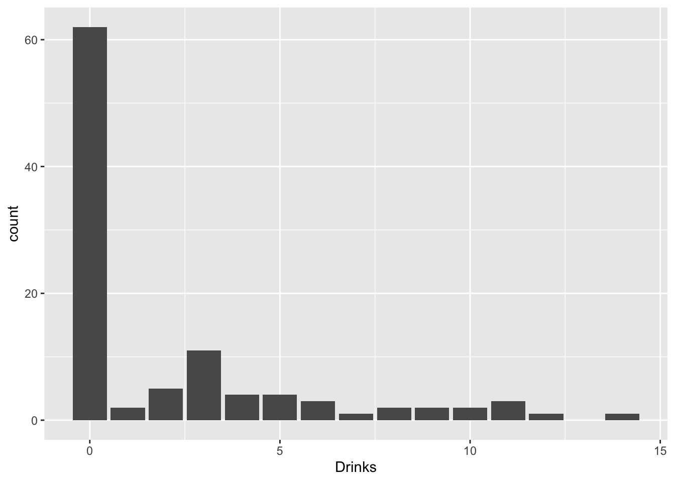
What are we to do? Well, we get creative! Think of trying to emulate the data-generating process: there are two overlapping populations here, drinkers and non-drinkers. Among drinkers, we may see a poisson distribution for drinks consumed in a week, but not among non-drinkers. However, non-drinkers are contributing to the zeros in our data.
poisfit<-glm(Drinks~Social*Stress,data=drinkdat,family="poisson")
summary(poisfit)
##
## Call:
## glm(formula = Drinks ~ Social * Stress, family = "poisson", data = drinkdat)
##
## Deviance Residuals:
## Min 1Q Median 3Q Max
## -3.4563 -1.8425 -1.5876 0.5853 5.3410
##
## Coefficients:
## Estimate Std. Error z value Pr(>|z|)
## (Intercept) -1.740315 0.548228 -3.174 0.001501 **
## Social 0.447490 0.081164 5.513 3.52e-08 ***
## Stress 0.062919 0.020656 3.046 0.002319 **
## Social:Stress -0.013059 0.003422 -3.816 0.000136 ***
## ---
## Signif. codes: 0 '***' 0.001 '**' 0.01 '*' 0.05 '.' 0.1 ' ' 1
##
## (Dispersion parameter for poisson family taken to be 1)
##
## Null deviance: 485.99 on 102 degrees of freedom
## Residual deviance: 440.71 on 99 degrees of freedom
## AIC: 586.33
##
## Number of Fisher Scoring iterations: 6pchisq(440.71,99,lower.tail = F)## [1] 1.293779e-44exp<-dpois(0:14,mean(drinkdat$Drinks))*length(drinkdat$Drinks)
obs<-table(factor(drinkdat$Drinks,levels=0:14))
chisq<-sum((obs-exp)^2/exp)
pchisq(chisq,df = 13,lower.tail = F)## [1] 0library(pscl)
zip_fit<-zeroinfl(Drinks~Social*Stress|1,data=drinkdat)
summary(zip_fit)##
## Call:
## zeroinfl(formula = Drinks ~ Social * Stress | 1, data = drinkdat)
##
## Pearson residuals:
## Min 1Q Median 3Q Max
## -0.7407 -0.7081 -0.6985 0.3800 4.1894
##
## Count model coefficients (poisson with log link):
## Estimate Std. Error z value Pr(>|z|)
## (Intercept) 0.426825 0.479516 0.890 0.37340
## Social 0.209253 0.072870 2.872 0.00408 **
## Stress 0.044174 0.015595 2.833 0.00462 **
## Social:Stress -0.007978 0.002728 -2.925 0.00345 **
##
## Zero-inflation model coefficients (binomial with logit link):
## Estimate Std. Error z value Pr(>|z|)
## (Intercept) 0.4004 0.2024 1.978 0.048 *
## ---
## Signif. codes: 0 '***' 0.001 '**' 0.01 '*' 0.05 '.' 0.1 ' ' 1
##
## Number of iterations in BFGS optimization: 18
## Log-likelihood: -174.8 on 5 DfThis model fits much better than the non-zero-inflated poisson,
vuong(zip_fit,poisfit)## Vuong Non-Nested Hypothesis Test-Statistic:
## (test-statistic is asymptotically distributed N(0,1) under the
## null that the models are indistinguishible)
## -------------------------------------------------------------
## Vuong z-statistic H_A p-value
## Raw 5.891903 model1 > model2 1.9089e-09
## AIC-corrected 5.840380 model1 > model2 2.6041e-09
## BIC-corrected 5.772504 model1 > model2 3.9051e-09Here the test statistic is significant across the board indicating that the zero-inflated Poisson model fits better than the standard Poisson model.
Zero-Truncated Poisson
Sometimes, instead of an abundance of true zeros, you have strictly non-zero data (e.g., count data where the minimum value is 1). An ordinary Poisson regression will try to predict zero counts, which would be inappropriate for this data.
What if you were interested in the affect of socializing and stress on number of drinks consumed among students who drink.
drinkdat_nozero<-drinkdat%>%filter(Drinks>0)

#install.packages("VGAM")
library(VGAM)

trunc_fit<-vglm(Drinks~Social*Stress,family=pospoisson(),data=drinkdat_nozero)
summary(trunc_fit)
##
## Call:
## vglm(formula = Drinks ~ Social * Stress, family = pospoisson(),
## data = drinkdat_nozero)
##
## Pearson residuals:
## Min 1Q Median 3Q Max
## loglink(lambda) -1.85 -1.172 -0.2817 1.054 4.026
##
## Coefficients:
## Estimate Std. Error z value Pr(>|z|)
## (Intercept) 0.435122 0.477608 0.911 0.36227
## Social 0.209062 0.073625 2.840 0.00452 **
## Stress 0.044434 0.015720 2.827 0.00470 **
## Social:Stress -0.008062 0.002818 -2.861 0.00423 **
## ---
## Signif. codes: 0 '***' 0.001 '**' 0.01 '*' 0.05 '.' 0.1 ' ' 1
##
## Name of linear predictor: loglink(lambda)
##
## Log-likelihood: -105.574 on 37 degrees of freedom
##
## Number of Fisher scoring iterations: 4
##
## No Hauck-Donner effect found in any of the estimates#AIC
-2*-105.574+2*3## [1] 217.148summary(glm(Drinks~Social*Stress,family=poisson,data=drinkdat_nozero))##
## Call:
## glm(formula = Drinks ~ Social * Stress, family = poisson, data = drinkdat_nozero)
##
## Deviance Residuals:
## Min 1Q Median 3Q Max
## -2.2303 -1.2847 -0.2845 0.9985 3.2402
##
## Coefficients:
## Estimate Std. Error z value Pr(>|z|)
## (Intercept) 0.471948 0.469777 1.005 0.31508
## Social 0.203073 0.072302 2.809 0.00497 **
## Stress 0.043329 0.015533 2.789 0.00528 **
## Social:Stress -0.007817 0.002751 -2.842 0.00449 **
## ---
## Signif. codes: 0 '***' 0.001 '**' 0.01 '*' 0.05 '.' 0.1 ' ' 1
##
## (Dispersion parameter for poisson family taken to be 1)
##
## Null deviance: 82.526 on 40 degrees of freedom
## Residual deviance: 74.156 on 37 degrees of freedom
## AIC: 219.78
##
## Number of Fisher Scoring iterations: 5Slightly lower AIC, slightly better fit compared to using a poisson regression. Results are extremely comparable.