
As the semester draws to a close, assignments have this way of becoming suddenly due and needing immediately to be done… while everything else, literally anything besides these assignments has this perverse way of becoming, in equal measure, more enticing, distracting, rewarding…
So, having just completed a final project for my C/Fortran programming course, and as other deadlines loom like so much Damoclean cutlery, I just can’t quit tinkering with gnuplot! I just wasted devoted 2+ hours to figuring out how to generate an animated GIF from a textfile; wait till the end of the post before passing judgment, but for comparison, my wife constructed a gorgeous dress in less time…
First of all, if you use gnuplot and haven’t updated in a while, look into it. Get at least v4.6 if you want full functionality; I was really impressed with these improvements.
The assignment was to use each language to write a program that discretizes and solves the heat equation in two dimensions:
We were to achieve this using stencil updates; as an example, an interior update example from timestep t to timestep t+1 is shown below for the point e).

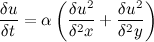
Basically, it allows us to roughly model solutions to a parabolic partial differential equation that describes the way heat spreads through a 2D domain over time (shown above), without violating special relativity (I promise there’s a pretty picture at the end of this post).
I did this in C somewhat kludgily with a 2D struct and a 3D array, using separate functions for I/O. In Fortran, things were smoother. I used a module containing a derived-type 3D array and I/O subroutines. To see the source files, see this link.
So essentially I want to illustrate to you here how heat spreads out from a single constant heatpoint in a 2D domain, as modeled by my own code; for simplicity, lets make our domain a 9x9 grid where the center point (4,4) has a constant temperature value of 10 units. We are going to run my C program and ask for the temperatures of each point on the grid for 500 timesteps.
In the above, heat-sample.inp shows the input file, and output.txt shows the output. We can use awk to parse it (right now the output is 40,500 lines). We want gnuplot to give us a heatmap of these values every 5 timesteps from 0 to 500, so we can visualize the heat spreading outward from the center of the domain. The following awk command says, amazingly, “look in column 3 of file output.txt and create separate files named out1, out2, etc. for all rows in output.txt that have the same value for column 3 (which is timestep).” This command splits the big output file into files with the data at each timestep. Then gnuplot can loop over all 500 files, plotting every 5th one, and create an animated .GIF like it’s nothing:
Here’s the file “animate.gif”, our final product:
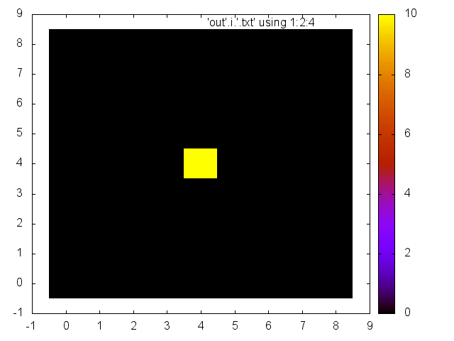
Over time, we see the constant, central heat point (yellow) warming up the entire 2D surface. This is my code in action! How about that! It really drives home the fact that a pretty graphic is actually just the dance of bits and addresses with a pixel mapping.